Continuing with the tight bodysuit theme, today we’ll take a look at Meiya Mitsurugi, the heroine from Age’s eroge Muv-Luv Alternative. Kotobukiya, of course, has made a number of figures of the characters from Total Eclipse – quite probably the best-known property of the Muv-Luv franchise, thanks to its recent anime adaptation. It’s a little bit surprising that Kotobukiya has gone to the older title, since few manufacturers aside from Volks and Good Smile Company have ever shown interest in making figures of its characters. Nonetheless, I’m glad that they have, since its character designs are quite appealing, particularly because of their pilot suits.
I’ve not played Muv-Luv Alternative, but everything I’ve heard about it suggests that it is a far superior work compared to its newer, more famous spinoff. Given what I know of Total Eclipse’s ending, I have no difficulty believing in the veracity of that claim. Muv-Luv Alternative has gotten an unofficial, fan-made English translation, so my excuse for not playing it is mostly because of time, and also because I’ve been hoping that it would get an official English localization; I remember Age showed up at one of the big US anime conventions as a guest of Mangagamer, and I had thought that they might begin a partnership. Sadly, that hasn’t been the case so far, and it doesn’t look like there’s anything going on between the two companies, so maybe I’ll give the game a try sooner rather than later.
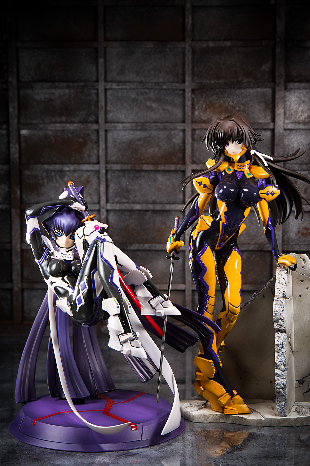
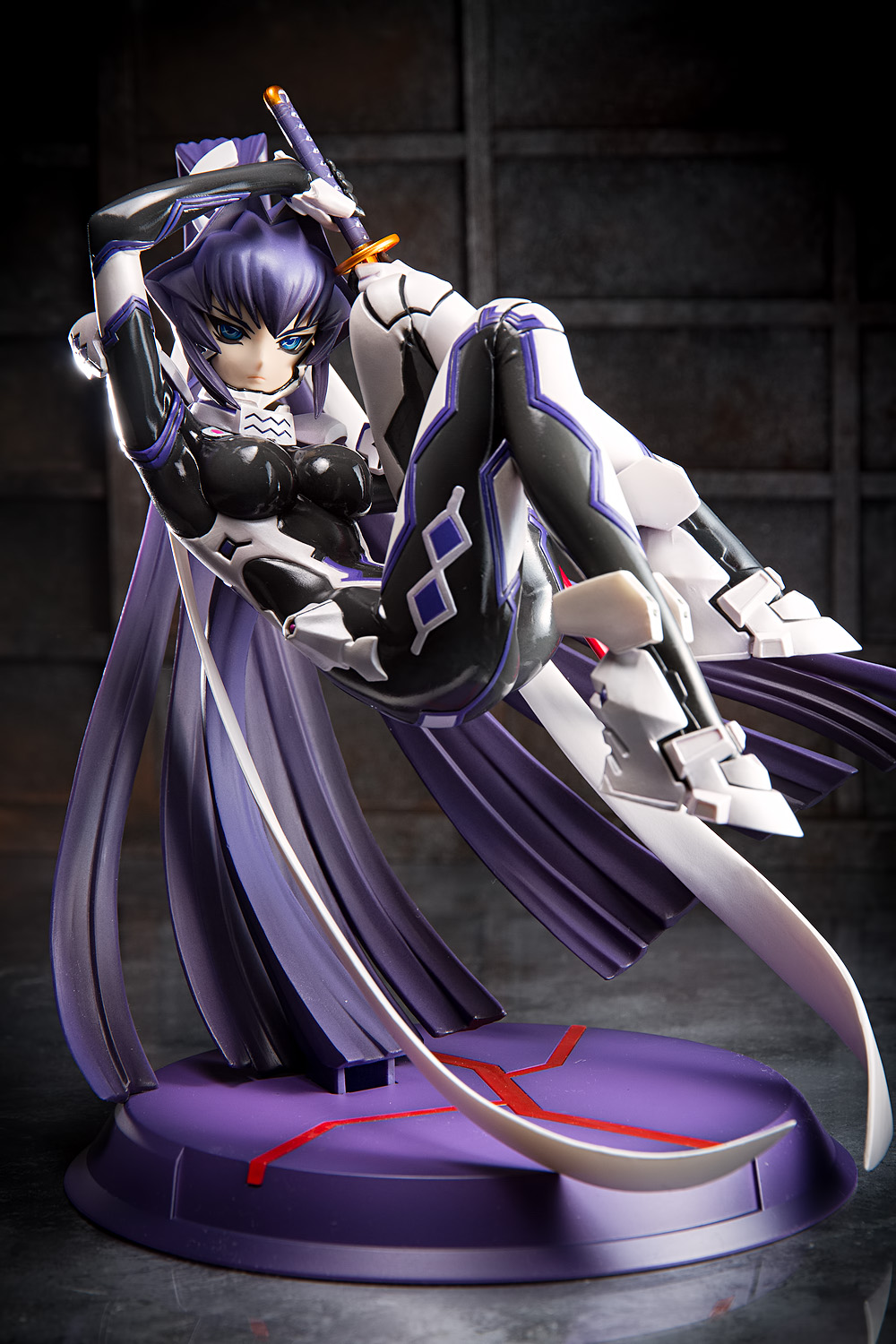
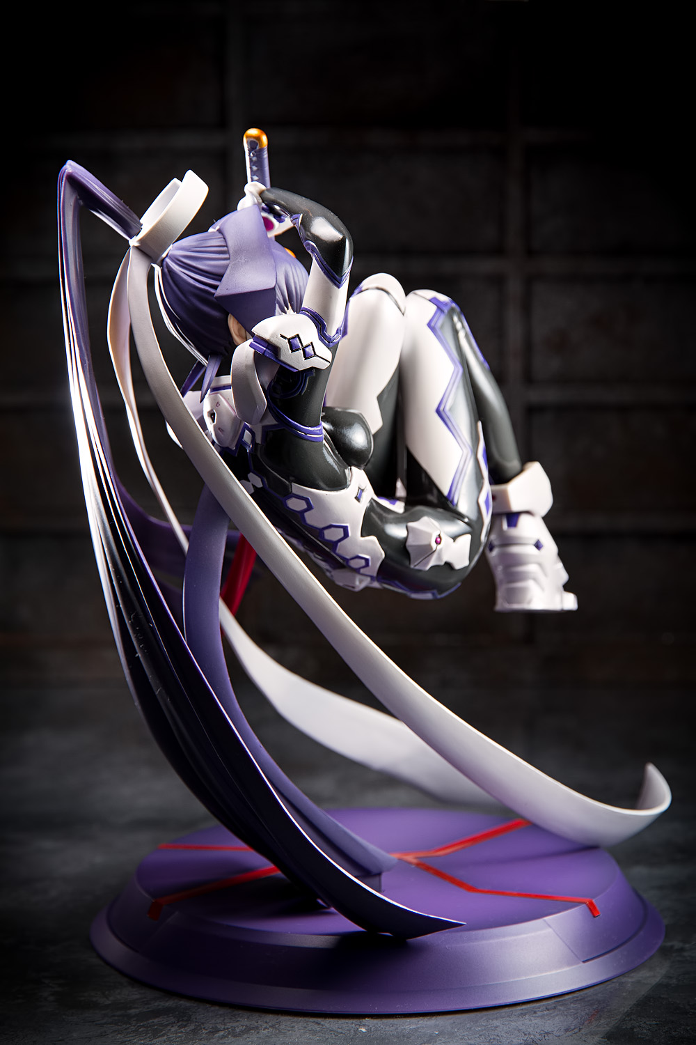
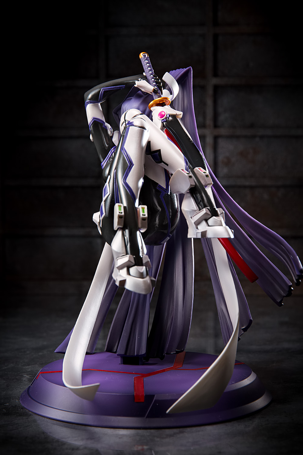
Like Yui and Cryska, Meiya is sculpted in 1/7 scale. She’s differs from her forebears in that she’s floating up on a stand, but her body proportions are roughly similar and her large size is pleasing, particularly because Good Smile Company’s old Meiya figure was quite undersized.
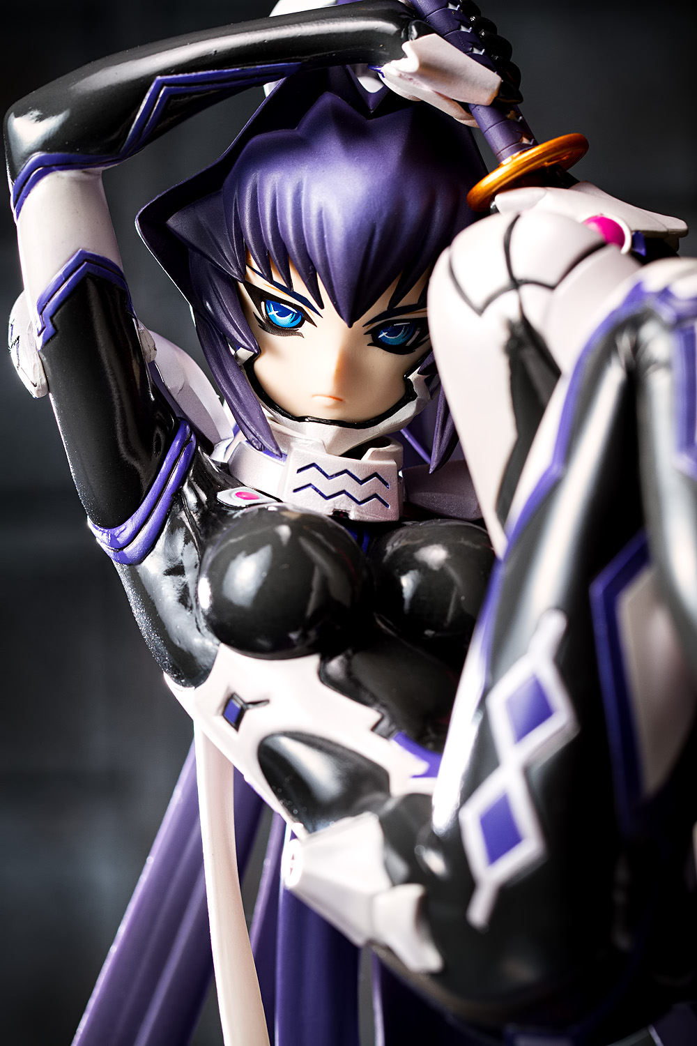
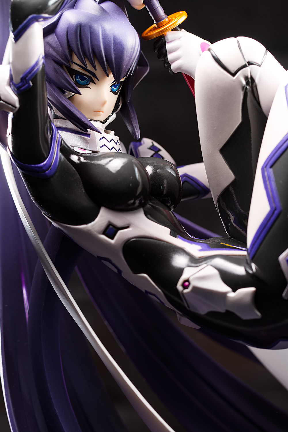
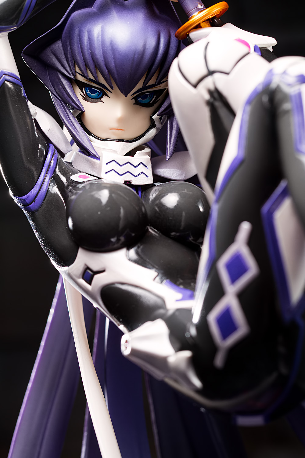
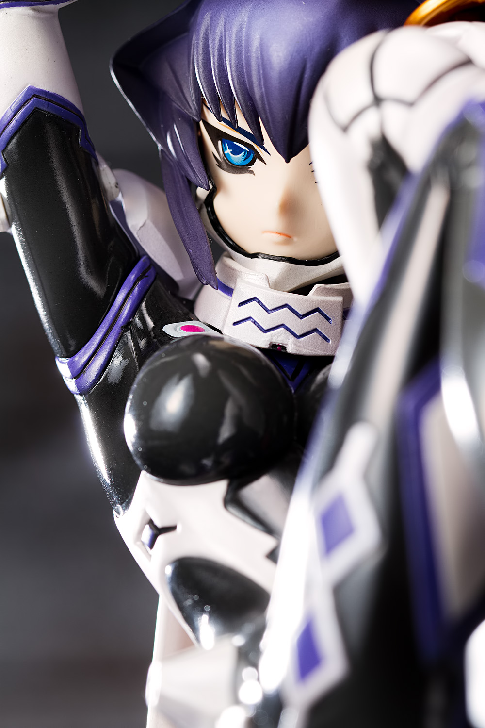
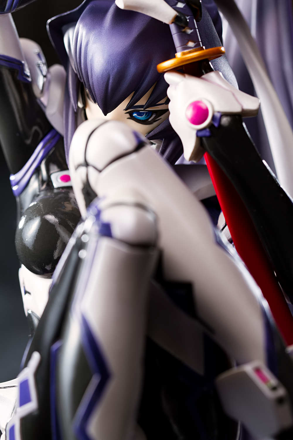
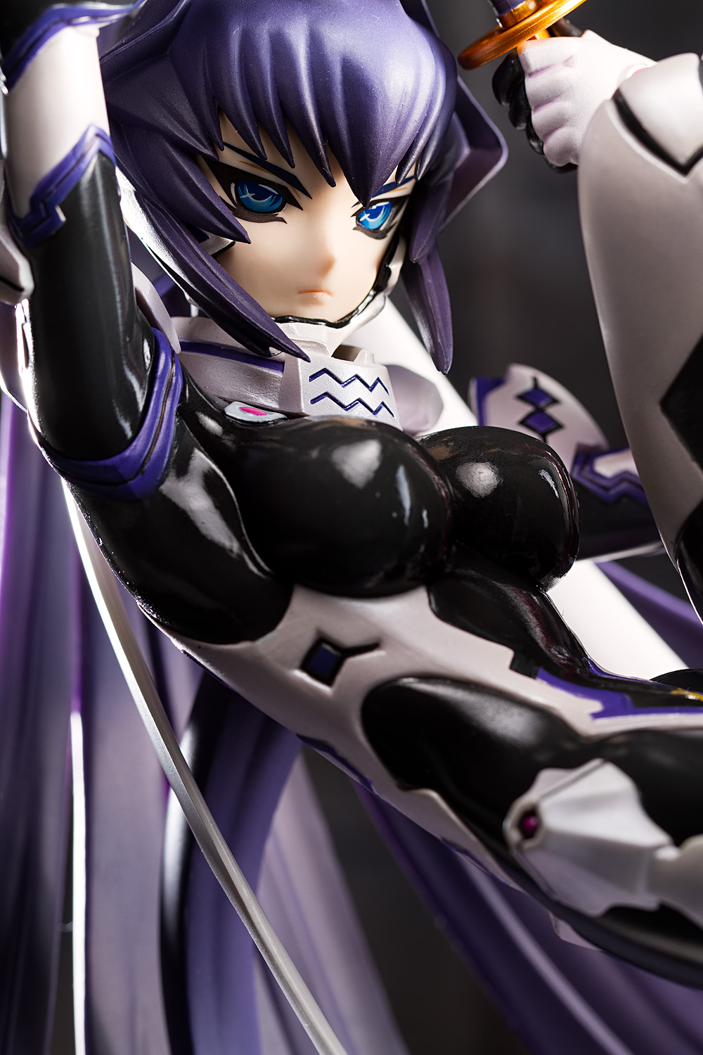
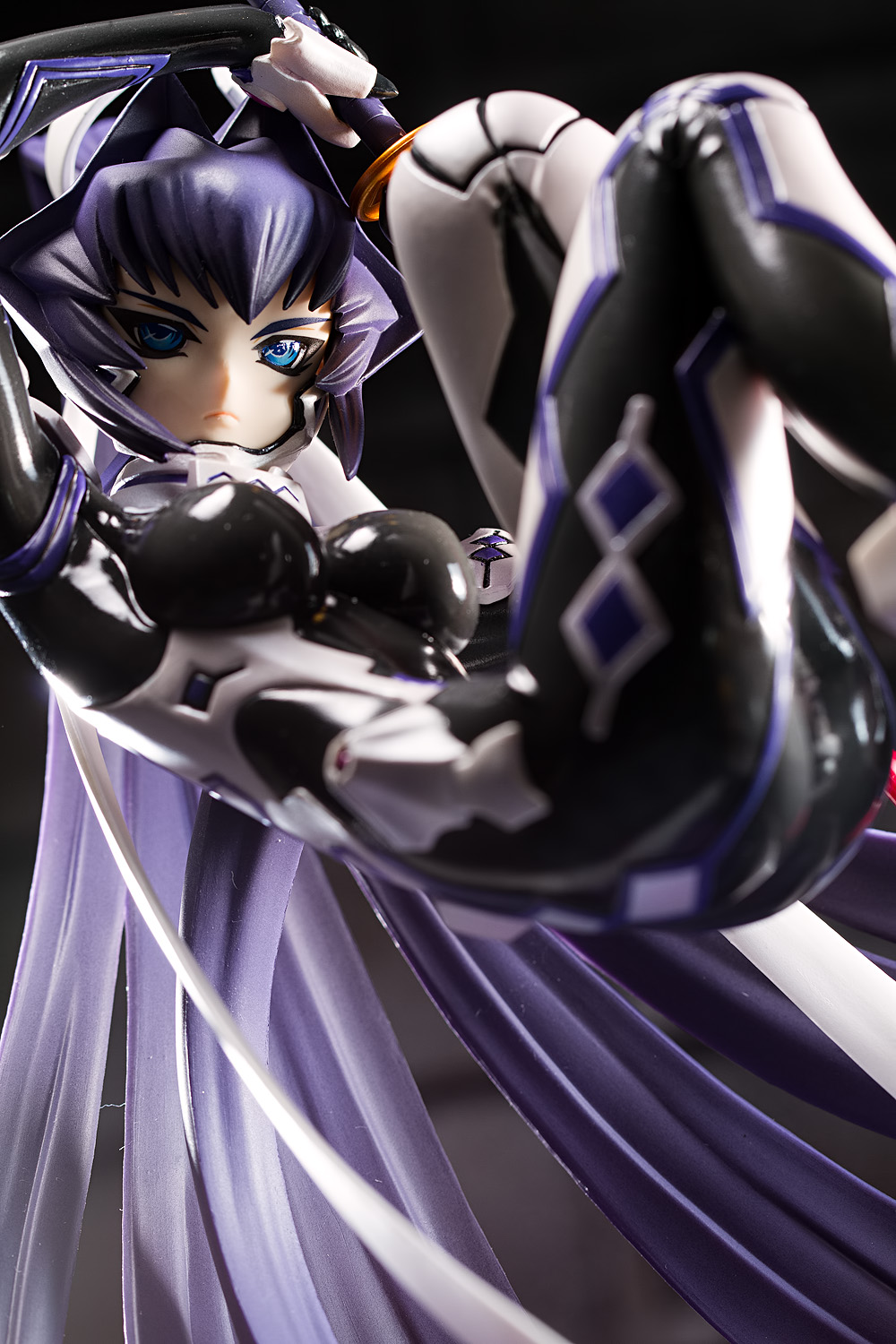
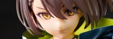
Anime designs are often fairly generic; it’s usually not too difficult to think of a character and then to think of at least a few other characters who strongly resemble the first. The character designs from Muv-Luv Alternative, however, are so distinctive that it’s hard to find anyone that looks like them. This is particularly true of Meiya, with her iconic, starburst-patterned hairstyle and her enormous, self-supporting ponytail. Her eyes and eyebrows are sharp and strongly raked, giving her a robotic appearance that parallels the mecha unit she drives.
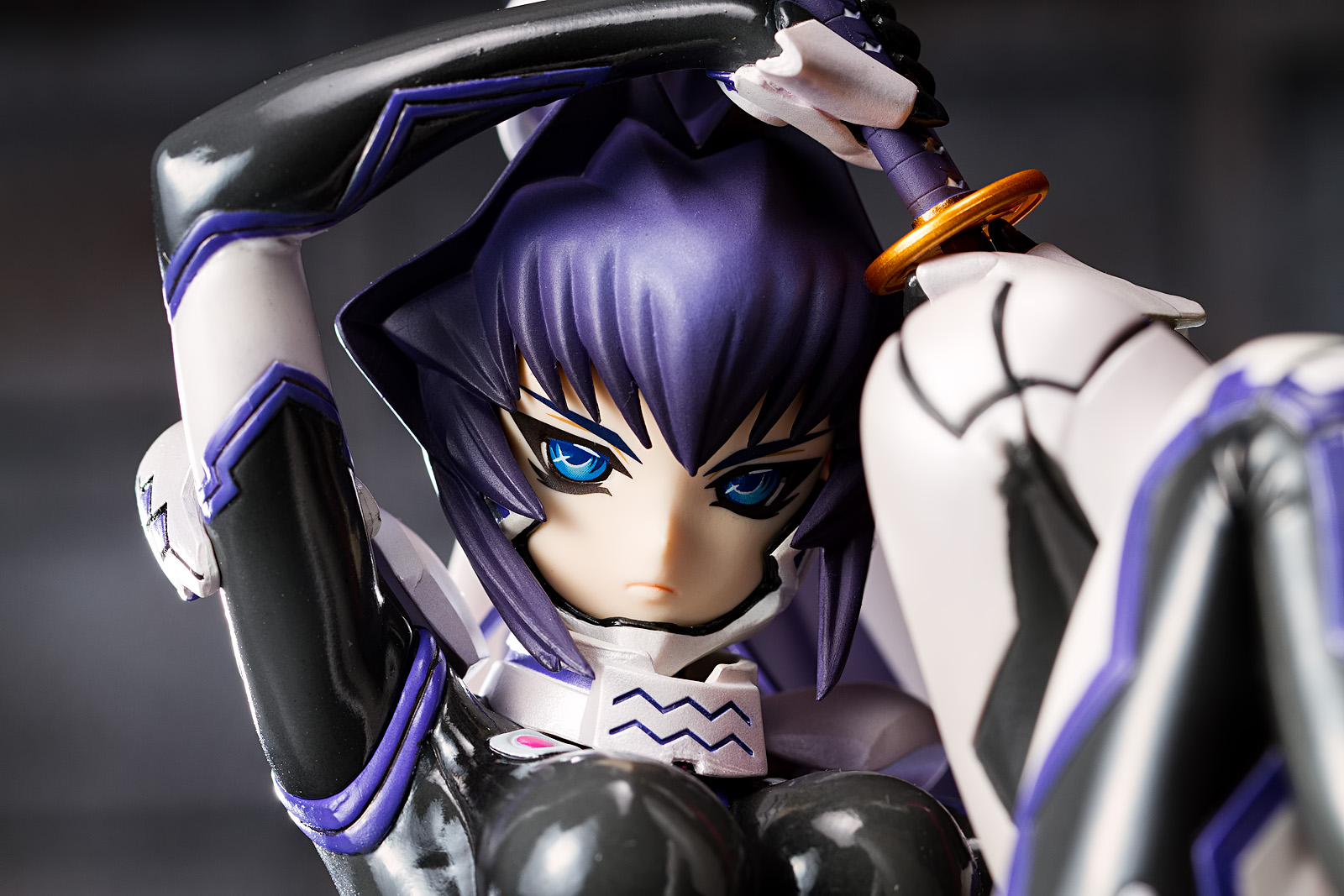
Her expression is as severe as the lines of her face; it clearly conveys that she is not in a good humor. Her eyes are narrowed, and her large irises and indistinct pupils give her a distinctly insect-like appearance, enhancing the predatory character of her visage. One little thing that I like is that her lower lip is emphasized, giving her expression a more realistic and three-dimensional look (contrast Meiya with the Horizon figure that we just looked at; Horizon’s expression is harder to read).
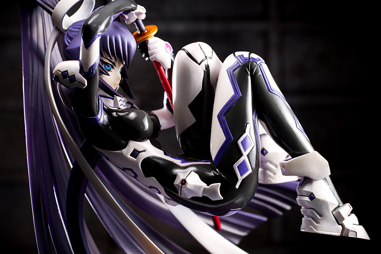
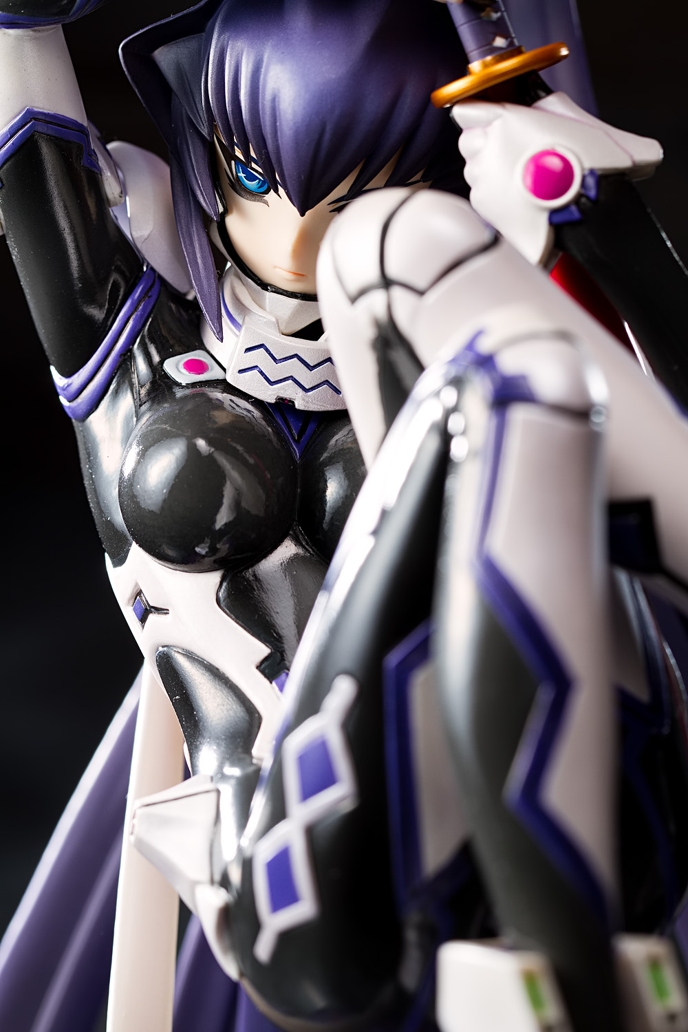
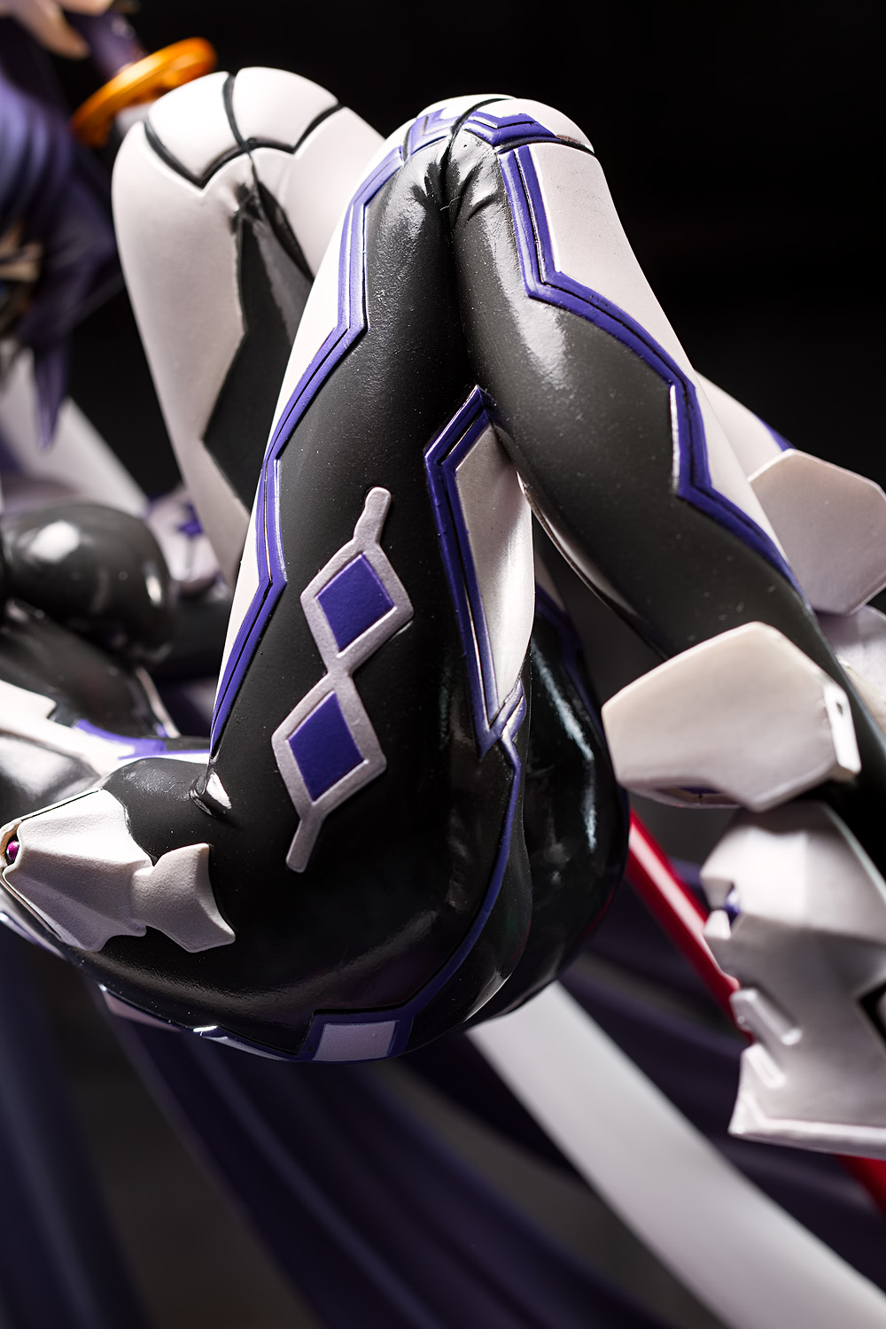
The angular theme is continued in the design of her piloting suit. Like the Total Eclipse girls, Meiya’s body is sheathed in an impossibly skintight suit that leaves little to the imagination – though more than I would like, actually, since Meiya is also shown wearing a translucent suit that hides nearly nothing. I’m told that this is her training suit, and I think it’s the suit that she’s first seen in. That said, aside from the fact that this figure is based off of existing artwork, it’s not too difficult to understand why Kotobukiya elected not to use that design.
Somewhat comically, despite being about the same size as Kotobukiya’s Total Eclipse figures, Meiya seems to have the smallest breasts of the four. Her bust is definitely smaller than Cryska’s and Yui’s, and she appears to be beaten by Inia Sestina as well, despite the relatively small stature of the latter. (I’ve got Inia sitting here but I haven’t yet removed her from her box, so I’ll perform a closer comparison when I review her.)
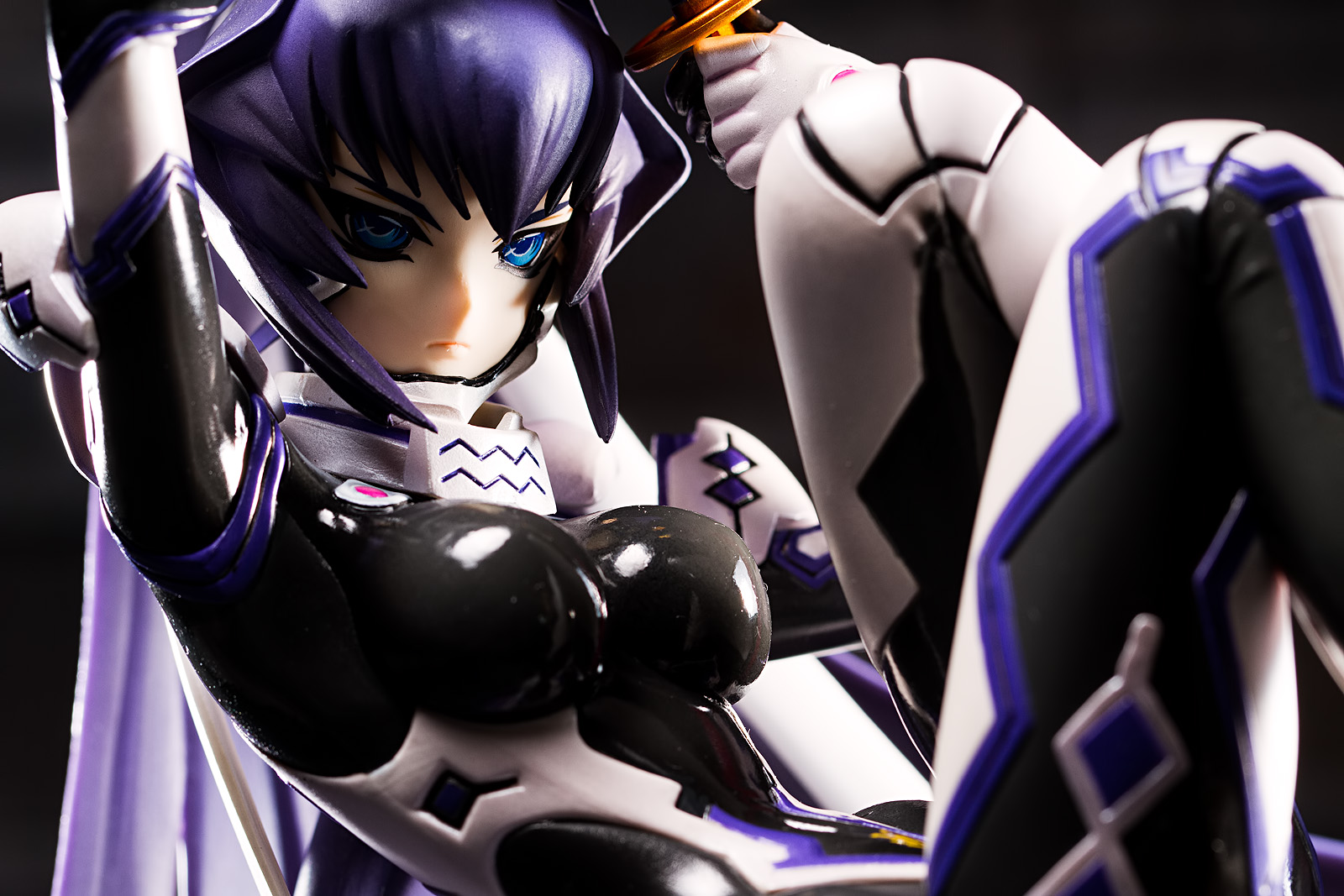
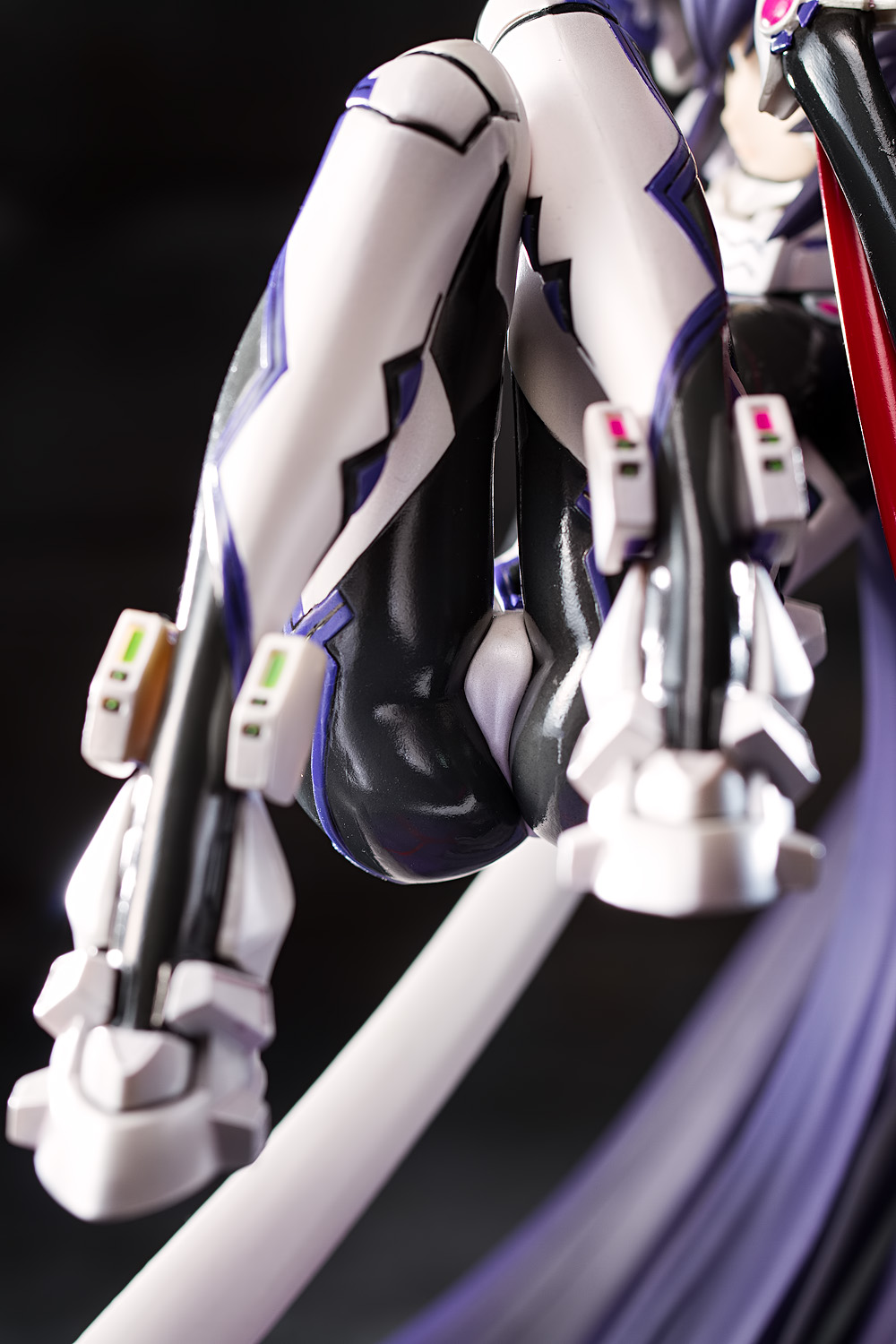
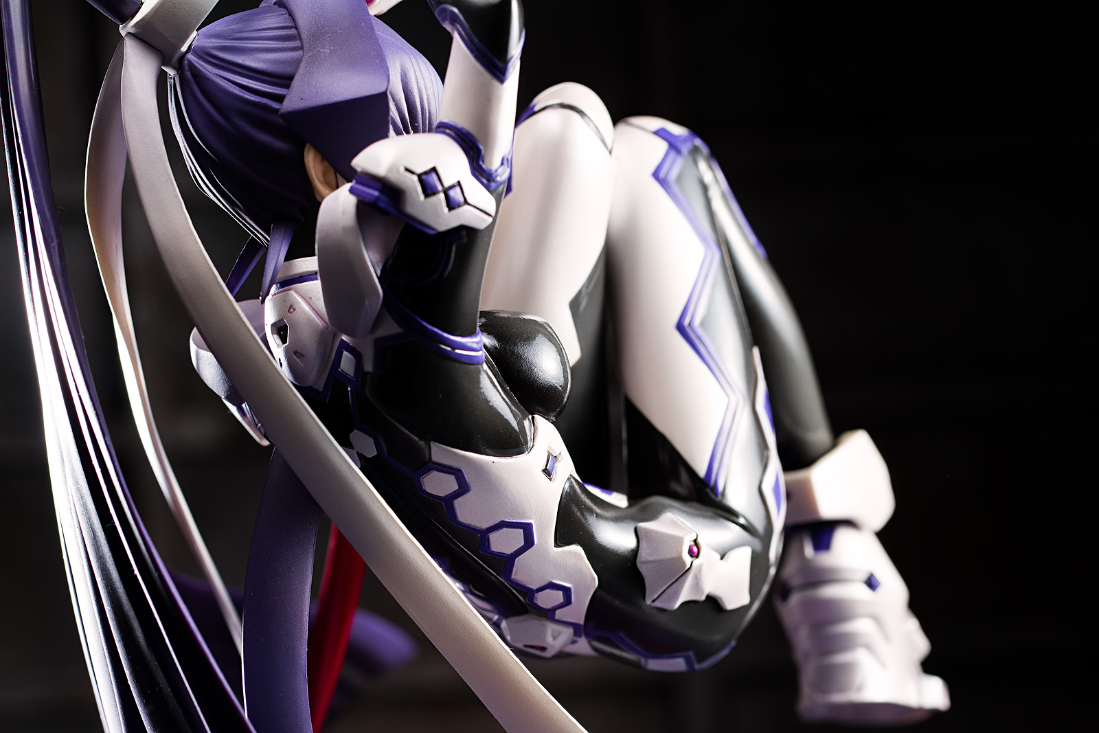
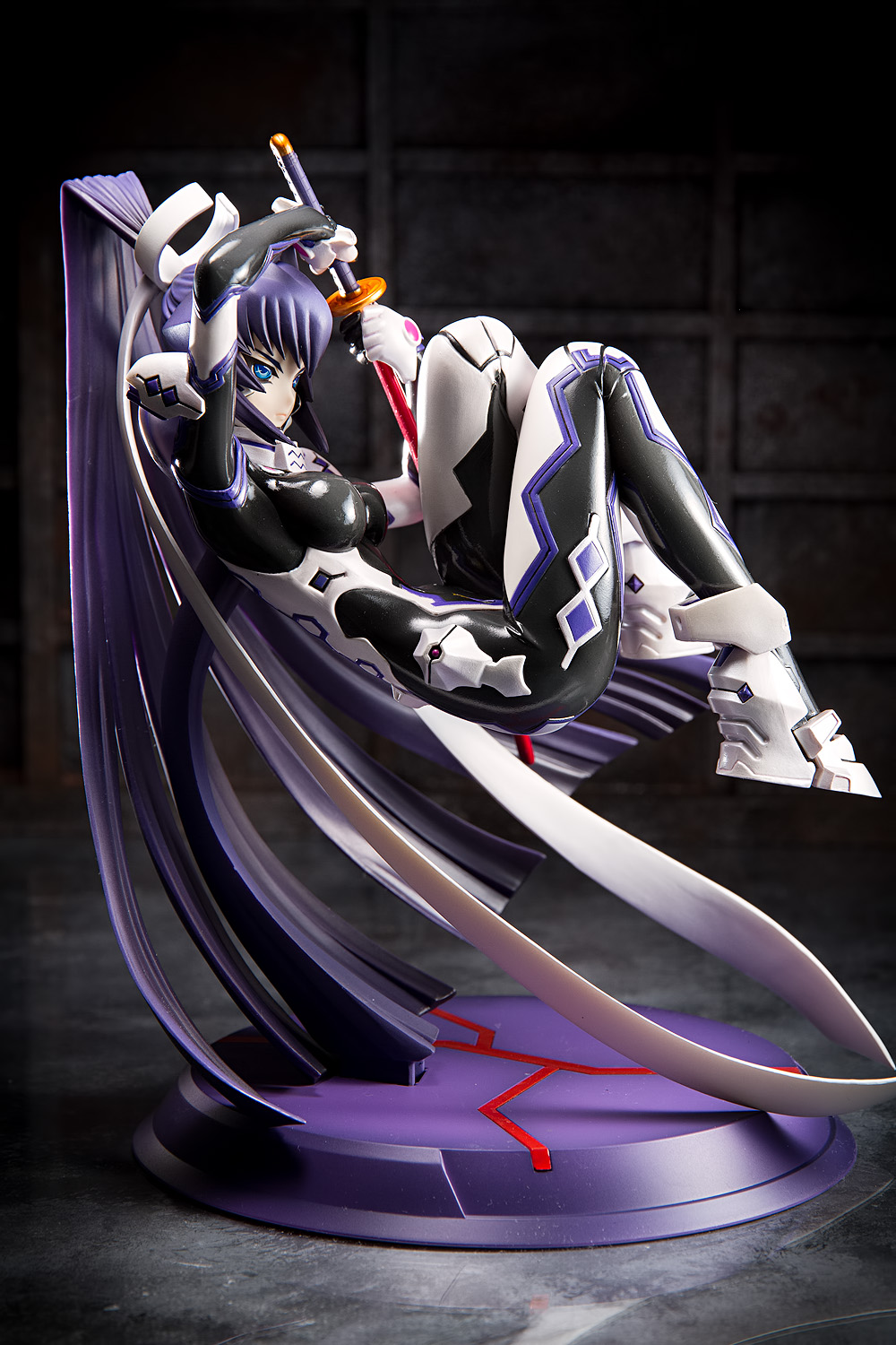
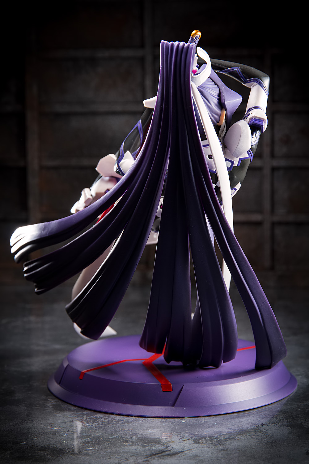
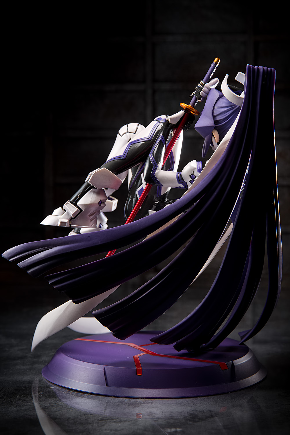
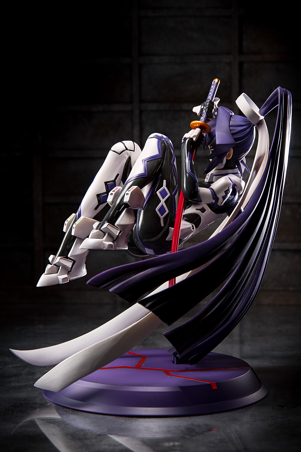
Meiya is curled up in sort of a fetal position, floating up in the air. She is suspended by a small pylon, cleverly colored to blend in with her hair. Kotobukiya includes an instruction sheet showing how to mount her to the base; there is no English translation, unsurprisingly, but it’s a straightforward process. I don’t think there’s any point in trying to display Meiya without the base; for one thing, the pylon slots into a large hole in her back, and for another, her massive sweep of hair would make it difficult to display her any other way.
Speaking of her hair, her ponytail is very large and seems to rotate freely. I really hope that that’s a designed element since the joint between her head and hair seems rather fragile.
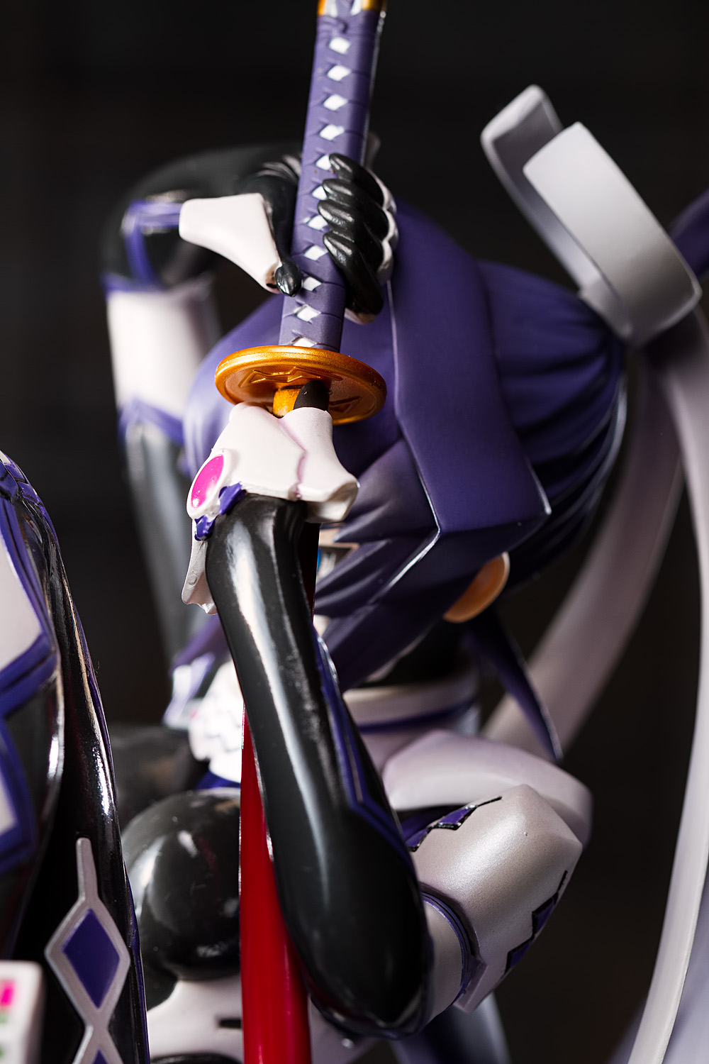
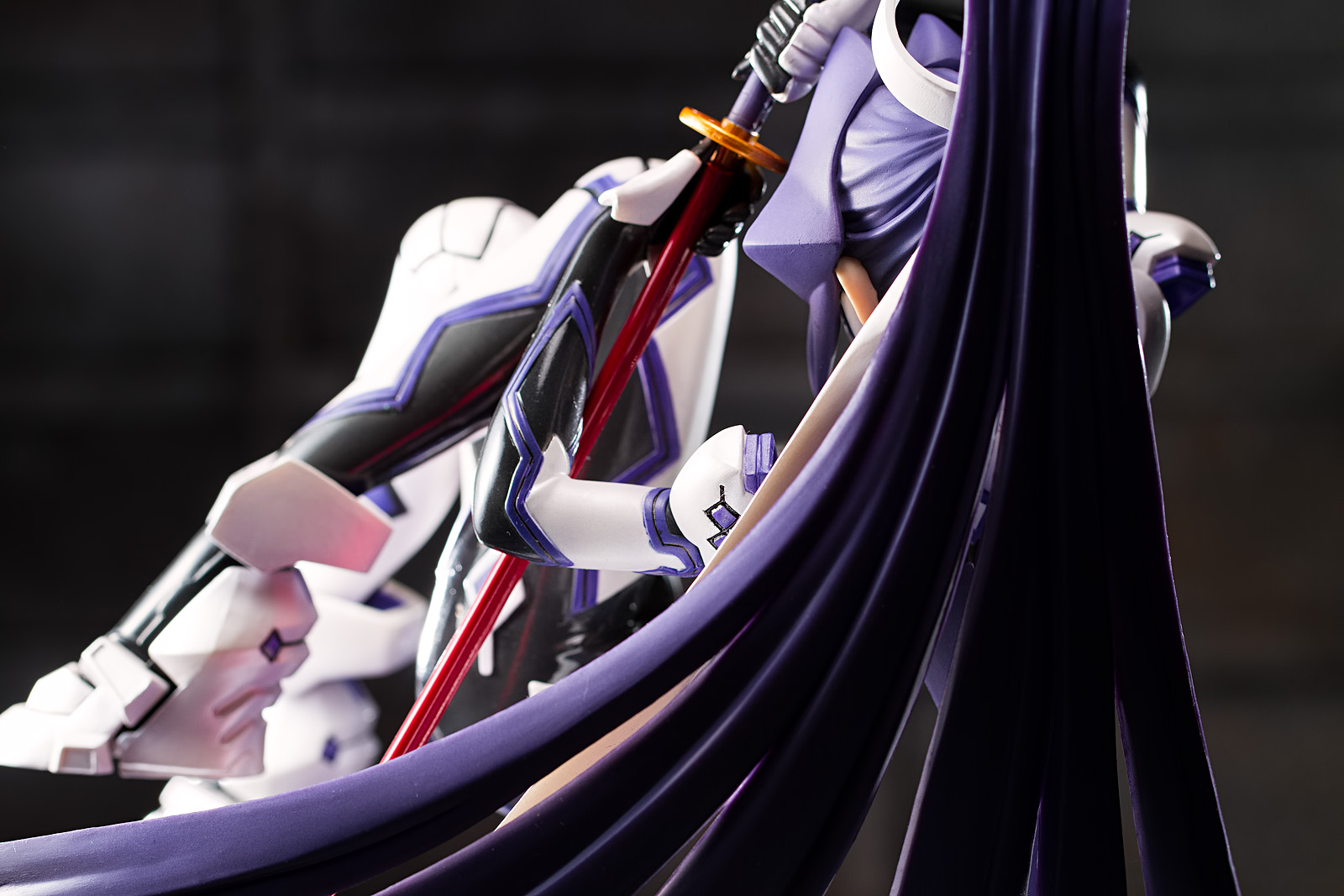
She also comes with this sword. It’s a nice-looking sword, though it probably looks like every other Japanese sword you’ve ever seen. The gold hilt and red scabbard give a couple of splashes of eye-catching color, but it’s hard to see them from a typical viewing angle. Indeed, there’s really only one viewing angle that works for her.
But if you were to look at her straight on, you might notice that there’s just the faintest suggestion of cameltoe. Maybe wishing for that transparent training suit isn’t so fanciful after all.
I have to admit that this was one of those figures that, if I had a time machine, I might not have ordered, because I thought it looked a little nondescript. However, now that I can see it in person, I’m very happy that I did buy it, because she looks great. I was ambivalent about the floating pose, being that I really prefer figures that are standing up, but it actually works really well, especially with the way the pylon is concealed, I was also apprehensive about her face, which has a very retro, 1990s-style look to it, but I’m surprised by how much I like the way Meiya looks; she really looks like a killer, which I would guess is not that accurate to her true personality, but it gives her a lot of attitude regardless. Kotobukiya’s pilot suit Muv-Luv Alternative figures have been fantastic, and Meiya is no exception. I hope Sumika continues the trend.
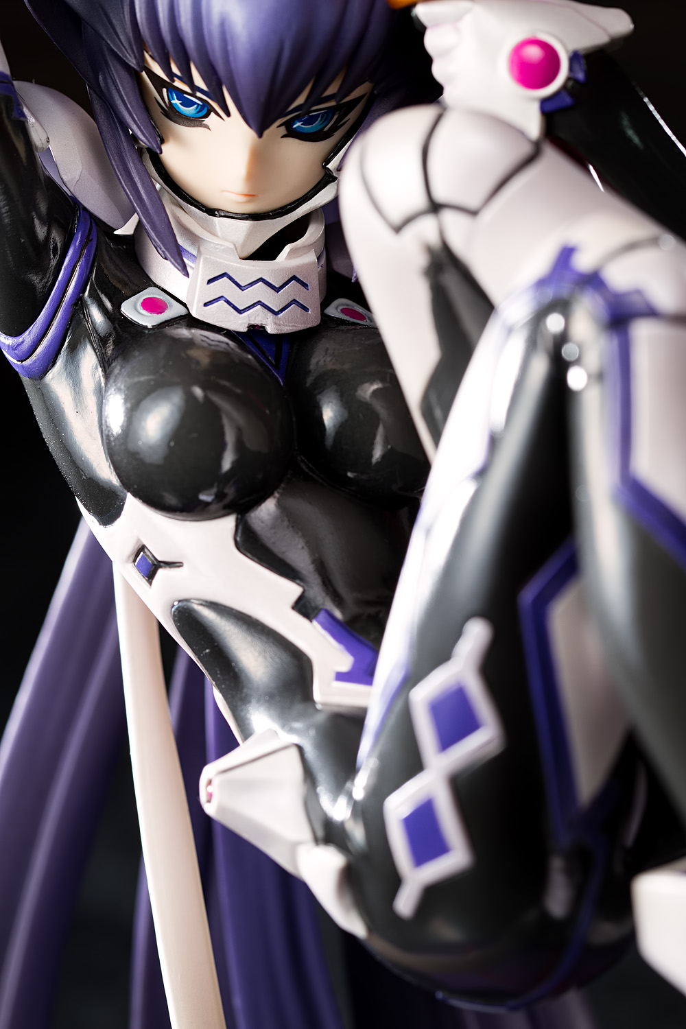
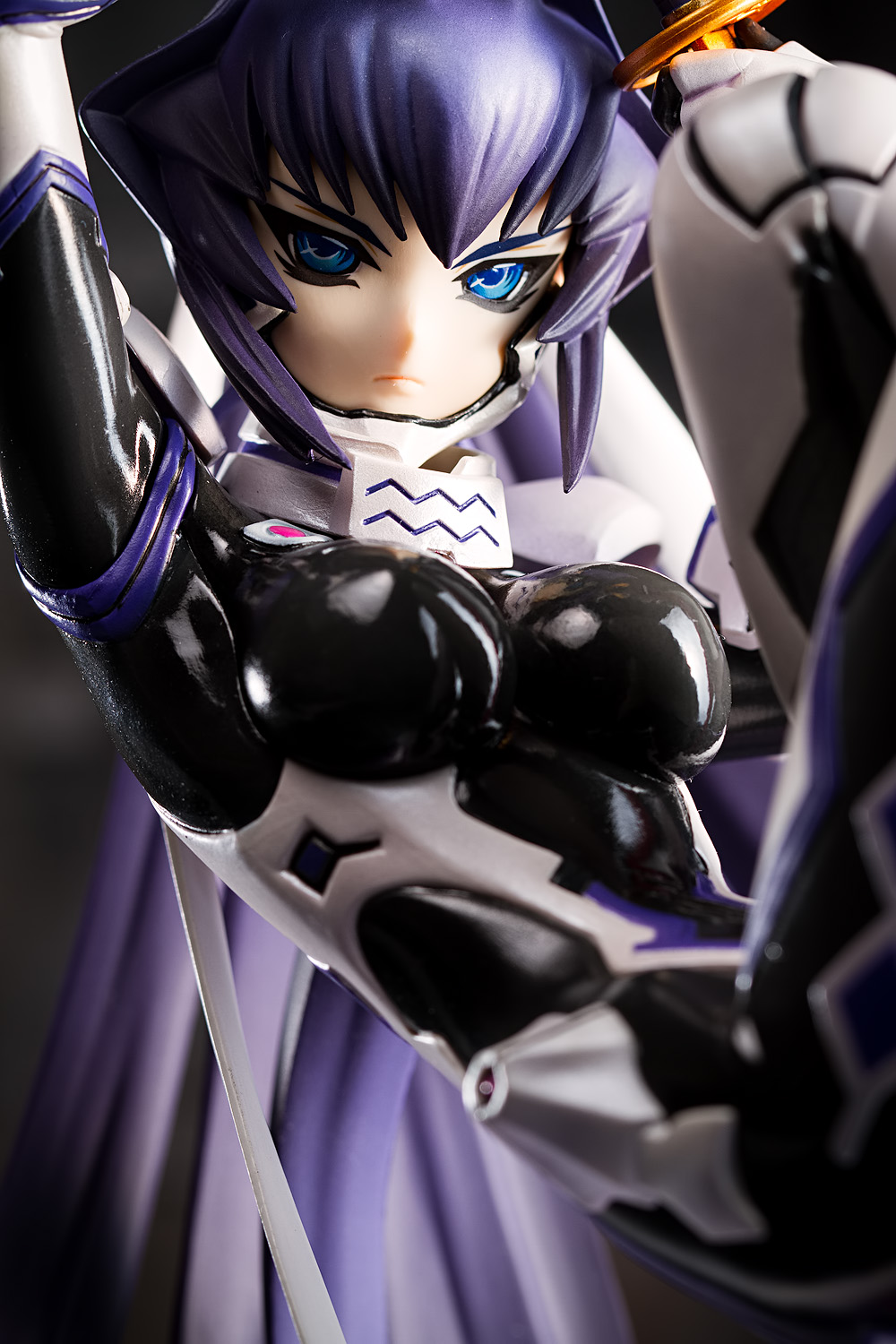


She is quite pretty, however I really can’t get over how shiny her boobs are. I see the entire suit is glossy, but her boobs pick up a lot of light to reflect from just about any angle (being rounded, that is expected). I just find it really distracting, is all. Every shot with visible boobs, I am drawn to them by the shiny.
The pose is actually neat, I like alternative poses instead of generic standing ones, so this is a nice change of pace. And Koto seem to have done a good job hiding the pylon. You wouldn’t know it was there without being told, or with very close scrutiny, I think.
As per usual, a great shoot. I like the backdrop, you’ve used it in other shoots and I have mentioned it there too. Grungy industrial warehouse kinda deal works for figures like this particularly. Not sure about the glossy concrete, though. It does look good itself, but the gloss doesn’t suit the worn looking backdrop, I feel. A grungy warehouse wouldn’t have such a sparkly floor!
They are! They definitely are a part of her that I wanted to emphasize.
I like the pose more than I thought I would, though I still think it’s a little strange that of the Muv-Luv figures Kotobukiya has done – I can think of nine off the top of my head – only pilot suit Yui is standing up.
Yeah, I’m happy with the backdrop; there’s a couple more figures that I think I’m going to use it for. I like the shiny floor for this figure, since I was going for sort of a generic futuristic look. I would like to come up with a more weathered-looking floor, though, particularly for the urban sets that I use; the foamboard and particle board slabs that I use don’t lend themselves well to that, but I wonder if I can distress them in some way to give them some texture.
I like girls with pride and Meiya seems fulll of it, I wish that I could see her chin without these china beard armor, at first these eyes are kinda scary, but on second look she has a really pretty face, the lower lip brings her to live.
The colorcombo of white and charocal looks great on her. She has toned down curves especially in comparison with Cryska and her huge rack, It’s a smart idea to let ip appear as if the figure is floating over her base while the pillar is hidden among to group of strands.
That ribbon is quite eccentric, Meiya must be an interesting person.
From what I can tell, she seems to be roughly analogous to Yui, though I have the feeling her relationship with Muv-Luv Alternative’s main male character might not be as adversarial as that between Yui and Yuuya.
Although I like the transparent suit best, I like the black, blue, and white color combination; it’s kind of muted and allows the shininess (and tightness) of her outfit to be more prominent. Some of the other Muv-Luv characters (such as the US Marine Corps characters) wear more garishly-colored uniforms that I don’t like quite as much.
Yui vs Yuuya was always fun at the beginning, so much tension XD
maybe I’ll take a look in the game to learn more about Meiya.
On first impression she has the aura of a proud warrior girl.
proud girls are hard to fiind in anime culture. it’s often mixed with tsundere and that’s something I don’t like that much, then the whole pride goes down the river for a dense guy XD. The kind of proud characters I like are Kurugaya-san from Little Busters, Kan’u or Kaya from Bakuman.
Yeah, I am not at all a fan of the tsundere thing either, but it seems to be here to stay, like incest and NTR. It’s telling that the only anime I’m watching right now – the one about pro wrestling – lacks any kind of male protagonist at all.
I find it very interesting how good she looks in your photos, as I had little to no interest upon seeing her promo shots. Ironically it was the fact that she looked too abstract which I would now say is her strongest feature.
In other news, I came across an ebay add for Daiki’s Imari which used a shot of President Obama feeling her up. Very curious…
Most curious. Well, not actually, I’ve seen that before myself; it is very easy to take things from websites on the internet.
I do try to make figures look as good as I can, most of the time. I know I’ve had a few times where I didn’t think too highly of a figure, but I was pleased with the way the photos turned out and that elevated my opinion of the figure.
great figure. I like her face and the glossy tight bodysuit, but I did not order one only because I don’t quite like her pose. I generally prefer standing/running pose because it usually displays the S-shaped body curve better.
Kotobukiya has done great job to improve the quality of their figures recently.
Yeah, I prefer standing as well; aside from being able to see more of the figure’s body, they also take up less space, which is becoming a very important concern for me. Kotobukiya’s definitely done a nice job with a lot of their figures, particularly their larger ones; that’s a welcome trend since Alter and GSC haven’t put out a ton of stuff that I’ve been interested in this year.
Ahh… Meiya… One of my favorite Muv Luv characters… I guess I’ve always liked her because I like girls with long hair. Perhaps that’s part of the reason why I like Yui as well? I suppose for Meiya there’s also a touch of neko-mimi there as well; (something I also like,) considering how her hair is shaped.
Since I was asking you about picking up the Sumika figure; I may have to look into picking up this Meiya figure.
It could be! I don’t really know what Meiya’s personality is like, but her character bio seems similar to Yui’s, and I’ve always liked those stoic, duty-minded military girls in anime. I’m guessing Meiya is kind of like that.
Turns out I DID order her. (Preview Magazine.)
Glory-be! One more girls to add to the Muv Luv collection!
Considering your earlier comments about the base; have you had any trouble with it? I have a few figures where the weight of the figure itself has deformed the stand over time, causing the figure to topple over.
And as a final ^_^ bit; the picture in the link showing Meiya in her training suit with Takeru reminds me of Dita from Vandread… where she was sitting in Hibiki’s lap and was cluelessly bouncing her tushy up and down on his… …lap…
Hoorays! Hmm, nope, I don’t believe I have had any issues, even though I’ve moved her around a lot (I have her on my desk right now and whenever I photograph a figure, I move everything off my desk).
Ah, Vandread; I never did see that show, actually, but I remember that it came out right around the same time I got back into anime, after having not paid much attention to it through the mid and late 1990s. That does sound like a fun scene, though, and I can picture what it looks like in my mind XD That also reminds me of shows like Angelic Layer, Noir, and Read or Die; I haven’t seen those in a while. Maybe it’s time to figure out where I put those DVDs.
G’day, Tier. This is the first time I try to leave a reply, but believe me, I’ve been paying attention to your photographs for a long time…maybe have a few years. To be honest, I really really like your works, I also have been trying to learn your skills, but it is too difficult for me…ToT…Recently, I just took some photos of the same figure; after about a week and then I saw your photos. I know the gap between us is huge, but I can’t describe the problems. I am sorry to bother you but if possible, please ~please give me some guidance on photography. There is a blog link on my name, by the way cause I am a Chinese Australian, so my blog is in Chinese, but no worries, I just want to know the problems of my photos…Thanks a lot!!
Hi, thanks for writing. And thanks very much for the kind words. Looking at your pictures, it looks like you are going for a product photography sort of style, the way that the foo-bar-baz guy and the Cutanews guy shoot. I think it looks pretty good if that’s the sort of style that you’re going for, but it sounds like you’re aiming for something different. The way I like to photograph my figures is with very directional lighting, typically placed nearly perpendicular to the figure; looking at your pictures, it looks like you’re using two (or maybe just one) very large, fluorescent light sources, judging by the reflections in Meiya’s suit. A big light makes for very soft light, but it can also look flat and low-contrast.
I wrote a post about lighting direction a little while ago and that might be helpful, if you want a more contrasty look with deeper shadows.
I also do contrast enhancement in post-processing, usually in Lightroom; my pictures tend to look a little flat right out of camera (which is how they’re supposed to be, since I shoot in RAW format), but a little boost in contrast can really enhance the way a picture looks.
I hope this helps; please feel free to drop another comment, I love talking about photography. Except for when someone asks me what camera I use, I mean.
Merry Christmas! Tier, I’m very sorry for the late reply, cause I was busy with stuff…anyway, I’m free now!
Yes, I am using two large fluorescent light sources, cool! You can tell quite a lot just from “the reflections in Meiya’s suit”. The way you like to photograph your figures is with directional lighting, so the differences between ‘A big, soft, flat but low-contrast lighting’ and ‘a very directional lighting’ will be the key issue, I really like the texture of your directional lighting, cause the effect of a high contrast lighting also have a three-dimensional effect on figures(In my view, especially for those hard, dark or cool characters).
I’ve seen your posts many times, of course they are great and helpful, so recently I think I need a new flash.
I will do contrast enhancement in post-processing too, but Lightroom or Photoshop are all too difficult for me ToT, some simple software (e.g ViewNX) is more suitable for me.
By the way, I’ve read your latest post, The visual impact is sooooooooooo enormous and Kuroyukihime is so ‘useful’!
Happy Christmas to you too! It’s all good, everyone is busy this time of year, I think. Yeah, it helps that Meiya’s suit is so reflective … it’s a big pain for the photographer (I hate photographing glossy surfaces), but it’s useful for anyone else who’s examining how the picture is constructed.
Yeah, I almost always light from the side (usually the figure’s right side), since it produces dramatic shadows on the opposite side of the figure. I don’t know if many people have noticed, but even though I have a variety of backdrops and settings, I generally use the same lighting setup in all my posts. I put the main light off to the side with a rim light on the opposite side, behind the figure and hitting it at about a 60 degree angle. Sometimes I’ll add in a hair light, and very occasionally I’ll use a fill card.
I don’t really write too much about post-processing, mainly because it’s hard to convey in words (if I say that I set the Highlights slider to +10, it’s really hard to visualize what that does). However, I really, strongly, firmly believe in the importance of post-processing. It drives me nuts when I hear people say that post-processing is cheating, because that’s a ludicrous claim to make and the people who say that are absolute idiots (and are usually complete noobs, too). Unfortunately, the anonymity of the internet makes everyone an empowered expert. In their own minds, at least. Anyway, here’s a quick visual example of how 45 seconds in Lightroom can help out a picture:
This is the picture out of the camera and imported into Lightroom. I’ve used my camera long enough that I’m reasonably familiar with its quirks and my own shooting style; I typically underexpose by a third of a stop (I judge exposure by looking at the LCD and I think I have the LCD set too bright). Further, the camera’s flash white balance setting usually produces a much more greenish look than I like. Cleaning it up produces the image up at the top of the post:
Generally what I like to do is add a magenta tint (which I think really helps make the skin tone more lifelike), correct exposure, add contrast, drop the highlights a bit (so that the skin doesn’t look too blown out), add a vignette, dodge the eyes (which also makes them more lifelike), and sharpen. I’ve set up a Photoshop action which does a lot of stuff for me; generally, by far the most time-consuming part of my post-processing process is cloning out dust specks, tiny scratches and other undesirable stuff.
+1 to Tier’s lighting guide suggestion. I cannot emphasize enough how much pure informational gold is contained within.
Your photography is quite nice and I can’t help but liken it to FooBarBaz’s work as Tier similarly concluded. FBB was an early figure photography influence for me so my humble opinion is that, combined with the various lighting approaches detailed by the lighting guide plus perhaps some richer backdrops, you could very well be a figure photography powerhouse.
Please post regularly so that we might eavesdrop more regularly on your latest photo experiments!
Kinda like the blue suits, I was kinda bored by this color scheme until, of course, I saw your portrayal after which I’m pretty much sold [again]. Perhaps it’s a bit garish but I still do very much love the bright pink and blue suits the best; [usually] riding the cusp between tasteful and extremely form-fitting. Perhaps it’s because my only initial exposure to the franchise was a wallpaper of Sumika Kagami presumably reclining in a ship’s portal, oblivious to the vast, expansive spacescape behind her, tears streaming down her face, clearly mourning some turn of events.
The decidedly cheerier GoodSmile rendition of her was one of my fist figures and I’ve since, almost subconsciously, collected the majority of the other Muv-Luv girls. It was kind of a surprise to see this one crop up here as it somehow had missed my radar entirely. Again, maybe it’s simply because it didn’t match my expectations but I definitely like her, particularly her rather non-standard pose.
As I’m sure you’ve likewise concluded after reaching a certain point in your collecting career, it’s a bit of a relief to get a reclining or otherwise not standing figure that can better accommodate a tiered (bad pun possibly intended) approach when putting them out for display on shelves.
Anyway, I owe you another fat sarcastic “thanks” for making me spend yet more money. ;D Cheers!
Yeah, this isn’t my favorite color scheme when it comes to the Muv-Luv characters; I like the transparent training suit best, and maybe Sumika’s or Yui’s suit after that one. I can’t rag on this suit, though; I do have a big thing for the classic black catsuit.
I have the Good Smile ones and while I like them, I’m really happy that Kotobukiya is doing the characters too, since the GSC ones are really, really small and Meiya and Kasumi are kinda plain-looking. (Speaking of figure size, I almost always prefer larger figures but I kinda wish that Kotobukiya’s bunny-eared Kasumi were 1/7 scale instead of 1/6 scale, just so she’d fit in with her peers … but then, I guess she’s wearing panties and a rubber band over her breasts rather than a piloting suit, so I guess she already stands out).
You are welcome! I always aim to be helpful.