Having looked at the physical properties of light and at some of the tools commonly used to shape and control light, we’ll now put everything together in some simple, easily-performed shoots. The objective here is to demonstrate how you can take nice pictures of figures using some fairly basic setups. To that end, the lighting equipment for all of these shoots is composed of two ordinary desk lamps and a simple homemade softbox. Obviously this post and the preceding posts don’t cover every aspect of anime figure photography – we haven’t talked much about composition or post-processing – but I hope that these posts have given aspiring figure photographers some ideas and insight on how to creatively control light.
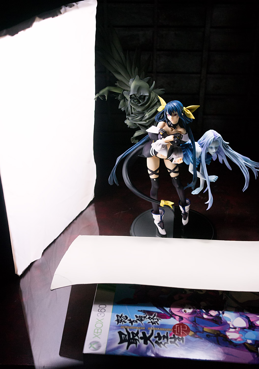
Solange
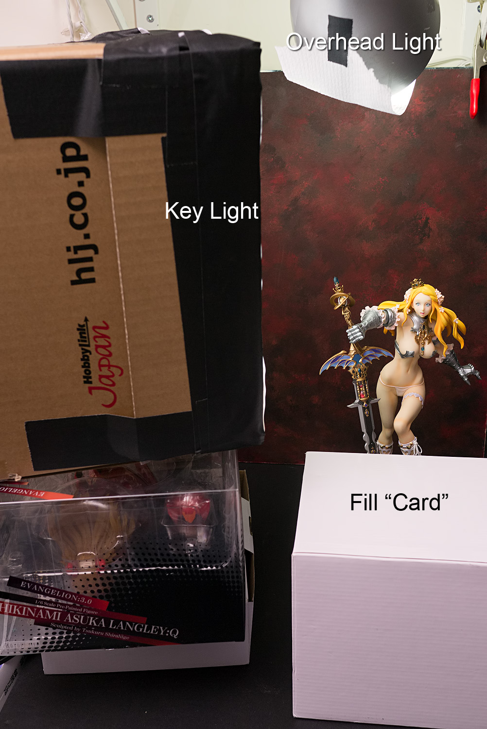
We’ll start with a very basic setup. The key light – the Hobbylink Japan box – is off to camera left, lighting up the figure’s right side. We also have an overhead light, which is the silver-colored lamp at the very top of the setup photo. I taped some tissue over it, since I want to knock its brightness down so that it’s not much brighter than the key light. I want the key light to be aimed at Solange’s face, and Solange is a pretty tall figure, so I’ve stacked the softbox on top of a couple of other objects. I’m also going to add a little bit of fill light by placing a white box in front of Solange; I’m only going to be shooting Solange from the thighs up, so this box won’t be visible in the photo.
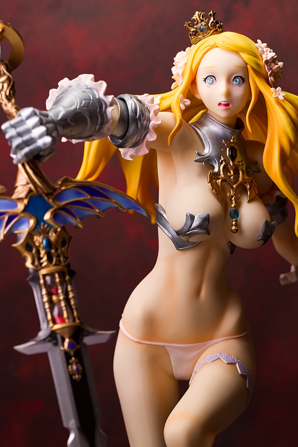
After a couple of adjustments in Lightroom (chiefly to correct color balance – fluorescent lights tend to be green in color, even if they are “daylight” balanced), we get this picture; the subject is illuminated nicely, there’s a good sense of direction as to where the light is coming from, and the quality of light displays a pleasing look. I think it’s a good starting photograph; it’s not extraordinarily (or even slightly) impressive, but the lessons we used here are easily applicable to more complex setups. Indeed, this is one of the very basic looks I often use.
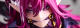
When I photograph a figure, I usually try to come up with a few words that describe it, particularly with respect to the emotions it conveys or the themes it embodies. With Solange, the obvious word would be “afraid,” being that fear and shock are evident in her expression. Another word might be “adventure,” as Solange is frozen in mid-stride, carrying a big sword and dressed in an exotic manner. Solange is obviously not a typical princess, and when I think of an atypical princess, I often think of a princess trying to escape from her castle, and these concepts are why I thought that an outdoor-type set would suit her well. (We’ll disregard that she seems more appropriately dressed for a wild night in bed than a nature hike.) That’s how I photographed her for her review post. Let’s explore this idea of theme a little more.
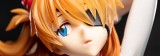
Sora Kasugano
Here we have Sora Kasugano, whom I photographed years ago. I had much worse equipment back then and no real understanding of how to light a figure, but among all the figures I’ve photographed, this is still one of my favorite shoots. It helps that Sora is a really easy figure to shoot; she has a very simple pose and a very simple color scheme, but I’ve found that both of these things open up a lot of possibilities.
The first word that comes to my mind when I look at Sora is “mysterious.” This was true even back when I first saw Sora, before the Yosuga no Sora anime aired and before I knew anything about her personality. To me, she seems to be hiding something, and her angelic appearance seems to be feigned. (Then I saw the anime. Before it aired, I already knew a little bit about what the game was about, having seen some of the images, but man, I really did not know what a nasty, randy girl Sora is.)
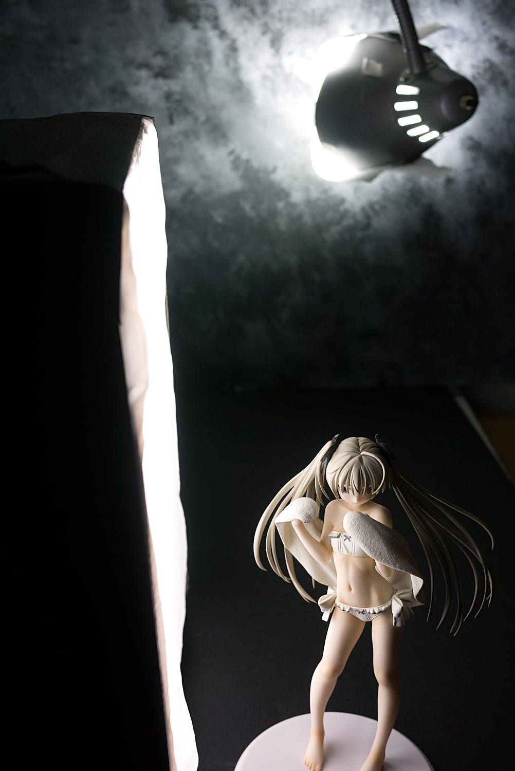
Sora means “sky” in Japanese, and when I look at her, I tend to think not of a cheery blue sky but either a cold, gray day or a warm, beckoning sunrise. I went with the latter approach when I photographed her for her post, but since I honestly can’t remember how I made those pictures, I’ll go with the gray theme here.
Again, the key light is set to camera left, lighting up her right side. Instead of an overhead light, I’m using the second lamp to light up the background. This time, I’ve placed this light very close to the backdrop; what I want is to have a very bright area at the top of the photo that rapidly transitions to darkness towards the bottom of the frame. I’ve placed the key light very close to the figure because I want the light to fall off rapidly, such that the far side of her body is shadowed. In particular, I like the contrasting duality manifested in Sora’s hair, with one twintail lit up white and the other darkened by shadow.
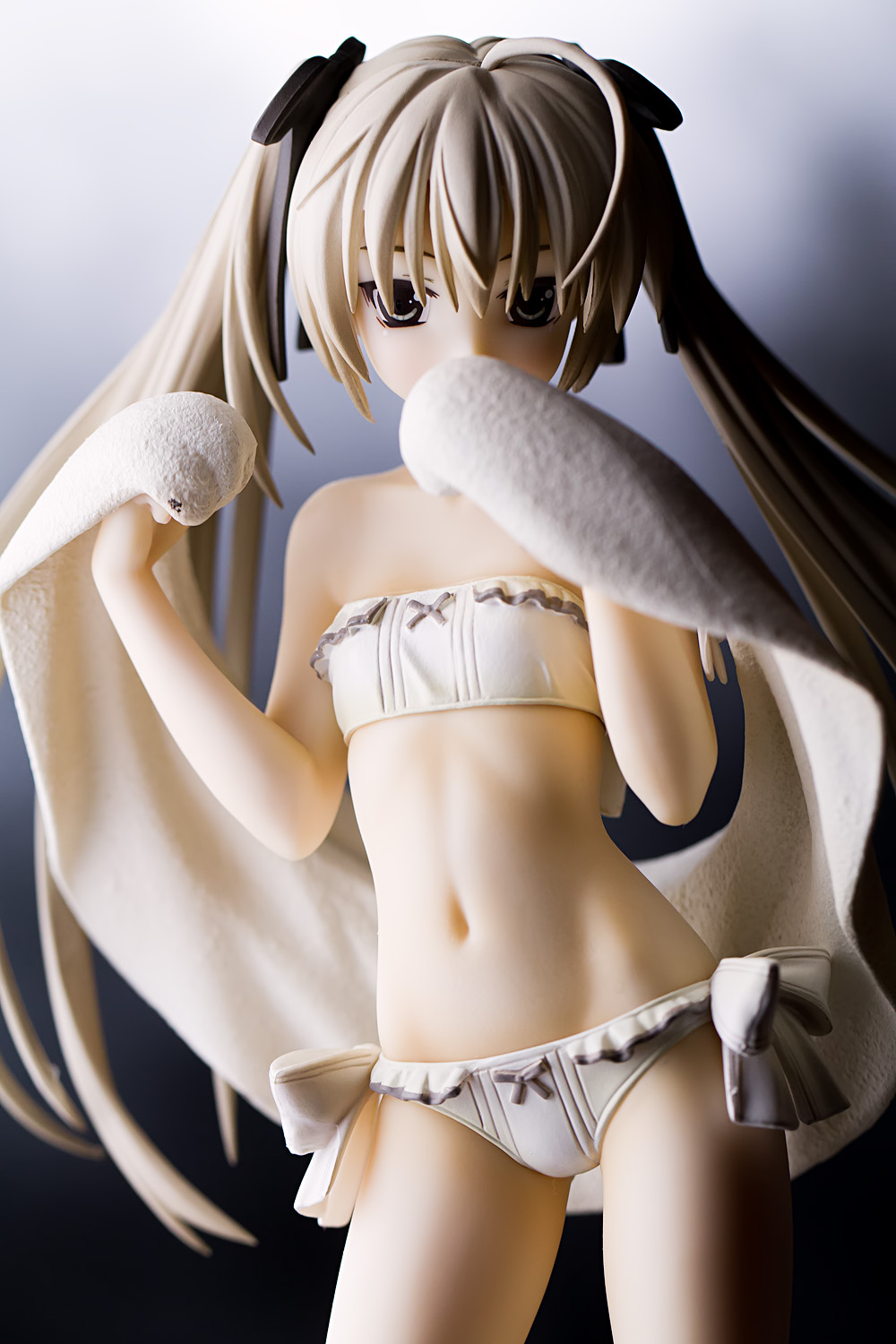
And here is the result. I’d spend a little time brightening up the upper part of the image so that her head is a little brighter, but for the purpose of this post, I’ve not done too much in post-processing aside from bumping up the exposure (I dislike using a tripod so this picture was badly underexposed) and cleaning up the color balance. The combination of the long focal length and relatively wide aperture setting renders the background a blur, giving us a gradient from light to dark, and that seems to suit Sora’s piercing gaze and hidden feelings. Note that her towel has confounded my plan to have the left side of her body remain shadowed; it’s serving as a fill source, which is why her torso is fairly bright while her left leg shows dark shadows.
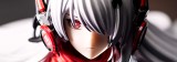
Rei Ayanami
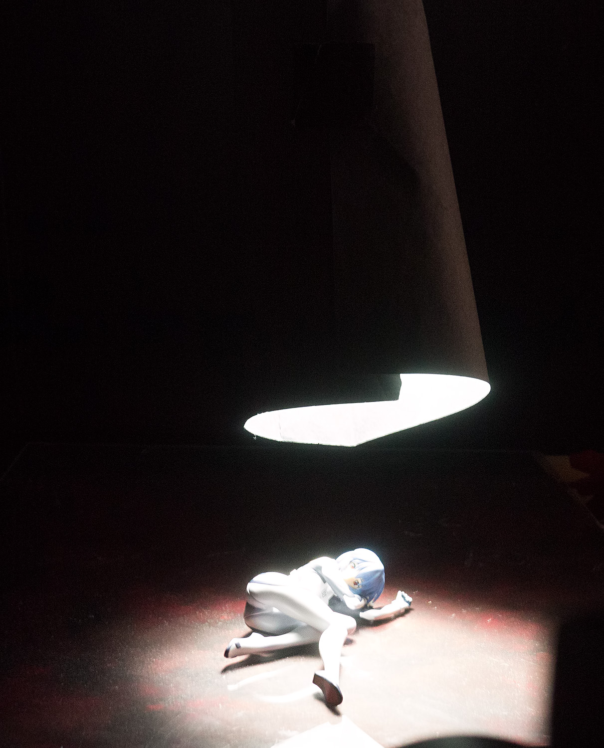
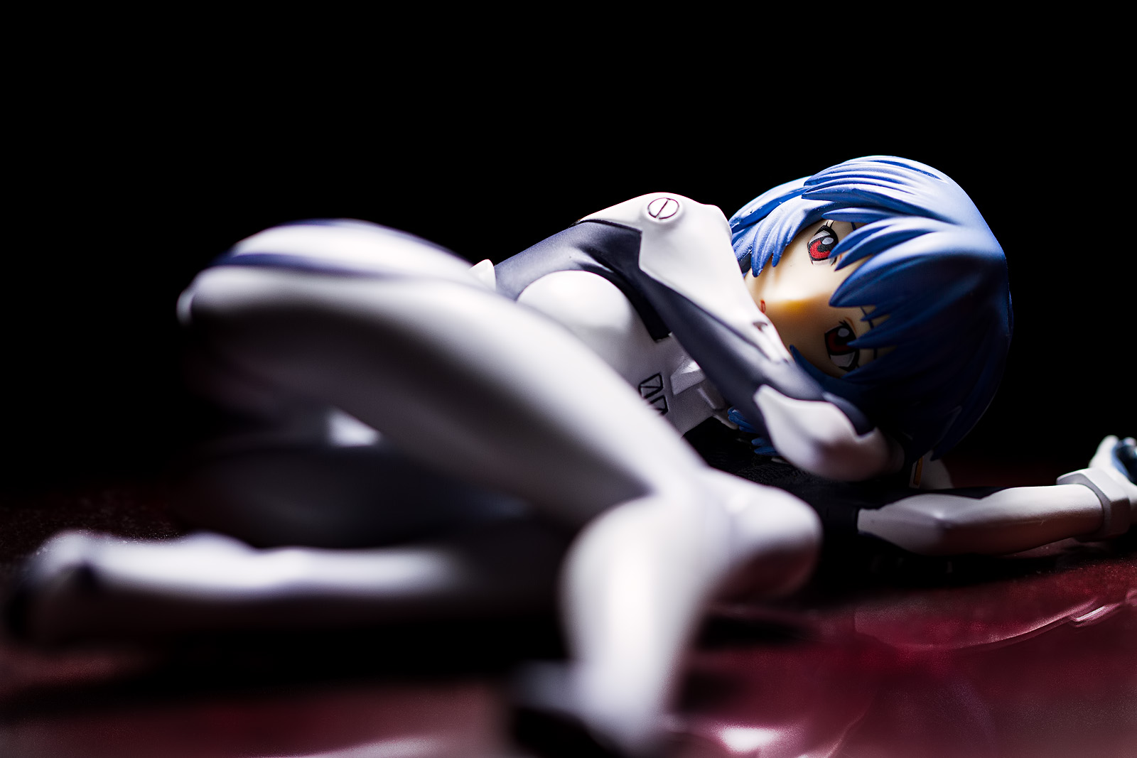
Let’s look at something a little different. We have Rei Ayanami here, whose post went up back when this site received no comments. Obviously, Rei presents a problem in that she’s lying down. How do we light her? Well, if you want to use a split light approach with a figure that is standing up, you shine the light horizontally; being that Rei herself is lying horizontally, maybe the right approach is to set up the light vertically, using an overhead light.
The above image shows the basic setup, enormously overexposed so that it’s a little easier to see what’s going on. Not that there’s much to see; it’s just one light with a long snoot taped to it.
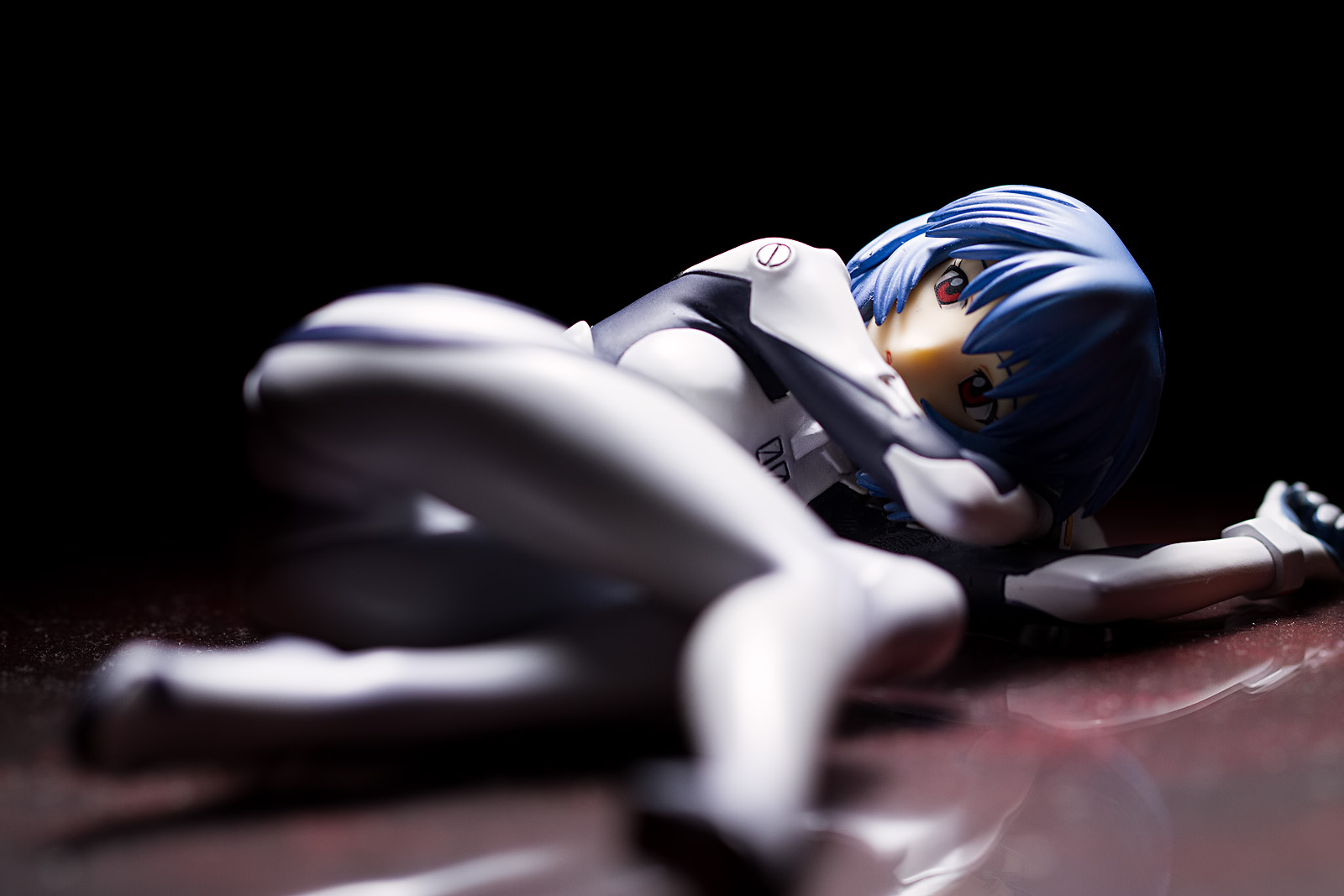
I don’t think that looks too bad. Rei can handle hard light, particularly when she’s dressed in her plugsuit, and that hard light gives us a dramatic look that focuses attention on her right eye. What bothers me is that the floor is washed out by the glare coming from that overhead light; the red color is muted and the reflection is hard to discern. But I like the rest of it. Let’s see if we can get the floor to stand out a little more.
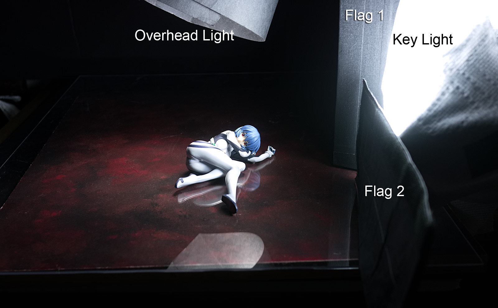
This time, we’ll position the key light to camera right. I want to constrain the light so that Rei is lit up but the surrounding area remains dark; this will enhance the sense of isolation and aloofness that Rei typically conveys. Instead of using a softbox, I’ve just taped a paper towel to the front of the light; this will still give us a soft light (though not nearly as soft as it would be with the softbox) while being easier to place very close to Rei.
I’m using two flags with the key light; one flag is placed in a typical position, between the light and the background, preventing significant light spill from falling onto the backdrop (note the sharp dividing line between the lit and dark sections of the floor). The second flag is placed in a somewhat unusual position; it’s actually right in front of the light, blocking the bottom part of the lamp. This will keep that light from lighting up the floor; instead, the light skims right over the top of Rei, lighting her up but keeping the floor fairly dark.
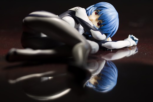
Here we get a really strong reflection, courtesy of the darkened floor (and a sheet of transparent acrylic). Rei’s face is nicely lit, but there are still strong shadows that reveal her feminine form while preserving that sense of mystery and loneliness that so suits Rei.
But is this a better photograph than the first one? Honestly, I don’t think it is. The composition is worse, particularly since the strongest element – the eye contact between Rei and the viewer – is lost. Also, I really do like the split light look, particularly with Rei; it’s the sort of look that works really well with her, given the sense of outward vulnerability she often expresses. Frankly, if I were going to use this sort of photograph for anything, I’d probably just use the first picture and clean up the floor in Lightroom.
Dizzy
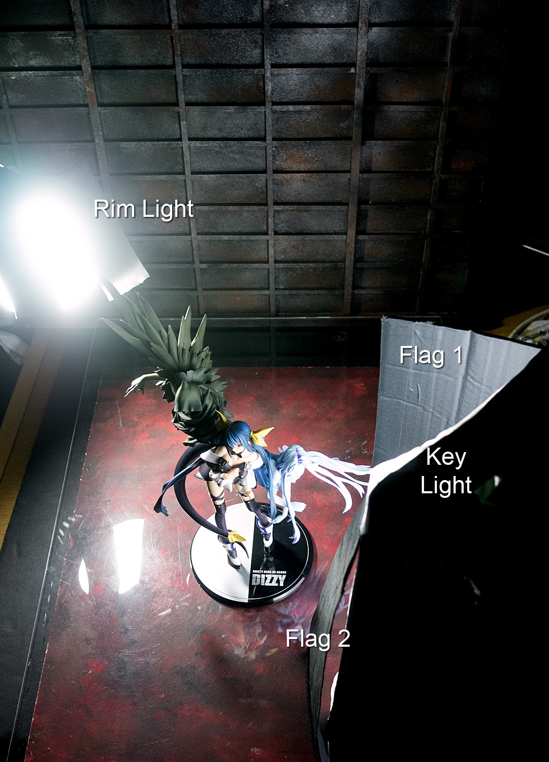
With Dizzy, I can’t really think of any words that would govern the way I photograph her. She is, however, one of my favorite characters and one of my favorite figures, so the imperative here is simply to make her look good. To this end, I’m going to set up a lighting scheme that includes a key light and a rim light. I want the background to be dark but not completely dark, so I’ve flagged the key light but not the rim light. I felt that the light from the key light was wrapping around Rei a little too strongly, so I placed a second flag to block a little bit of the key light, so that the shadows on the far side of Dizzy’s body would be just a little bit darker.
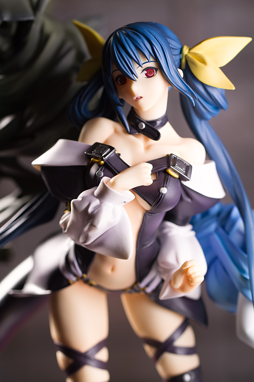
And here’s the shot; very simple and straightforward but still appealing, I think. I’ve gone with a broad light configuration since I think it works better with the way Dizzy’s body is posed. Aside from color balance correction, this is pretty much straight out of the camera (some people value that; I am not one of them).
Conclusion
This concludes the figure photography lighting guide. Lighting sometimes seems like a very cryptic, intricate process, but I hope that these posts have shown that it’s really not that hard. I also hope that these posts have provided some useful tips, and that they provide some useful knowledge and perhaps some inspiration for your own shoots.


Certainly useful. I have garnered a good bit of info from these guides. Now you need to do more in other aspects, like composition. It’s what I struggle with after lighting. Which I guess makes up all of photography, composing a shot and lighting it. But yeah. I readily accept I am crap.
I must say, though, I’m not too keen on that Solange shot. The highlights look a bit blown or something. Just too bright. Yet Dizzy, who looks very similarly lit, looks okay despite the brightness. Maybe it’s just the blonde hair on Solange. The rest are great, however. Hopefully I’ll be able to put some of this info in to practice.
Yeah, I think you’re right, I bumped up the exposure by about a third of a stop in post (as I usually wind up doing) but I think that was too much. It doesn’t help that Solange’s eyebrows are almost invisible, so that makes her forehead look even more shiny. I’ll revert the exposure boost since it’s not as strong a teaching point as it should be.
I’ve got a few other ideas for guide posts, but I’ll see if these posts are helpful to anyone first. I have to admit I was running out of steam by the sixth post.
comments…
Thanks for all the tips here and the invested time to write these things also the previous post, your quite talented with setting up the light. I like that you are so serious about figure photography, also from a technical aspect.
I still haven’t managed to work with overhead light, I have no idea where to place it, I guess it’s a question of equipment, I have clamp lamps but with quite limp necks, I can hardly use them overhead. What also never worked were fill cards, setting them in the right place feels kinda tricky. I’ll work on that ^^.
Im not sure if you should give away infos about composition, it might end up in everybody copying your style 😀 And actually I wanna see a new review next 😀
The same here. I appreciate it that you’re so kindly sharing your knowledge about figure photography lighting, but I’d also like to see a proper figure review for a change.
Considering that out of the ten last reviews there was only one NSFW, and seven SFW in a row, I daresay it’s time for some girlie parts again. How about Irma? She’s been out for quite a while and I assume you already have her. If I recall correctly, Irma is your most favourite character from Queen’s Blade, so what other motivation do you need? 😉
Ha! I have 250 reviews listed in the figure review archive and yet the people demand more. And at the expense of education! And moreover, they somehow think that I am a purveyor of naughty bits. Where in the world did I acquire this reputation?
Your request may be granted soon. Never let it be said that I don’t listen to the people. (Well, actually, go ahead and let it be said since this whole site is about what makes me happy. But indeed we will be getting back to figure reviews very, very soon. But not Irma, since she’s still in her box and I haven’t yet constructed her set … rather frustrating that is, since I can picture what I want, I just need to get around to building it. It’s well past time for another preorder post, too.)
It is all good, imitating someone you admire is a fantastic way to learn. Not that I think I’m worthy of admiration or anything but if anyone were to shoot in a style similar to mine, I’d find it to be an honor. And not to make it sound like I have a huge ego (though I really do), but it also wouldn’t bother me because I think I can still do it better, and if someone were to make better pictures than me, then I’d have to give them props.
I do take figure photography very seriously, maybe more seriously than a lot of people do. I’ve heard a lot of people say they want to take nice pictures but they really don’t care to invest too much time, brainpower, or money on the hobby, and so they go shoot pictures in whatever manner is most convenient to them. I very much respect that perspective, since this is indeed just a hobby for almost everyone, and I certainly don’t demand that people treat it with great gravity. (Bringing back that cooking analogy; I enjoy cooking, and like most people, I enjoy eating tasty food, but I am not at all a foodie. I know a lot of people treat food with great seriousness and place high value on acquiring superior ingredients but me, I’m happy making burritos from a package of tortillas and a pound of ground chuck.) I’m hoping that these posts will help those people who do want to take a larger step towards getting better pictures, and I hope that it helps even the more casual photographers into thinking a little more about what they want to do with light.
Likewise with the other kudo givers, this series has been great and it’s neat to see it all come together in this article. No worries on running low on steam; I honestly can’t think of a more concentrated yet concisely stated guide that I’ve come across thus far [on any topic]. I’m keenly aware of the slippery slope you deftly tread with many of these topics; I don’t know how you could have included much more without getting caught up in lengthy detours into theory yet you also managed to give form to that which I’ve always found rather ephemeral and hard to cast to words: creative composition.
As any photographer advances, some explorations of the deeper elements of theory are inevitable but you wisely chose to cull the bulk of that largely, I believe, because your own explorations [if they were anything like mine] primarily driven to produce an effect; only through trial and error and adapting a core intuition in attempting to achieve various creative outcomes is there born a desire to learn the theory that could improve one’s advantage in bringing a given creative vision to light. Perhaps I’m projecting a bit here but it’s the vibe i get.
Heh, but perhaps I’m projecting. Nonetheless, this was a great series of articles. It may take some time for people new to photography to assimilate all of this great information but you may very well have accelerated their abilities years into the future. I’d have killed to have a guide like this years ago!
Regarding your last response (in Part 6 [IIRC the reply indents stop after a certain depth in this blogging software which triggers compulsive dysfunctions in all reasonable people ;D]), I remember reading about cross-processing back in the days when film was dominant and dreamed of having a dark room where I could play with all of the creative permutations such stuff could offer…at least up to the point where reality set in and dealing with chemicals that age and require proper ventilation and disposal put me off of the idea really quickly but, being a kid with no income, turned out to be a convenient reality.
I too admittedly like the look when it’s done right but, as with all extremities, like this and the prior effects we seem to agree are too trendy and overdone, I’ve mellowed slightly over time. For effects that are trendy and currently way overdone, I avoid them almost entirely. Other of the more potent effects that have had their day in the sun, I like to think of as spices; a spice is used selectively and is best used to subtly alter the flavor of something. I’m rather hesitant to completely write off any creative avenue so, in keeping with the analogy, I push popular spices to the back of the shelf while [very] occasionally employing a tasteful dash of one of the remaining spices. I think I’ve done the selective coloring thing exactly once and [what could arguably be called] a Dutch angle once to, I think, tasteful effect.
I guess with all things I still enjoy, and prefer to produce, output that remains heavily rooted in reality. Clearly there are two different HDR camps and, likewise, I’m with you on blue-screened images (or figures shot in front of a TV or monitor). Not that they can’t be interesting (most are crap) but even for successful compositions, it’s hard not to consider them a hollow victory. Perhaps it’s because I got into figure photography largely because I’m a technical guy who wants to foster a creative ember (and still struggles with reigning in my technical zeal so that my creative side [presuming I have one] might flourish) but I can’t help but wonder “Where’s the creativity in doing this?”.
I banged out a quick monochromatic backdrop over the long weekend. (My thinking with not committing to a color scheme meant that I could gel up a flash to color it however I want.) I kinda blended the techniques I saw on YouTube plus the one you recommended (which I think I interpreted too literally but eventually recovered from). I even added a few layers I made up on the fly like using a sponge to paint with and all different varieties of blending. I think it came out ok for a first run but I’m anxious to try another. Your post was kinda forehead-smack-inspiring it that, for whatever reason, it never occurred to me to paint on anything other than canvas; painting on foamboard is profoundly more cost effective!
FooBarBaz was an early influence for me as well since he largely played to my desire to portray figures crisply and accurately albeit with a homogenous presentation. To his credit he did often use depth of field to good effect and, for a good part of that last year or so, he was mixing things up a little with high and low-key lighting and the occasional contrasty shot.
I’m curious which Bakemonogatari figure you mentioned. Black Hanekawa (not that recent) had a little soft rim lighting but nothing I’d call “nuclear” so I’m curious about checking out the one that caught your eye since I’m surprised it didn’t catch mine (to my memory at least).
Again, thank you again for these great articles. The technical aspects may be largely review for me solely because I’ve bludgeoned my way through to many of the same revelations but it’s been an inspiring read nonetheless; I can’t help but dream up new ideas as you describe in detail your various setups, philosophies and approaches. For anyone at an earlier stage of their photographic exploits, this has got to be nothing short of pure gold.
Anyway, rest up and dream great dreams of future figure shoots. Take care, cheers and stay awesome.
If you asked me four years ago what my philosophy was with respect to photography, my answer would have simply been, “I want to shoot pictures like the HappySoda guy.” I did not yet understand why I liked his pictures, but I knew that there was an enormous gap between what super rats was doing and what I was doing. It’s actually a little funny to think back now; I can’t quite remember ever thinking that there was a moment where I was starting to get it. I do recall that there was a point in the last half of 2010 (starting with Senhime and ending with Asuka) where I did a lot of experimenting and I felt that my photographs improved a lot over what I had been doing before. Maybe it was sometime during that period.
I do think you’re right; my basic approach to shooting any figure is that I just want to make pretty pictures, but a lot of experimentation has gone into that, and I often want those pretty pictures to stand out in some way. That’s why I tend to react poorly when people suggest that I take a swimsuit figure to a beach or a swimming pool or a flower bed or something; I think that sort of idea tends to be mundane, and that’s not really what I’m interested in. I do find that I don’t do nearly as much experimenting as I used to, partly because it takes a lot of time (particularly since there’s a high risk of failure) and partly because I just don’t need to. It is, however, a bit depressing to me because I do look back fondly on some of my old ideas.
I remember back when I started this website, I set the comment reply depth to stop indenting at three replies, since I figured I’d never get any comment chains of that length. In fact, now that I think back, the original theme for this site didn’t even allow for replying to comments; I had to make a brand new comment in which I replied to everyone. It is a little wistful and more than a bit humbling to think back on how many discussions have occurred on this site.
I never did do much with film as a kid; in fact, I remember being so terrified of messing up the film while unloading it that I simply never did. My dad would occasionally loan me an old Canon point-and-shoot (the only reason I bought my first Canon DSLR, to be honest) and I’d shoot just one roll. He would’ve been better off getting me a disposable camera.
That’s very much the way I feel about Photoshopped composites; I don’t think it’s cheating (unless one lies and denies that it’s a composite) and I wouldn’t ever call it cheating, but if I did it, I would feel like I’m cheating. Maybe, anyway; if I felt very strongly about an idea and if I felt that the best way to do it would be as a composite and if I felt that I had the skills to do it well, then I would absolutely do it. I might have my own opinions and viewpoints, but I try not to set too many moral barriers on what I do in photography.
The funny thing is that I didn’t actually know about foo-bar-baz until well after I got into photography, probably because I was only looking at English-language sites. It’s a little odd in that he had mostly a product-shot style and yet, he did it so well that you could easily identify his photos as soon as you saw them (even if you didn’t see the watermark).
The Bakemonogatari figure was this one … I guess it’s really a Nisemonogatari figure? I’ve not seen the series so I must admit that the difference is lost on me (though as I understand it, Bakemonogatari is the first season and Nisemonogatari is the … third, I think?). Big rim lights, some really strong split lights; I don’t think I’ve seen anyone shoot a set of official promo photos for a manufacturer in this style.
Thanks for all the kind words XD
Oh wow, you’re right! That’s completely different lighting than I’ve ever seen used for a figure’s product photos. Indeed the difference isn’t even remotely subtle.
I feel like I should clarify my “cheating” point. Perhaps it’s a harsher term than could be used for my take on the matter but it’s not an outward-directed notion; I’m cool with anyone snapping a photo of whatever gives them happiness. By “cheating” I primarily mean that I’d feel like I had robbed myself out of the challenge and learning experience of pulling off a really difficult shot if I instead plunked my photo on a shoebox in front of a monitor displaying Yellowstone picture. And while I respect anyone’s choice in shooting and composition, I do feel a bit disappointed when an otherwise well-composed and produced photo takes such a shortcut or uses a garish trendy effect and complete sidetracks my potential excitement for it.
I’ve elaborated so much here largely because I’m just stoked to have discovered someone who is in very close philosophical alignment; I’ve never finger-wagged at anyone for their creative choices (except occasionally in jest in conversations like these) and it’s that vast pool of varied styles that will always have me questioning any of my preconceived notions.
Perhaps you find that you don’t experiment as much these days because you’ve refined your style to a point that pushing the envelope is not as necessary as it once was. And I’d imagine efforts like your Miku water-shoot must be, by necessity, few and far between as the effort in producing such a shot is nothing short of monumental. I don’t doubt that your inner creative Tasmanian devil will get restless some day and lure you yet again into another ambitious shoot that will add new dimensions to your ever-growing stylistic palette but even your regular shoots are a blast and I look forward to them all.
Cheers!
Yeah, I’m not going to cast judgment on other people on how they make their pictures. Not publicly, anyway; privately, I cheerfully admit I am full of scorn, spite, and condescension. I’m not really sure how I feel about photos taken in front of monitors, perhaps because I don’t think I’ve yet seen one that I thought looked good. Indeed, I think most of the ones I’ve seen have looked really, really bad, so my opinion (or lack thereof) of the technique isn’t really predicated on its qualities. I’m not interested in trying the method myself, partly because I don’t think it’s worth the effort and partly because I occasionally print my pictures, and taking a picture of a two or three megapixel LCD with an 18 megapixel camera doesn’t really make much sense. (I did once try to use an LCD display in an attempted shoot, but I wanted it to simulate a large TV screen, which I think is different from having it display a nature wallpaper or something.)
I think that’s a pretty accurate summation; also, a lot of the ideas in my head are centered on more complicated sets rather than particular photographic techniques, and I’m not a very good set-builder compared to a lot of the diorama work I’ve seen on the web. Also, I think that just running this site for a number of years has somewhat eroded that curiosity; I can’t say that trying to come up with new ideas and sets isn’t very stressful at times.
thanks for all these lectures. you have helped quantify how under-equipped i am to even attempt tackling this light control problem. 🙂
Gee, I missed this comment. To be honest, that is really not the impression I wanted to convey; I wanted to stress that you do not need a lot of equipment to light a figure in a nice way. There’s an obsession with gear in photography that I think is both unhealthy and counterproductive and I do not intend to have any part in perpetuating that impression.
I’ve had all seven parts of this lighting guide bookmarked for a while now and finally got around to reading them all yesterday. It was a great crash course in figure photography lighting for me and I wanted to leave a comment so that you know I appreciate you taking the time to post these.
Thanks very much XD It still feels a little odd to have completed these posts, given that I’d been mentally writing them for years. I’m still planning on writing more tutorial posts, hopefully in the near future.
Nice work~
I am your fan and enjoy your site for a long time~
Recently,I started shooting with flash.And I find the flash is more different than use constant lights.But I got many great ideas and solution to my lighting from your articles.Here I express my gratitude.All parts of your articles are really useful for me XD~~~
Thanks very much for the kind words! XD It’s great to know that this site has been helpful. Flash is indeed difficult to use at first; I had a really hard time when I switched over from light bulbs to flash. In fact, I gave up after my first few attempts and went back to light bulbs for a couple of months, but then I tried it again and it became easier once I became more familiar with power output and light positioning. I’ve been planning to write a guide to using flashes which I hope will help people who are interested in using flash but are intimidated by the learning curve (or the price of the flashguns).