Photographic lighting is often compared to cooking. That might seem to be a strange analogy, but they actually have a lot in common, and while lighting is not something that everyone is proficient with, most people know something about cooking (or at least, most people know something about eating). The lights you use are like the ingredients to a meal, and how you prepare and use them will have a critical impact on how attractive the final result is. Let’s take a quick look at the individual components that make up a lighting setup.
Key Light
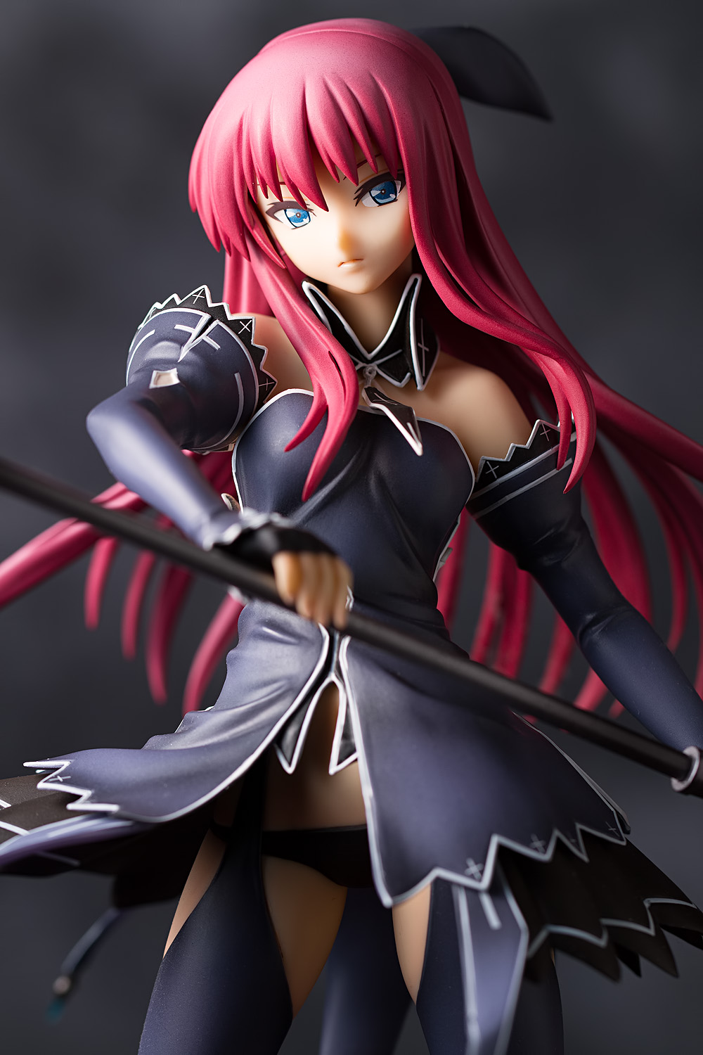
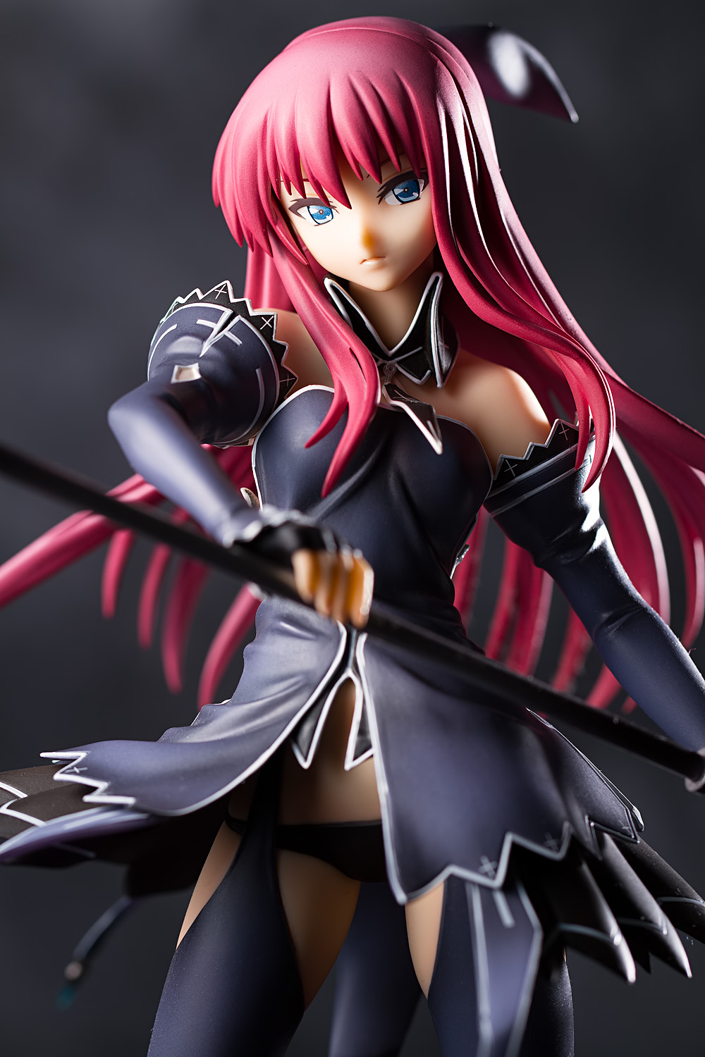
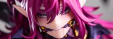
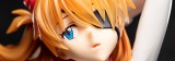
The key light, or main light, is the main ingredient; it is the light that illuminates your subject. In this case, it will be typically be the light that lights up your figure’s face. It doesn’t have to be the biggest or brightest light that you use, but it often determines the character of your photo, and will thus often be the most important light in your setup. As such, its usage requires particular care and attention, and much of what we will discuss in this series of posts – light direction, quality, and distance – is principally applicable to the key light.
Your key light may also be your background light, if you so choose – or even if you don’t, if you aren’t careful about controlling the light’s spill. (Note that in the image above, a separate background light was used.)
Generally speaking, unless you’re trying to call attention to some specific part of the figure, you should aim your key light directly at your figure’s face rather than its body. Even if you’re shining the light through a modifier like a softbox, you will want to aim it at the head. The reason for this is that the center of your light will generally be the brightest area (termed the “hot spot”), and the most brightly-illuminated area is often the most attention-grabbing area. Thus, you will typically not want your figure’s face to be dimly-lit compared to some random part of its torso. This does mean that a large part of your light will be flying over your figure’s head, but that’s alright.
In some cases, you may not have a key light at all, such as when your are shooting a backlit silhouette. You may also have more than one key light, such as in a hatchet light setup (the most famous of which might be Arnold Newman’s portrait of the German industrialist and war criminal Alfried Krupp). There may also be instances where it may be nebulous as to which light you use is the key light; for example, if you’re outside with the sun behind your figure and you’re bouncing light into your figure’s face with a reflector (though personally, I think I’d call the bounce card the key light). I recommend not getting too hung up on terminology, and that goes for photography in general, not just lighting.
Fill
Fill is supplemental light used to brighten shadows generated by your key light (and other lights, as the case may be). You can use an artificial light source or sunlight, or you can also use a reflector, which will typically be a fill card. A fill light can actually be a technically brighter light than your key light (for example, in a multiple-flash setup where the fill light is placed much further away from the subject than the key light, you would need to boost its brightness to compensate for the increased distance). However, by definition, your fill light will not affect your image’s exposure as much as the key light will.
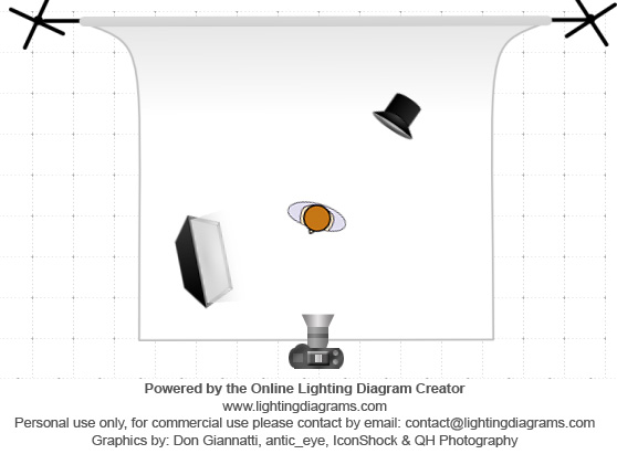
I recommend using a reflector rather than an additional lamp; they’re easier to work with and are guaranteed to not overpower the key light. Here is a typical configuration for placing a fill card:
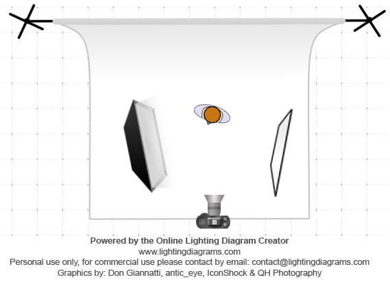
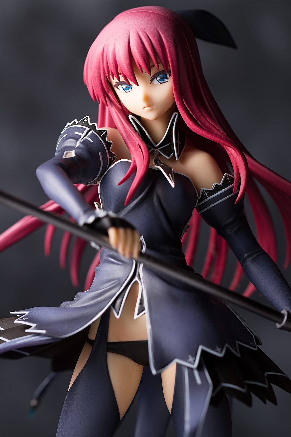
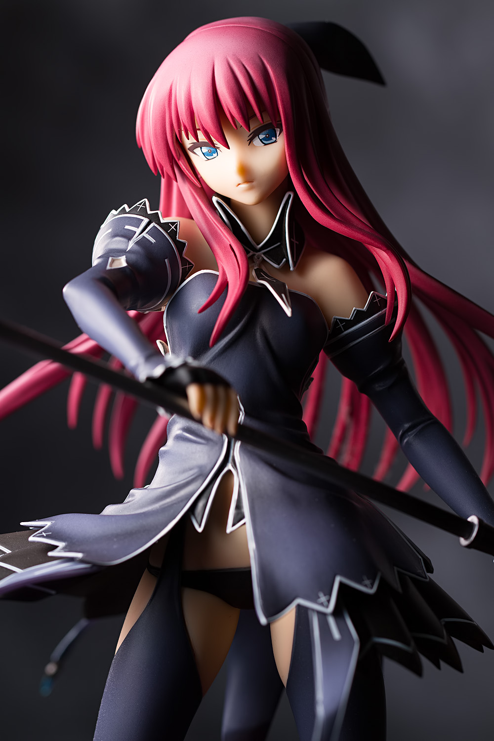
The key light is setup to the left and the fill card is placed on the opposite side, reflecting light back onto the figure’s shadowed side (its left side). Such a result might look like this (if you want to compare this result with the image of just the key light, I recommend opening them in separate tabs and switching back and forth):
In this image, the fill card was placed quite close to the figure, about five inches away. Placing the fill card further away, of course, reduces the amount of fill:
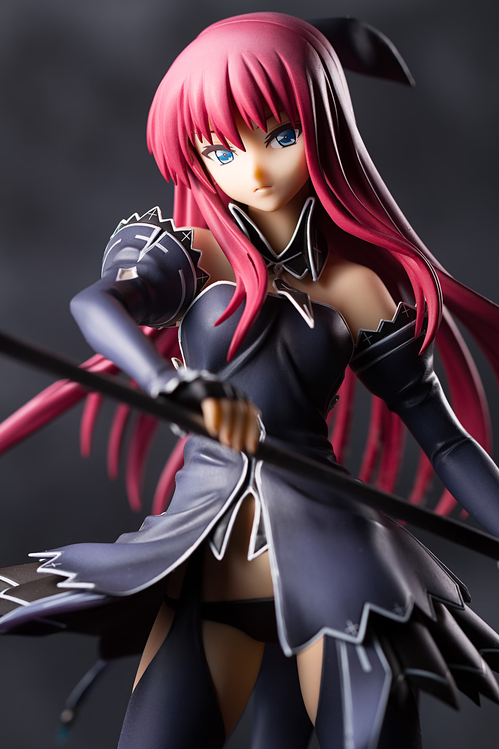
In this case, the fill card was moved back to about ten inches from the figure. It is wise to take care in determining how strong you want your fill to be, should you use it; too much fill tends to flatten out the light, giving an effect similar to frontal on-axis lighting, which is generally not a good thing.
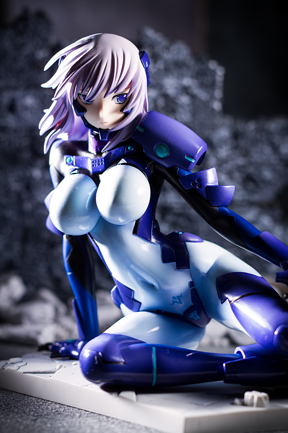
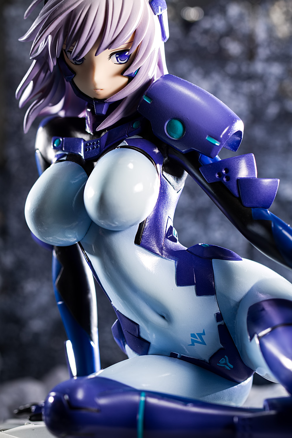
The conventional placement for a fill card is directly across from the key light, on the opposite side of the subject. However, other placements are possible; for example, you can place a fill card directly in front of the subject, lying on the floor:
In this case, light bounces back up at the front of the figure. This is particularly useful if there are areas that the key light cannot illuminate; in this instance, the figure’s stomach and groin, shadowed by the flare of her dress, are now well-lit. Another situation where this placement can be useful is when a figure is bent over; for example, I used this technique for Yagyu Jubei, whose torso would have otherwise been very dark. This placement also generates a more subtle fill effect in other areas; for example, it provides a slight lift to the shadows on the left side of Buddy’s face rather than the more noticeable effect caused by the more traditional fill card positioning.
You can, of course, use no fill at all. I don’t actually use fill very often; in fact, I’d guess at least 90% of my photos do not use any sort of intentional fill lighting. My own preference tends toward deep shadows and strong contrast, which are both reduced by fill. However, I do use it on occasion, and as it has a strong influence on the visual impact of your image, it’s important to be aware of the possibilities it provides and removes.
Rim Light
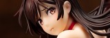
A rim light is a light placed somewhere behind, below, or above your figure, such that it provides a bright outline around some part of the subject. If you’re shooting on a dark background, a rim light can provide some separation between your figure and the backdrop so that its darkened side doesn’t meld with the shadows. A rim light can also be used to generate high contrast, amplifying the excitement level of your image. Continuing with the cooking analogy, rim lighting is like adding some sort of exotic spice to your dish; it can be subtle or prominent, complementary or overpowering. It can add a tremendous amount of drama to your photo. It can also completely ruin your picture. As such, it’s important to be aware of the pitfalls when using this type of lighting component.
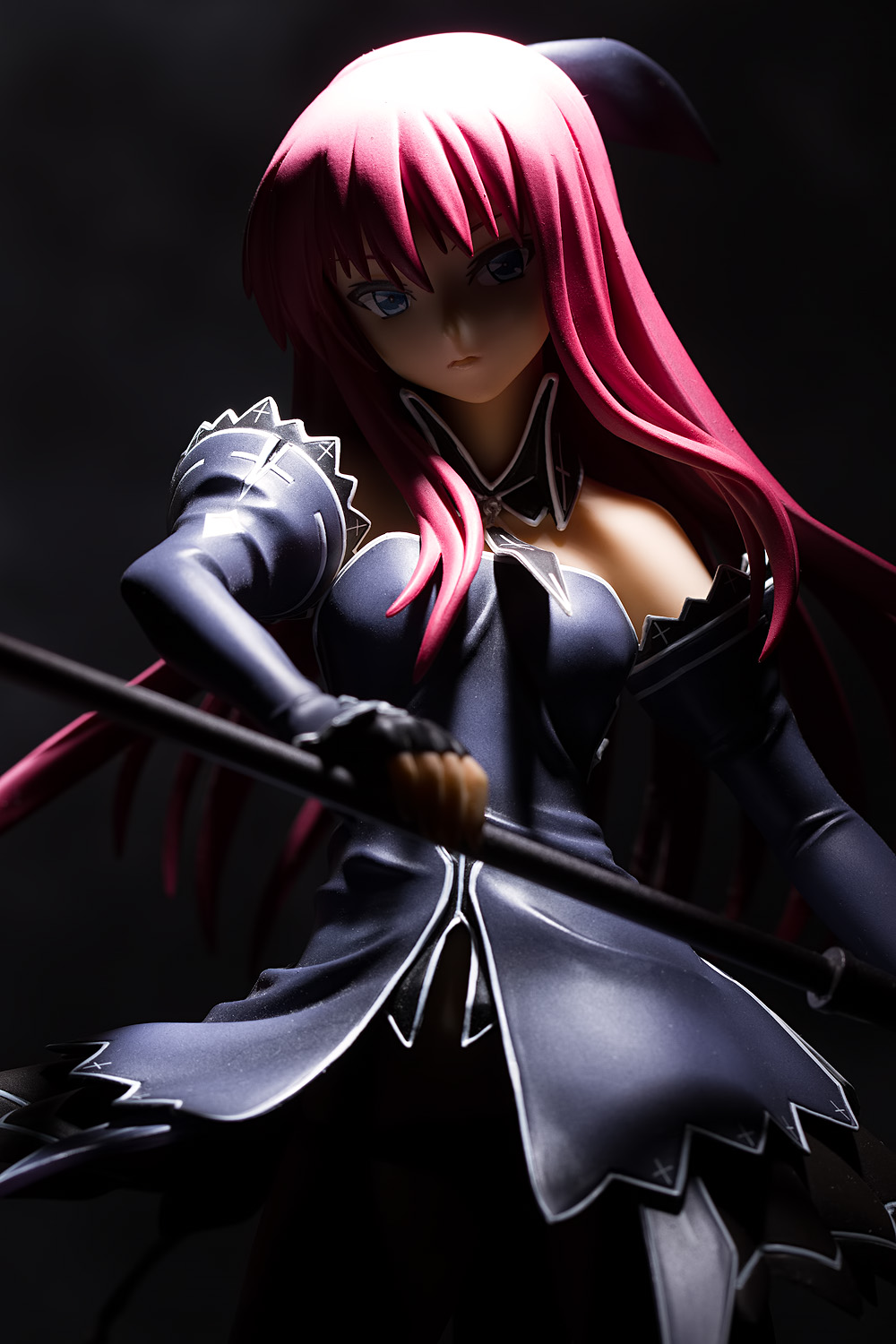
A common placement of a rim light is behind your subject, on the opposite side of your key light. In this setup, looking at the photo from left to right, the key light creates a brightly-lit area, a shadowed area, and then the rim light generates a bright outline on the far side of the figure.
This particular rim light is noticeable but still somewhat subdued. A harder, brighter rim light generates a more obvious effect:
I tend to think of rim lights as being used more often in this manner – hard, crisp, and strong. It’s the sort of style often used on sports magazine covers, where drama is valued and the form of the body is emphasized. I find that this type of lighting works best with action-girl figures, but to be honest, I tend to use it with most of the figures I shoot.
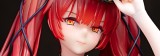
You can also place a rim light on the same side as your key light. This can generate a more subtle result:
In this instance, it isn’t easy to tell that a rim light was used; if you compare it to the key light picture, the differences may not be obvious. However, you can tell a rim light was used by the bright highlights on the upper part of her right sleeve and along the right side of her dress and her right thigh. A brighter, harder rim light would, of course, have a more noticeable effect.
You can also use multiple rim lights, one placed on each side, creating a bright outline around the figure’s entire body. This is a popular look, but it’s not one I use that often, mostly because of practical concerns: in my shooting setups, I usually have my rim light on one side of the figure and my background light on the other, and there usually isn’t enough room for another rim light there. (This is why the position of the background light changes in the picture above.)
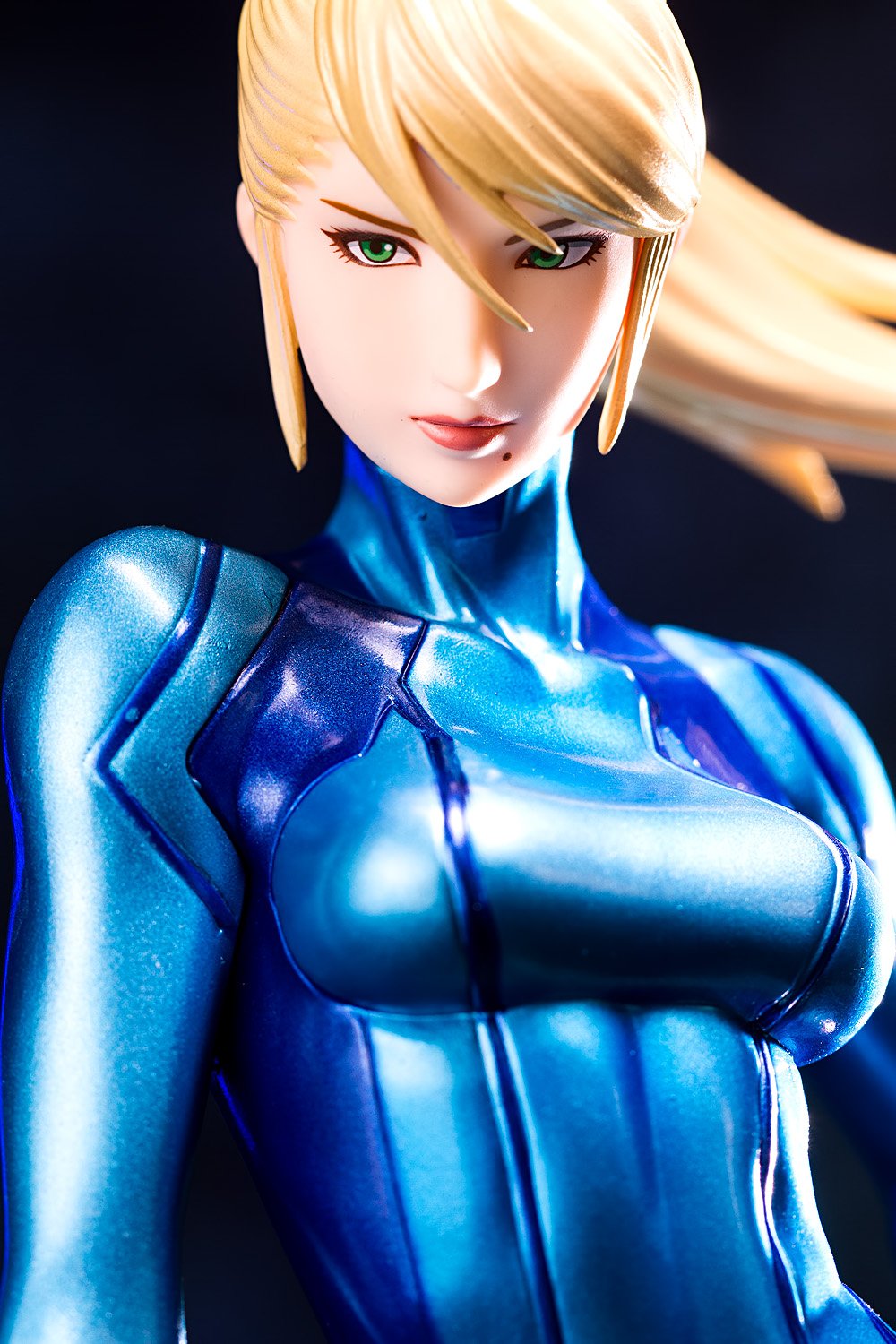
Now, I mentioned that you can run into problems when using rim lights. Perhaps the most annoying one is getting highlights where you don’t want them. Most problematic is when that happens on the nose; a rim light placed at too shallow of an angle can put a hot spot right on the side of the nose, smack in the middle of your figure’s face, where it is going to be noticeable by everyone (here’s a clumsy example of what that looks like). Note that this isn’t always automatically bad; I don’t have a problem with it on Samus, for instance, but that’s because she has a relatively realistic face whereas most anime faces don’t really have noticeable noses, so a bright spot on a nostril looks out of place. Unwanted highlights can occur elsewhere, such as on bits of hair or on other body parts, such as in this picture, where I don’t really like the big highlight underneath Cryska’s right thigh. If you’re using a hard rim light, this sort of light will emphasize texture, including dust, specks, and manufacturing defects, so you’ll need to make certain your figure is clean or be prepared to spend some time with the healing brush and clone stamp in Photoshop.
Anyone who has visited this site for a while knows that I love abusing rim lights. However, there have been a number of times where I’ve eschewed the use of a rim light, even when it might seem like something I would include. For example, with Katanako and Alisa, I wanted to impart a feeling of moodiness, mystery, and elegance, and I wanted the effect to be understated rather than forceful, even though both characters are carrying gigantic swords (I’m referencing the header images for both posts, which are the ones I care most about; some of Katanako’s pictures did use a rim light). Rim light usage can profoundly amplify the energy and intensity of your picture, and you should decide whether those are characteristics that you want to express.
Hair Light
A specialized type of rim light is the hair light, which is placed over your subject. This type of light is so named because it is used to provide a separating outline along the top of the subject’s head and shoulders. Search Google Images for “executive portrait” and you will find numerous examples of a hair light in use.
You’ll also see numerous examples where a hair light is omitted. An overhead light is very much an optional thing. Personally, I sometimes use one, and I sometimes don’t. When I do include a hair light, I tend to go for a more nuclear look than the relatively subtle usage employed in typical portraiture. This is particularly true in my stock urban rubble set (including Inori and Rei), where I try to simulate the harsh brightness of overhead street lighting. It’s the kind of style that I like to use:
I think of this light as “gangster” light; it reminds me of the classic images of Marlon Brando in the Godfather, with the glare on his pate, the deeply hooded eyes, and the strong shadows under his nose and chin. It’s an aggressive type of light that heightens the intensity of the image.
Now, you probably wouldn’t want to use this sort of light by itself. I find that I like this sort of look when I pair it with a hard rim light. This sort of setup tends to work less well with figures of friendly schoolgirls; with those, I would recommend going for a softer, toned-down look. This is particularly the case if you’re working with an interior set; most interiors feature overhead lighting, and a soft hair light can improve the realism of the picture.
While a hair light is typically fairly constrained in normal use, figures are so small that you’ll typically light up much more than just the hair and the shoulders. This includes the floor; you’ll typically have a big patch of light where the figure is standing, and it’s up to you to decide if that’s something you accept or not. The size of the lights that you will typically work with also provides an advantage when photographing figures with large breasts; the light provides the chest with more definition.
Background Light
The background light does just what it says; it lights the background. This may be another light pulling double duty; for example, you could use spill from the key light or a rim light to light your backdrop.
However, in many cases, you might want to light the background separately from the figure. This is fine, and it’s what I do most of the time, but it does carry an enormous risk: if your figure and background light levels are too far off, your entire lighting setup starts looking unrealistic, as if you’d photographed the two elements separately and cut and pasted one on top of the other. That’s a really awful look and it’s something you want to be extremely careful to avoid.
My figure lighting setups tend to not change that much; it’s my background lights that vary from shoot to shoot, and so I’ll stay away from giving general tips on lighting up backdrops. We’ll look at some example setups a bit later on. I’ll also refrain from giving specific guidelines on shooting on black or white, as those setups really ought to get a post to themselves.


This is awesome lighting guide! Thanks for sharing. and strongly agree the idea that lighting is like cooking. I figured out your setup for the racing Miku in the top picture by about 80% while it is still good to see your setup shot. I think I will steal this idea in some of my shots later 🙂
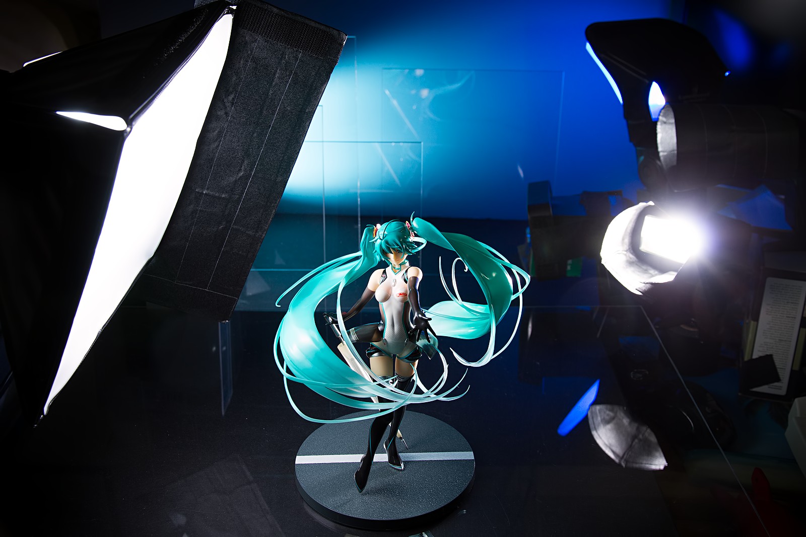
Thanks very much! Thinking back at that Miku picture, I think it’s actually a six-light setup; four lights are obvious (the key and rim light, plus the two background lights), the two that are not as visible are the two gridded lights shining on the edges of the acrylic panels, to put a bright outline around them.
Yes that effect works out very nicely for these figures with some futuristic sci-fi style. I got a few of these acrylic plates and did a few test shots. Haven’t come up with a better solution to place them in my setup. I tried hang them on a string but can’t prevent them from jiggling in this way. Still need to play around with it a little bit.
Yeah, getting them to stand up properly was a real pain; I had them taped to boxes of metal washers and I had a real tough time getting them to stand straight. I think I gave up after a while; a lot of the shots I used were close-in with a long lens, so I could straighten them up in Lightroom.
Yeeessss I’m going to use all of the rim lights now.
I’m a little surprised you don’t see more figure photographers use rim lights; a lot of them are action-oriented and a rim light can add a lot of energy to them. Though then again, it’s easy for me to talk because I no longer have to go through the annoyance of cramming three lamps on my desk. I definitely don’t miss those days.
I guess from the perspective of product photography, some people get the idea that hard light = bad. I’ll say this too: with rim lights, it seems much more important to get precise positioning vs. light from a diffuse source. Maybe some people avoid rim lights because they don’t have the time/patience to take 15 subtle variations of a shot to get the highlights just right.
Yeah, I’ve seen that perception a lot. I’ll be writing something about it very soon.
That has been my experience as well. I’ve got some pictures of Lacia that I do not think will ever get posted here because of how ghastly they look. Hard light can look good, but it is very unforgiving when you botch it.
One other thing I forgot to mention is that rim lights can very easily flare into the lens. I guess I should add that in when I revise this post.
Ah… So that’s how some collectors/shop owners do it. Interesting helpful guide and nice comparison with cooking.
Thanks for the kind words! I certainly can’t claim credit for comparing lighting to cooking, though (the first place I read it was in one of Joe McNally’s books, but I’ve seen it pop up fairly often through the last couple of years).
Honestly, I can’t see the difference in some of these photos. If I were able to compare side by side, maybe, but scrolling down to one and back up to the other loses it when the differences are so subtle.
Still, what you’ve said is a lot to think on, and much to play with.. I really should get around to it.
Thanks for continuing these guides. <3
Yeah, this wasn’t the way I wanted to present it. I’ll look into ways of changing it since what I originally had in mind was a simple mouseover or mouse click image swap. I’m not sure what WordPress allows me to do and I’m about a dozen years removed from the last time I tried to do web development, but I’m sure there’s some code on the web that I can crib from. However, if you open up the images in individual tabs and just click on them in turn, I think the differences are readily noticeable. Subtle, maybe, particularly with respect to different fill styles but I think that subtleties often have an outsized influence on the tenor and impact of a photograph.
Pingback: The week in things: stuff and happenings | Makigumo
question!
is white background no good?
Nah, white is fine; I use white from time to time, though not as much as I used to. The thing is, a white background can be more difficult to work with than it might appear at first, so it’s a subject that deserves its own post. Personally, I still struggle a lot with white backgrounds so I might not be the best person to write about it.
thanks for the replay~ i shall try darker background
Hi.
Can someone help me how can I achieve the following and how is the light setup been
used? How many probably and is it diffused? I want to learn and achieve the following maybe some of you already learned and achieved it. Also maybe someone know where can I get those special backdrops use on the gradient effect photos. Thanks for all your help
Pure Black background :
http://farm3.staticflickr.com/2842/9465619002_ddc7f4f9f5_o.jpg
Pure White background :
http://farm8.staticflickr.com/7355/9136778284_77f7f47366_o.jpg
Gradient Effect background :
http://farm8.staticflickr.com/7409/9260235306_810e49fa77_o.jpg
Dim Effect background :
http://farm8.staticflickr.com/7449/9218203062_5d6c40dfe7_o.jpg
The first one looks like two lights, one on each side. I’d guess the one to camera left is smaller since the light looks harder and there is no rim light effect on the tail. The black background is achieved by killing ambient light spill onto the backdrop. The floor is probably a sheet of acrylic or plexiglass.
The white background in the second one is achieved by aiming lights at a white background and flagging it to prevent spill from hitting the subject. The subject is far enough away from the background to prevent bloom effects from causing a color or brightness shift around the edges. The key light looks like a single short light setup.
The gradient effect is achieved using a seamless background, like a roll of white paper. I’d guess the key light is positioned high and very close to the subject with a flag.
The fourth picture is just a seamless background with what looks like one light placed high. That light might be an ordinary desk lamp since you can see its reflection in the shoulders and feet. The lighting pattern looks very soft so there could be another light somewhere; I have no idea how large this toy is.
I talk about some of this stuff in some of the other posts here.
Thanks for your response I really want to learn from them but of course they didn’t reply to me as they don’t want to share how they do this thing. Is it ok to discuss with this page? Or you have any site/forum which we can post more on discussion? Anyway ok lets discuss more on image 1 first this will be very helpful. Currently I am using 3 lights one at the top(big), 1 left(small) and 1 right(small). All bulbs are in 5400K which I purchased on a bundled photographic lights and just cover them to diffuse with a tracing paper. On the 1st photo I tried to achieved it with using 3 lights(1 above/ 1 left and 1 right) and cover them with a piece of black board in both sides of the figure just to avoid any spill from the backdrop(velvet). Still I notice some spill on my backdrop or maybe because my acrylic sheet is really more black than the backdrop that’s why its noticeable compare to my backdrop? I read some of you’re tips and I am glad to learn more about it and how to apply them still understanding how to position the lights since controlling is a bit difficult as well. In this case room light should be turned off right and only the photographic lamps should be on when taking photos. In positioning the lights since I want to achieve the background to be fully black I need to move my figure farther and positioned my lights directly on the subject rather than doing and angle direction to avoid spill. In this case I can only use 2 lights maybe my hair light above also gives the problem to spill on my background right? Is it possible I wrap a black paper around my lamp to make it like a snoot on the above hair light will it help to spill just cover the edges where the lights projected? Or I can apply to all the lights to make it like a snoot effect? just my idea since I think the boom of the lights directional spread through every where even my figure is already far from the background. Thanks!
Thanks for your response I really want to learn from them but of course they didn’t reply to me as they don’t want to share how they do this thing. Is it ok to discuss with this page? Or you have any site/forum which we can post more on discussion? Anyway ok lets discuss more on image 1 first this will be very helpful. Currently I am using 3 lights one at the top(big), 1 left(small) and 1 right(small). All bulbs are in 5400K which I purchased on a bundled photographic lights and just cover them to diffuse with a tracing paper. On the 1st photo I tried to achieved it with using 3 lights(1 above/ 1 left and 1 right) and cover them with a piece of black board in both sides of the figure just to avoid any spill from the backdrop(velvet). Still I notice some spill on my backdrop or maybe because my acrylic sheet is really more black than the backdrop that’s why its noticeable compare to my backdrop? I read some of you’re tips and I am glad to learn more about it and how to apply them still understanding how to position the lights since controlling is a bit difficult as well. In this case room light should be turned off right and only the photographic lamps should be on when taking photos. In positioning the lights since I want to achieve the background to be fully black I need to move my figure farther and positioned my lights directly on the subject rather than doing and angle direction to avoid spill. In this case I can only use 2 lights maybe my hair light above also gives the problem to spill on my background right? Is it possible I wrap a black paper around my lamp to make it like a snoot on the above hair light will it help to spill just cover the edges where the lights projected? Or I can apply to all the lights to make it like a snoot effect? just my idea since I think the boom of the lights directional spread through every where even my figure is already far from the background. Is that ok to use a fill like a white foam board will it help also? Thanks!
I’m perfectly happy to discuss lighting and everything related to photography here (though to be honest, It would be easier to read your comment if you broke it up into paragraphs). Let’s see; with respect to shooting like in the first photo, if you’re having trouble with spill, there are a few things you can do. The best thing, in my opinion, is to move the figure further away from the background; try to get as much space between them as you can. The next thing to do is to place flags next to your lights to block them from spilling onto the background (which you are already doing).
I’ll be honest, if you’re having some issues getting a completely black background – which is a little surprising to me since black velvet usually soaks up light really well – I’d just fix it in Lightroom, Photoshop, or some other image editing application. Dropping the black levels is trivial with any of those programs.
That said, it’s better to learn how to do it the right way, at least when you’re starting out. I would consider removing the overhead light; I’m not sure if it’s necessary and adding more lights tends to make things more complicated. You can certainly experiment with the approaches you mentioned, and I would encourage you to do so. Just go ahead and try all those ideas and see what happens; that’s a great way to learn what works and what doesn’t get what you want.
Hi.
I tried 2 lights only without the hair light and move my subject farther from the black background and surprisingly it works and makes my background isolated. Only issue I am facing now is some parts of my subject which is a 2 inch figure has some dark areas like some part of the hair and some side parts of the arm and legs beneath. What can you suggest to lit some of the dark areas of the figure.
My subject is a 12″ figure and currently my light position is one 45degree front left and a above higher on my subject lighting downward from the head to feet. The other light is positioned on the right side of the figure and above as well lighting downwards from above head of the figure going to the foot. What can you suggest to improve my light position?
I read from your tutorial to use side lighting and will also help to prevent background spill would it be better directing the lights from left and right and
not positioned above the head of the figure or do I need to enable again my hair lights to help it but I suspect since my hair lights is a bit bigger than my 2 other lights it my cause again spill on the black background.
I am not sure how the guy make it balance on the image link above that I show you previously on the black background setup. since you mentioned that he is using only two lights it maybe because the figure is smaller than what I am trying to shoot now? I haven’t tried the snoot on the light as I mentioned before since you mentioned to try first 2 lights and move the subject a bit farther on the background to give it a try and happily it works 🙂
Only issues is I cannot achieve a perfect lit on my entire subject same as the picture link I attached previously. Thanks for you advice again and appreciate your help. Thanks!
Whoops, I forgot to respond to this comment. I’ll delete your other comment to keep the comments tidy. If you want to light up darkened areas of a figure, you’re going to need another light source; from what you describe, it sounds like using one or more carefully placed fill cards would give you what you want. I can’t really make any suggestions beyond that, though; I’d need to see a picture in order to give more specific advice. There’s no one-size-fits-all approach to lighting a subject.
Hi. Is this 2 light setup also (http://farm6.staticflickr.com/5347/9767656672_09a9ba938a_o.jpg)? not sure how he lighten up the front part of the subject neatly. Would you give any advice if this a 2 light setup how it been position or angle is it lightning downward from head to the floor or just at level of the subject directly straight lightning without any angle direction from left and right side of the subject? What would you suggest?
In my own practice in shooting a 1/6 scale figure I tried it I angle down my lights a bit high from my subject lighting towards down positioned front left corner and other light right side lightning from top of the subject towards down also not sure if I am doing it right because sometimes my 1/6 scale figure front part doesn’t lit light much and need to do some adjustments on Photoshop.
Do you think its normal? or do i need to put 1 more light to light up the front of my figure? can i positioned it close or much farther? Just worried it will spill to my background since I am still achieving pure black background.
Thanks and cheers!
Judging by the way the robot’s “eyes” are shadowed, I think there’s a light placed up high, which is sort of the classic “beauty” key light position (google “beauty lighting” for some videos that show how to set that up). Then it looks like there’s a rim light placed on each side. Optimus Prime’s chest is bright because the light is placed above and in front of him. If this is the sort of look you’re shooting for, I’d experiment with adjusting the angle and distance of the key light. You can keep the background black by moving the figure and lights away from it, or by flagging the key light on the side that is furthest away from the camera.
At long last, the taxonomy of lights! 8D
Thanks for including the diagrams, of which the tutorial would have been even better if every single snapshot included its corresponding light positioning diagram with directional markers to give beginners a heightened awareness of each light’s area of contribution. Or maybe even exposing the effects of only a single light in turn.
I think I’m going to revise some parts of this post, since I figured out how to swap images around in JavaScript despite WordPress not making it too straightforward to do so. The position of the key light doesn’t change in most of these pictures, so I don’t think an additional lighting diagram would be helpful, as it would look like the one provided up above.
Hi Tier. When are you going to release your Irma photo session?
I’m not sure; I’d guess maybe sometime in October. I don’t yet have a background idea for her (or rather, I do but I haven’t made it yet) and there are a few other figures that are probably ahead in priority, like some of the 7 Deadly Sins ones, since I kinda want to do those as a series.
Hi Tier,
About the optimus prime figure. If you mentioned beauty light does it mean I need to buy a equipment for it or I can experiment with a diffused light also? I contacted this guy and we notice that most of his picture uses continues lights or daylight bulbs.
I am sorting trying that as well. About the rim light I tried putting 2 rim light both left and right corner of the back of the figure do i need to set it farther or i can set it close to my figure? last time I tried it but it seems it produce some spots on my picture like it was a part of the black background that has some lighten spots but my light direction ofcourse are point toward the subject since its at the back.
If rim lighting should it be farther and near the backdrop or closer to the figure? Thanks again and will experiment this setup. This is the setup I am trying to achieve well lit balanced distribution of lights I am not only sure how big the bulbs this guy use in the optimus prime figure and how they are been positioned.
Thanks and cheers!
Nah, beauty lighting is a technique rather than a piece of equipment (though a beauty dish is sometimes used with this method). You can use whatever lights you already have.
The distance that you place your rim lights depends on what sort of look you’re going for and there’s no right or wrong answer. Generally speaking, rim lights seem to often be used to generate hard light, which would mean placing them further away (or doing something else to make them relatively smaller). Without seeing any of your pictures and not knowing what look you’re going for, though, I can’t make any more suggestions other than to experiment for yourself.