Another day, another Vocaloid figure. The Vocaloid phenomenon offers a little something for everyone. To amateur musicmakers, it is an empowering tool, giving them the ability to add vocals to their instrumental tracks. For artists, it is a source of inspiration for their illustrations. For companies, it’s a reliably fat cash cow – slap a Vocaloid image on a product or insert one of the characters into a video game and watch the units fly off the shelves. A few companies have taken this commercial exploitation to another level; Sega, for example, loves throwing her into games that she has no business being in. And Good Smile Company too, who have made so many products featuring her likeness that she might as well be their mascot. At least in the case of their auto racing team, it seems that this is literally true, as this figure represents.
I have to admit that I’m pretty tired of the whole Miku Hatsune thing. Many of her products aren’t too interesting to me – this is particularly true of all her nendoroids – and I find it really difficult to write anything about her figures. That said, I like this figure – as should be obvious, since like most people, I’m not generally in the habit of buying things I dislike. I like it enough that I could disregard my weariness at seeing yet another Miku figure; she has a distinctive and attractive look and she appears older than she is normally depicted. That was enough to sway my disposition.
However, while I’m favorably inclined towards this figure, I wasn’t sure how much I liked it, and thus I haven’t spent much time reading the comments on its Tsuki-board page (which, to be honest, I usually don’t do for any figure, anyway). If a figure doesn’t leave a strong initial impression on me before I photograph it, I prefer to not read about it so that I can keep my mind and opinion clear. That said, I did hear that a number of collectors feel that there’s some sort of quality control problem with this Miku. I’m not entirely certain of the nature of this defect, but I have my suspicions and we’ll talk more about that in a bit.
Unsurprisingly, this figure is made by Good Smile Company. They’ve made a number of Miku Hatsune figures, typically in 1/7 and 1/8 scale; this particular Miku is 1/8 scale, standing about 20 centimeters tall. Like just about all of GSC’s Miku figures, Racing 2011 Miku hit the bargain bin fairly quickly, which is where she remains.
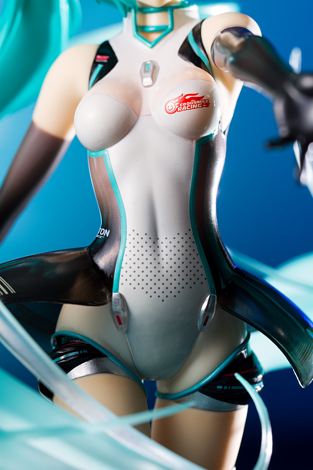
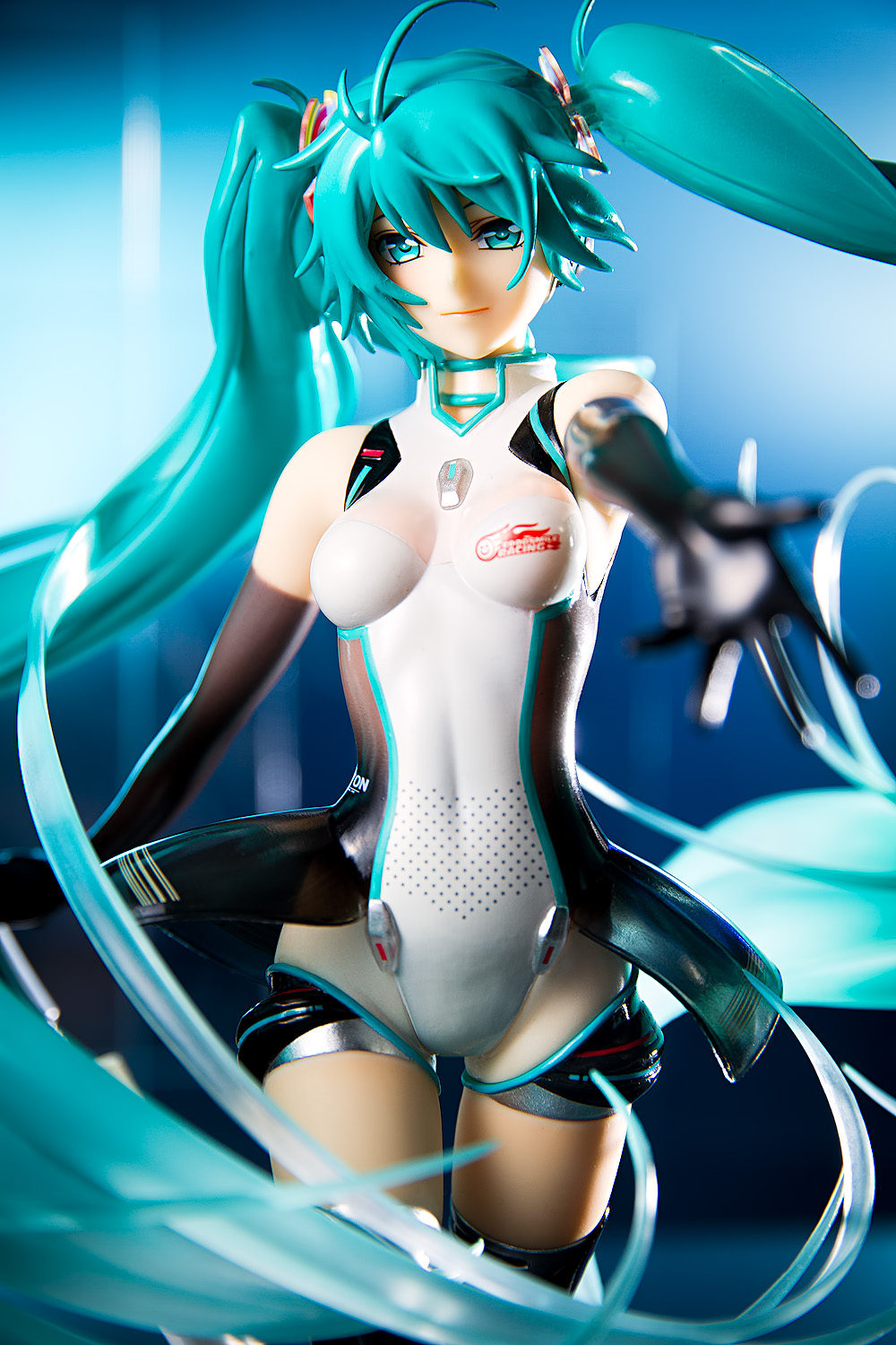
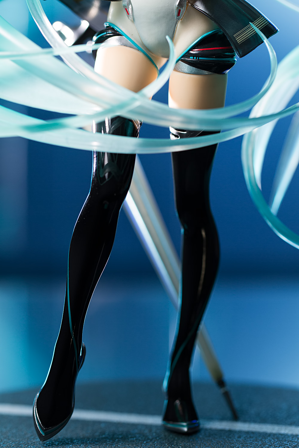
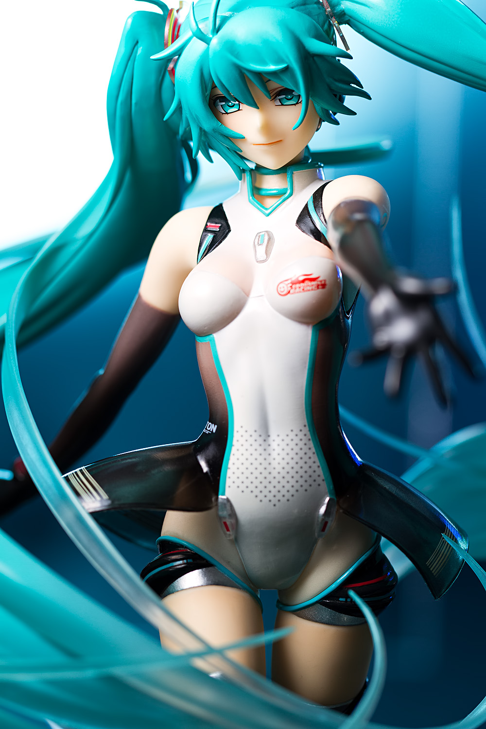
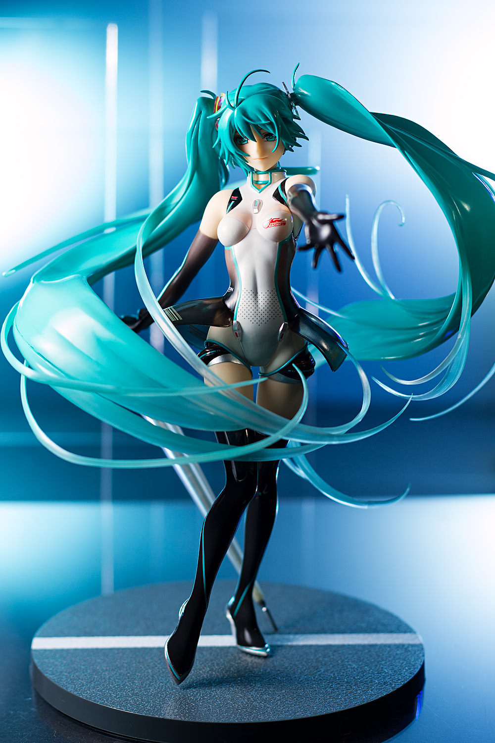
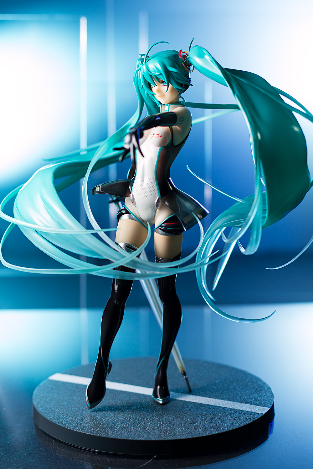
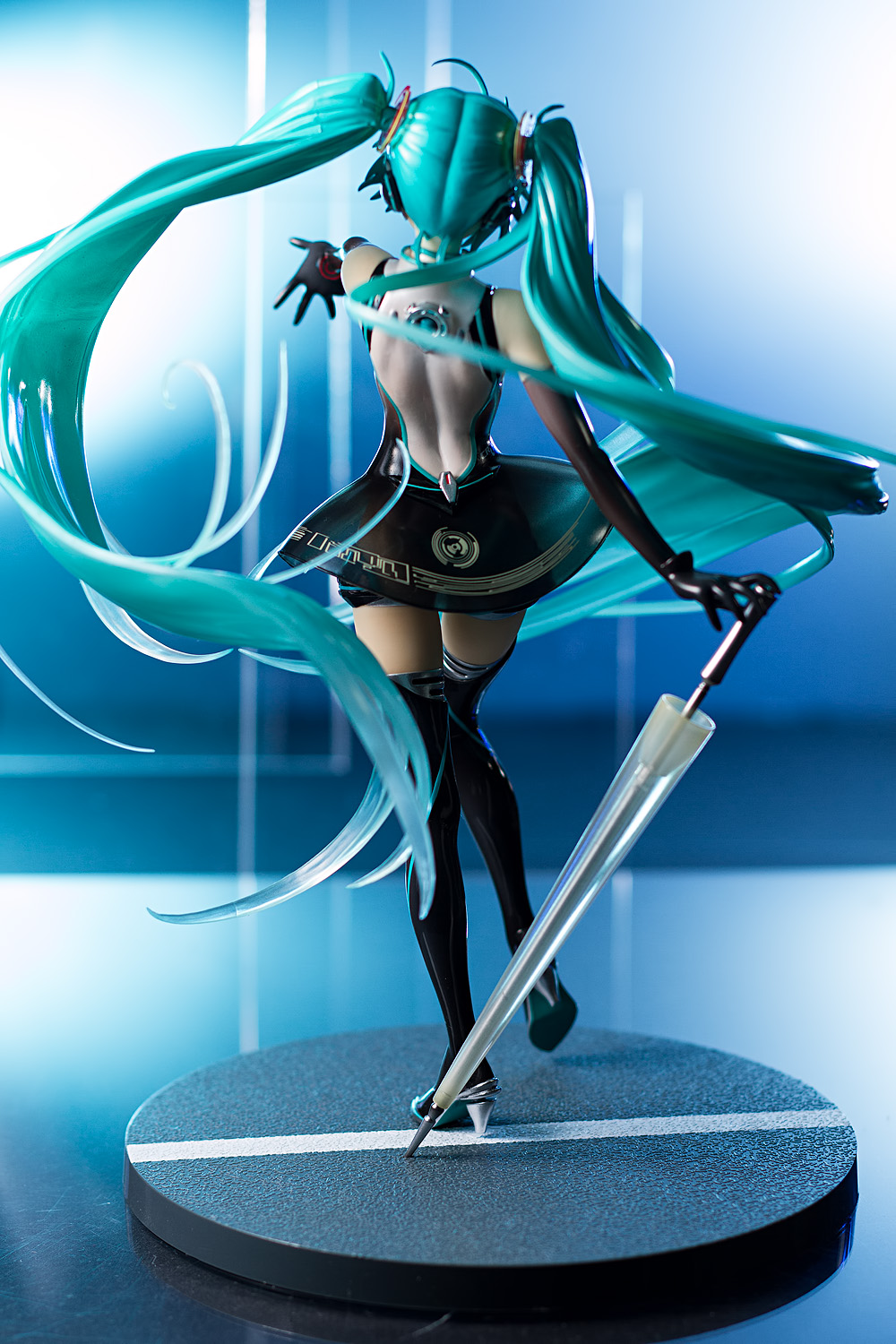
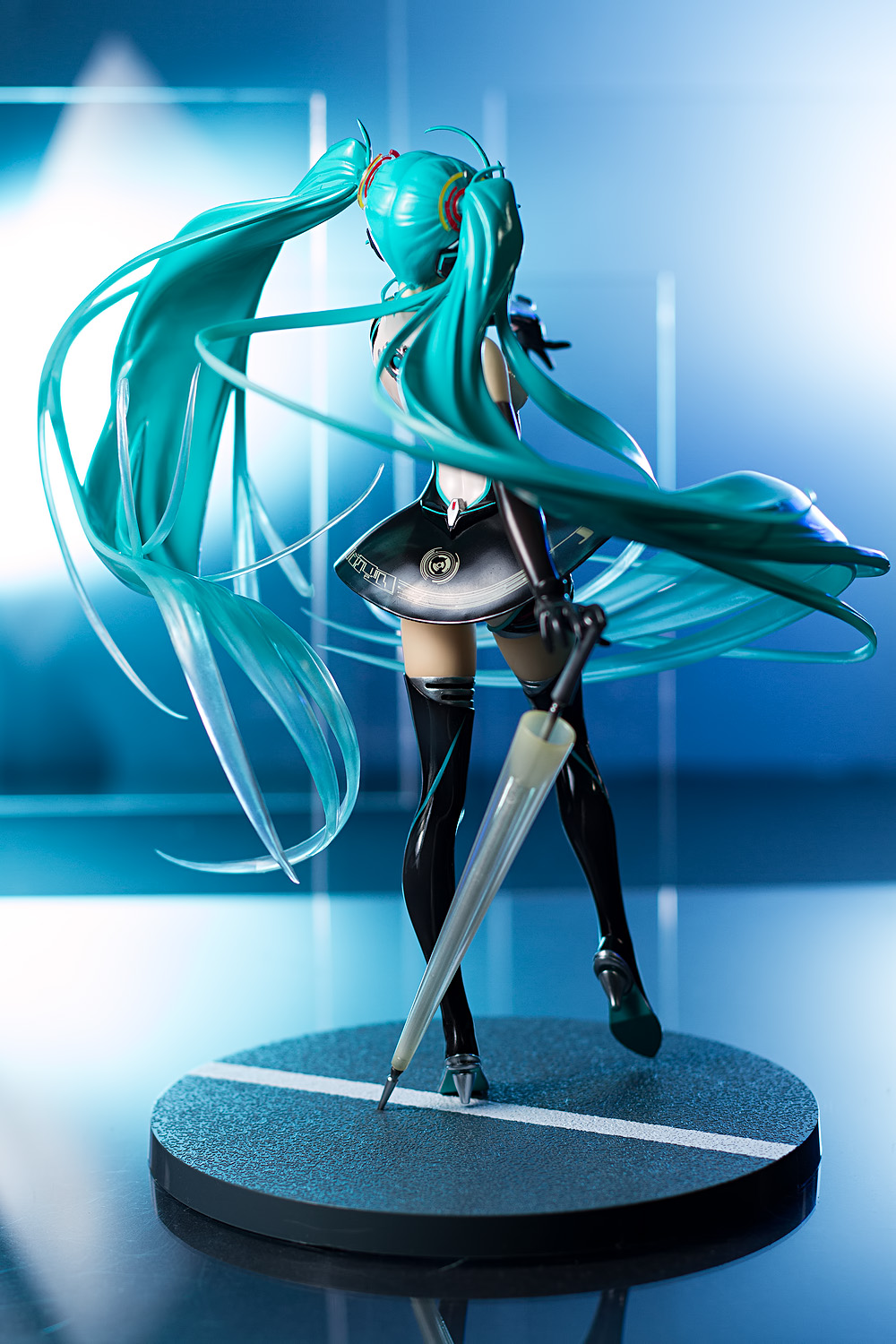
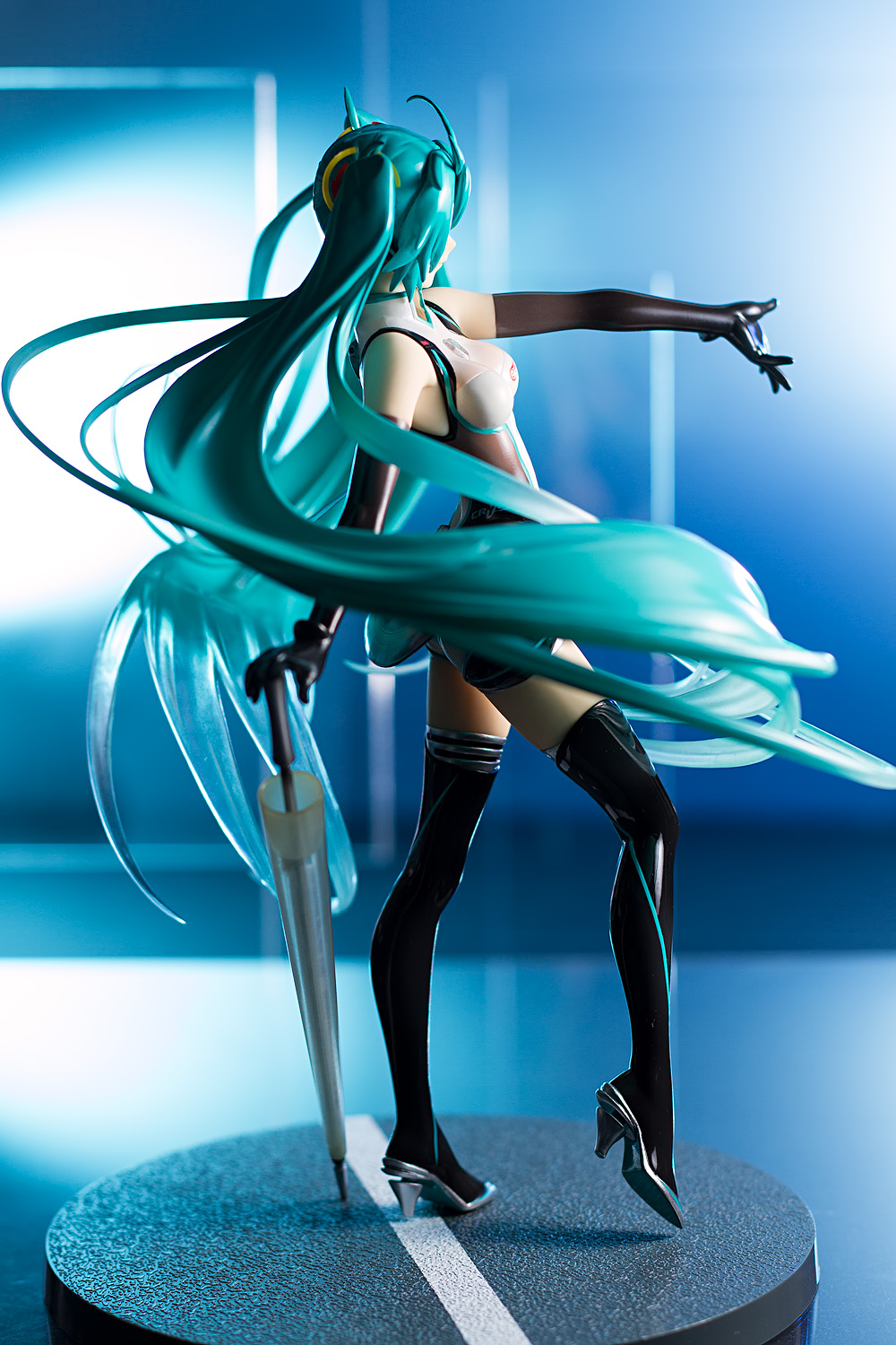
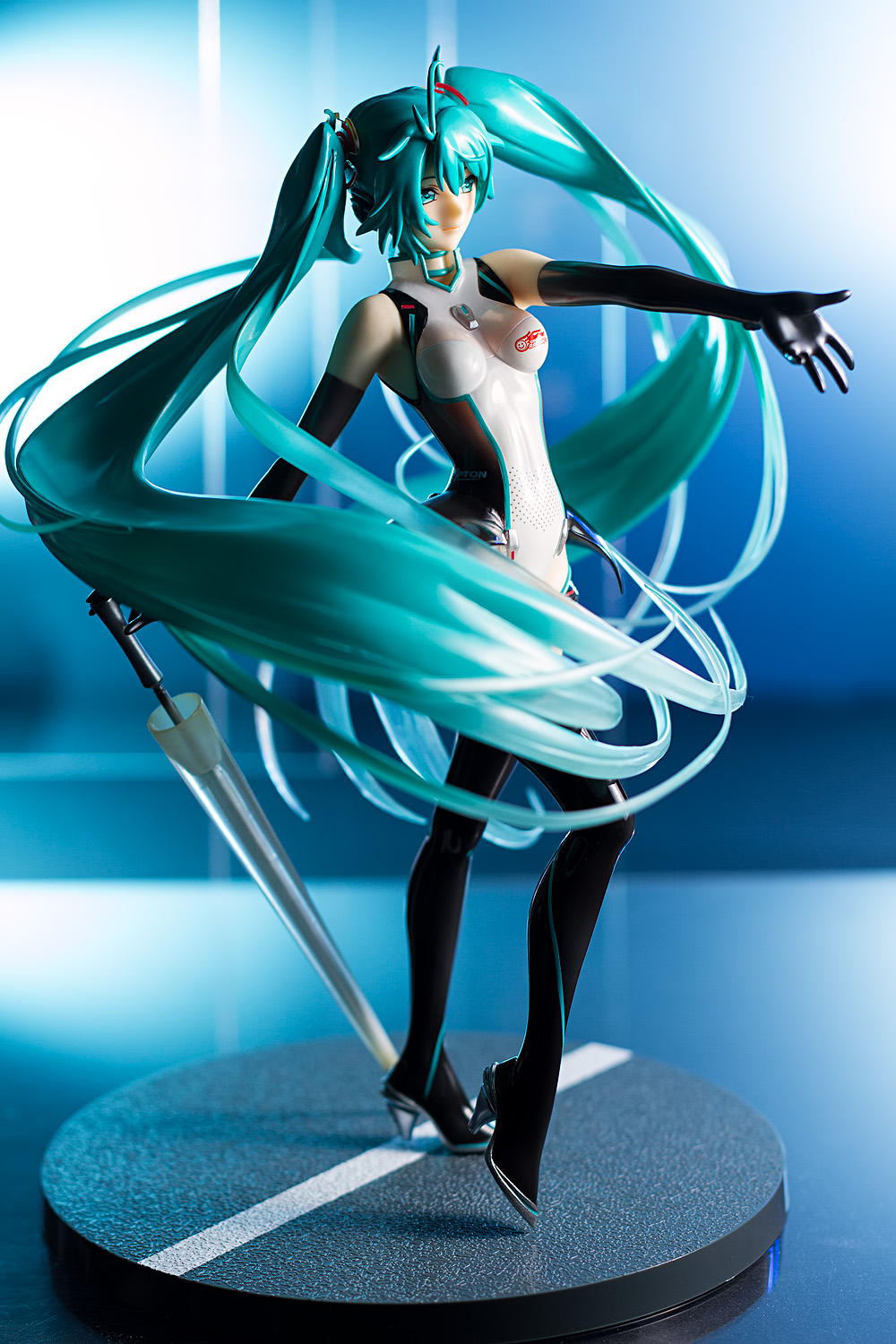
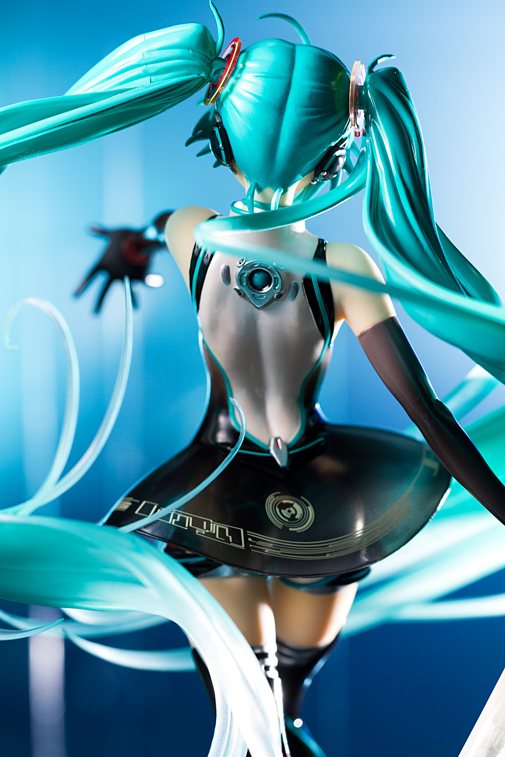
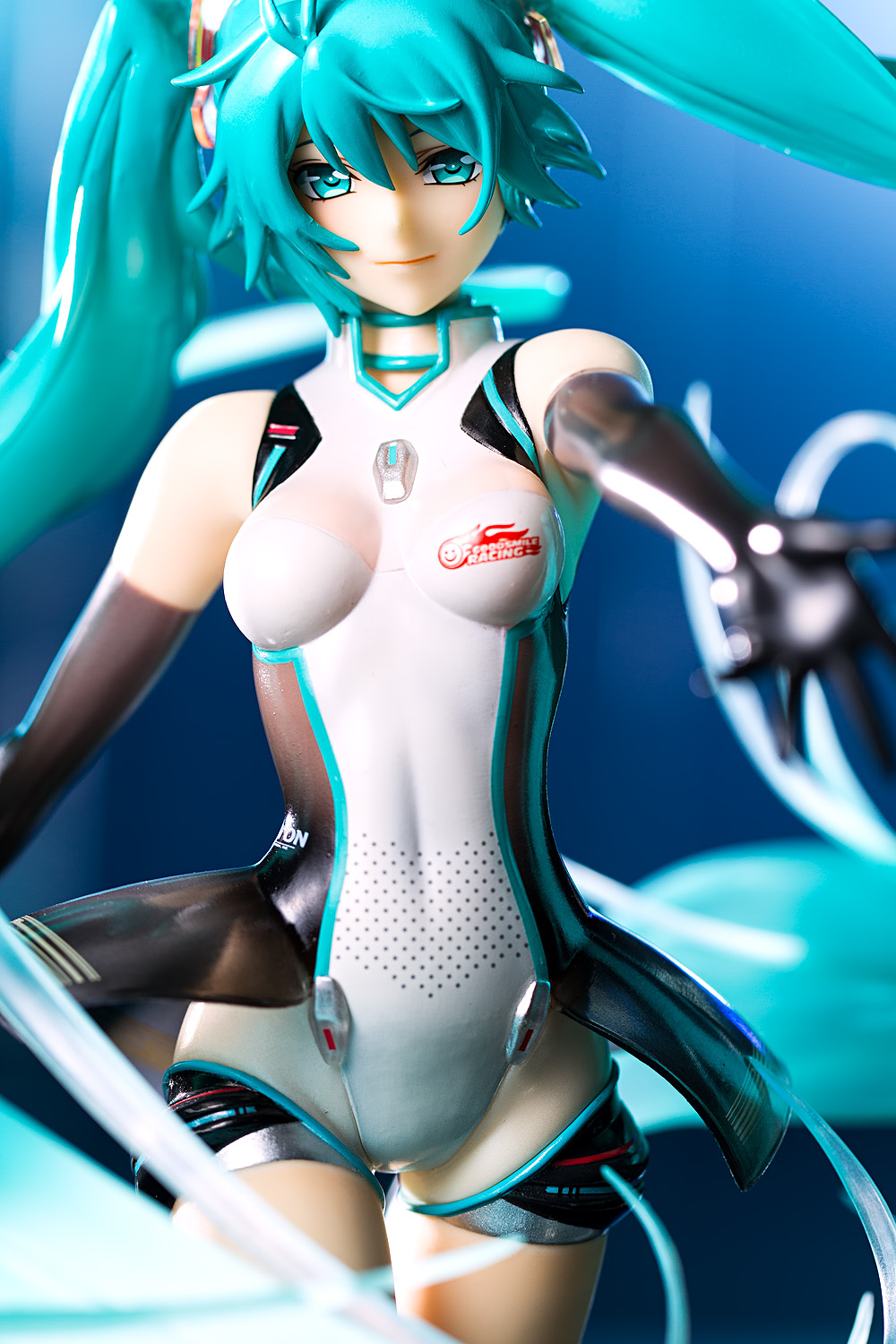
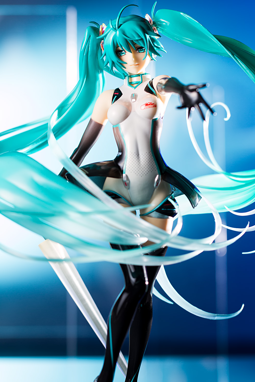
I don’t really know anything about Good Smile Company’s adventures in motorsport. I presume they’ve co-opted Miku Hatsune’s image as their mascot, and that seems to be the capacity in which she’s presented here. She’s dressed in a futuristic derivative of a race queen outfit – she’s wearing a leotard, some thigh-high boots, long gloves, and is carrying the all-important umbrella. It’s a very sexy outfit, though I can’t help but think that she looks a little like a cybernetic prostitute or something, particularly when paired with her beckoning gesture.
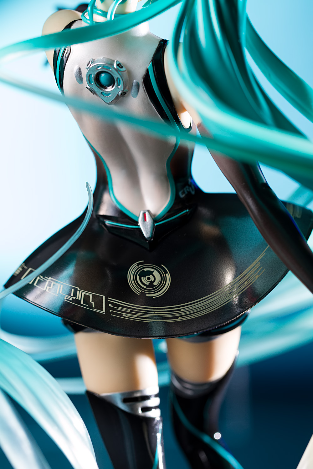
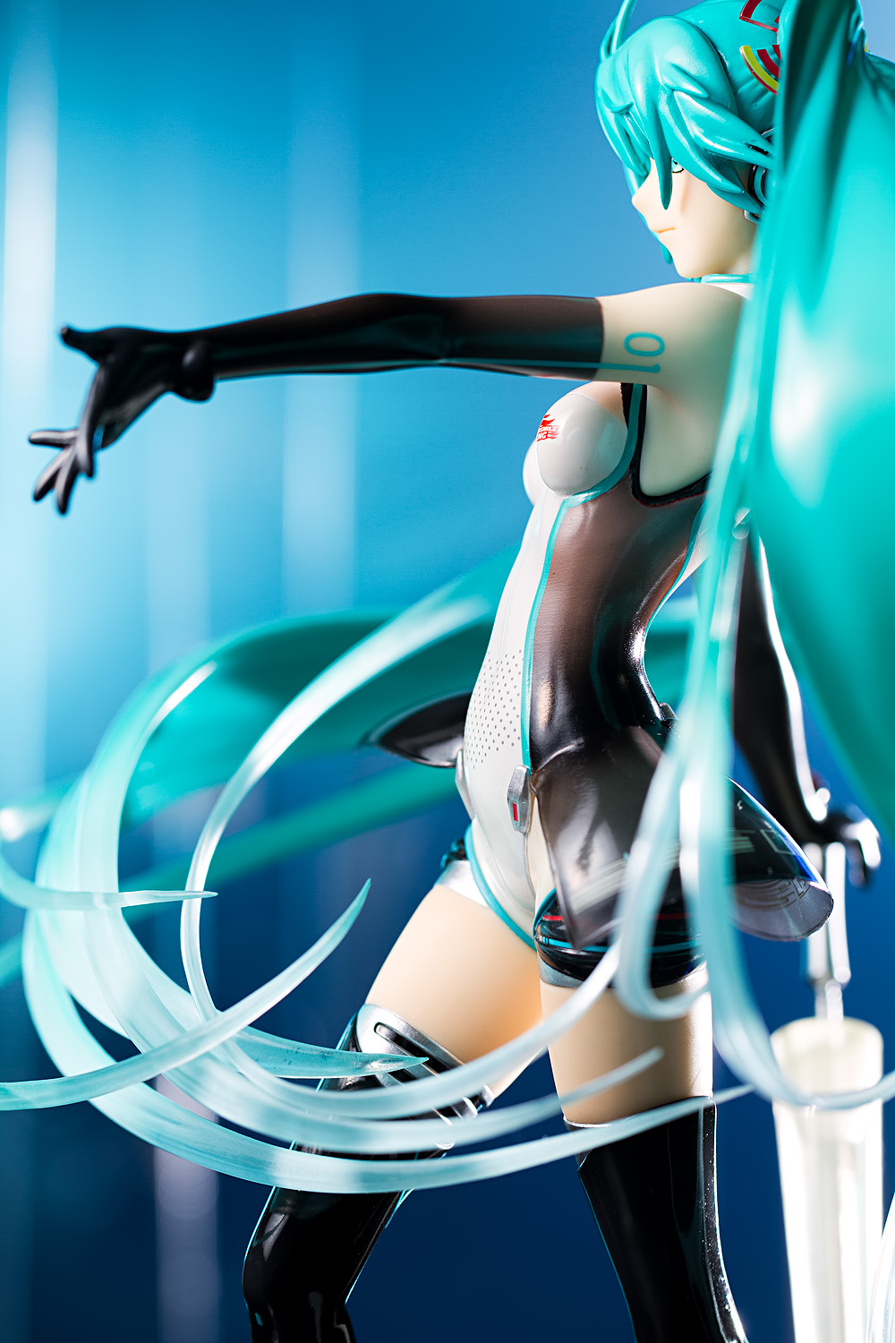
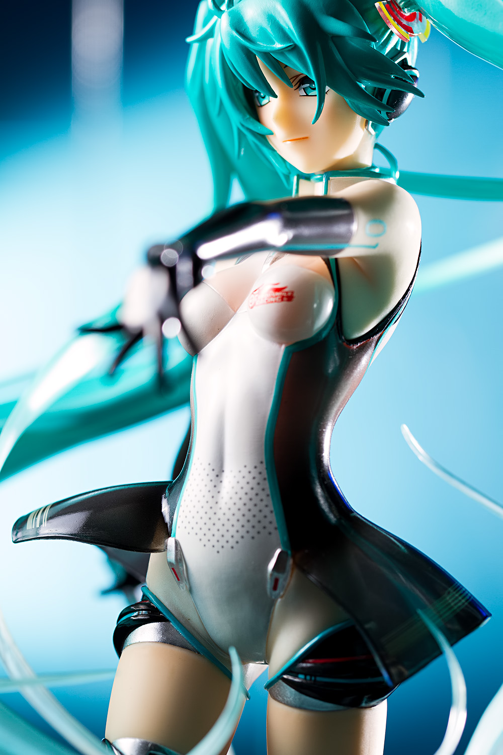
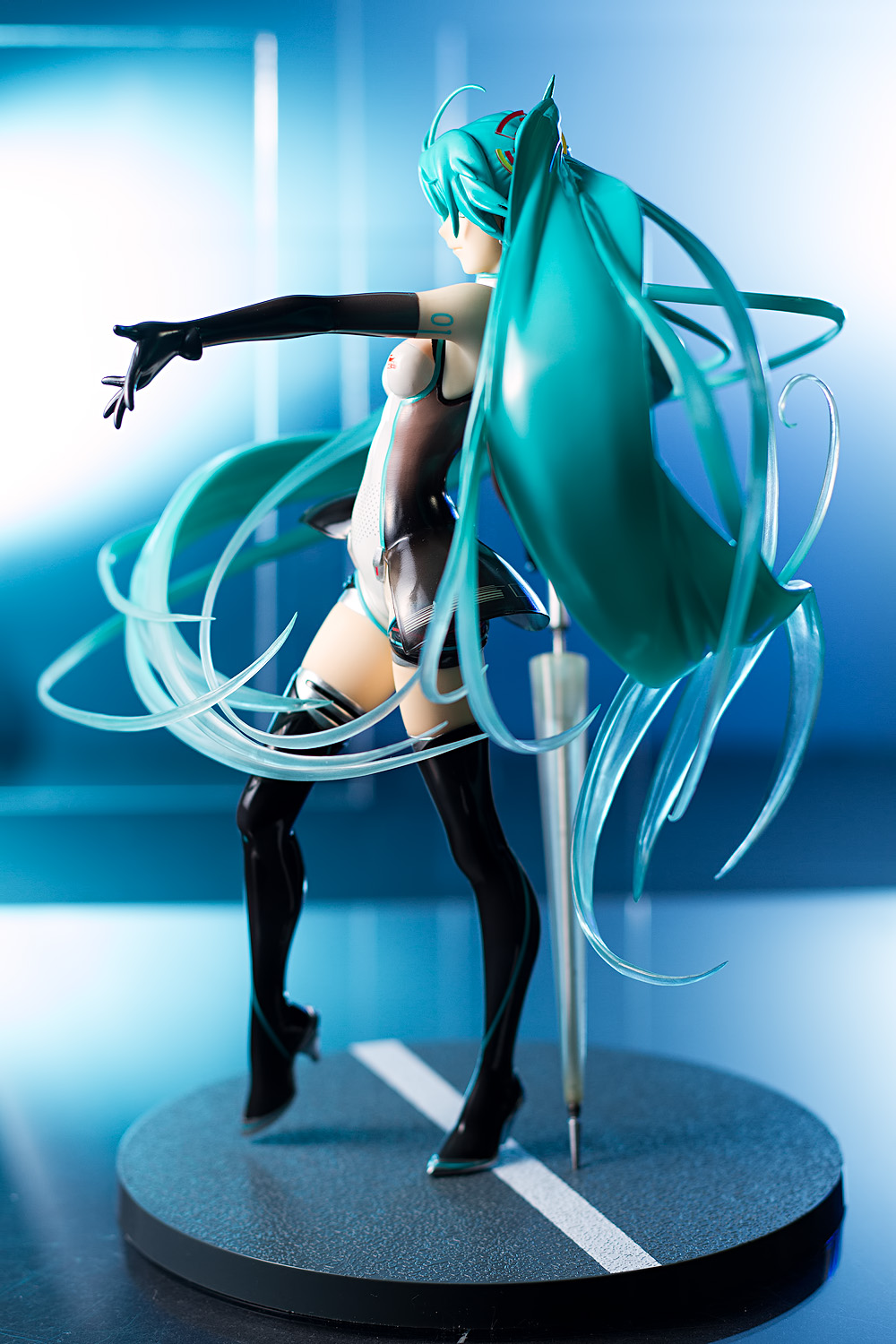
I’m less fond of this part that flares around her waist, though; it seems both unnecessary and disruptive. Fortunately, it’s a lot less obtrusive when the figure is viewed from the front rather than the back.
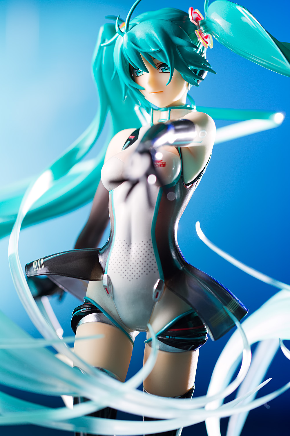
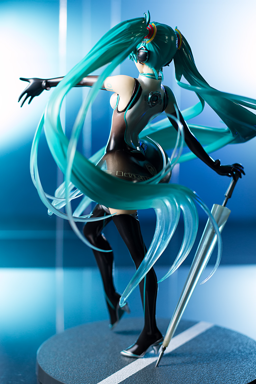
The umbrella doesn’t actually attach to anything; you have to sort of wedge it under her right hand. There’s a small divot in the base where the point goes into, and though the whole setup seems a bit precarious, it holds up well. The figure, though, is quite a bit more wobbly; only one of Miku’s feet attaches to the base, and the figure vibrates worryingly whenever it is nudged. Hopefully that’s not a harbinger of leaning or peg-snapping problems in the future.
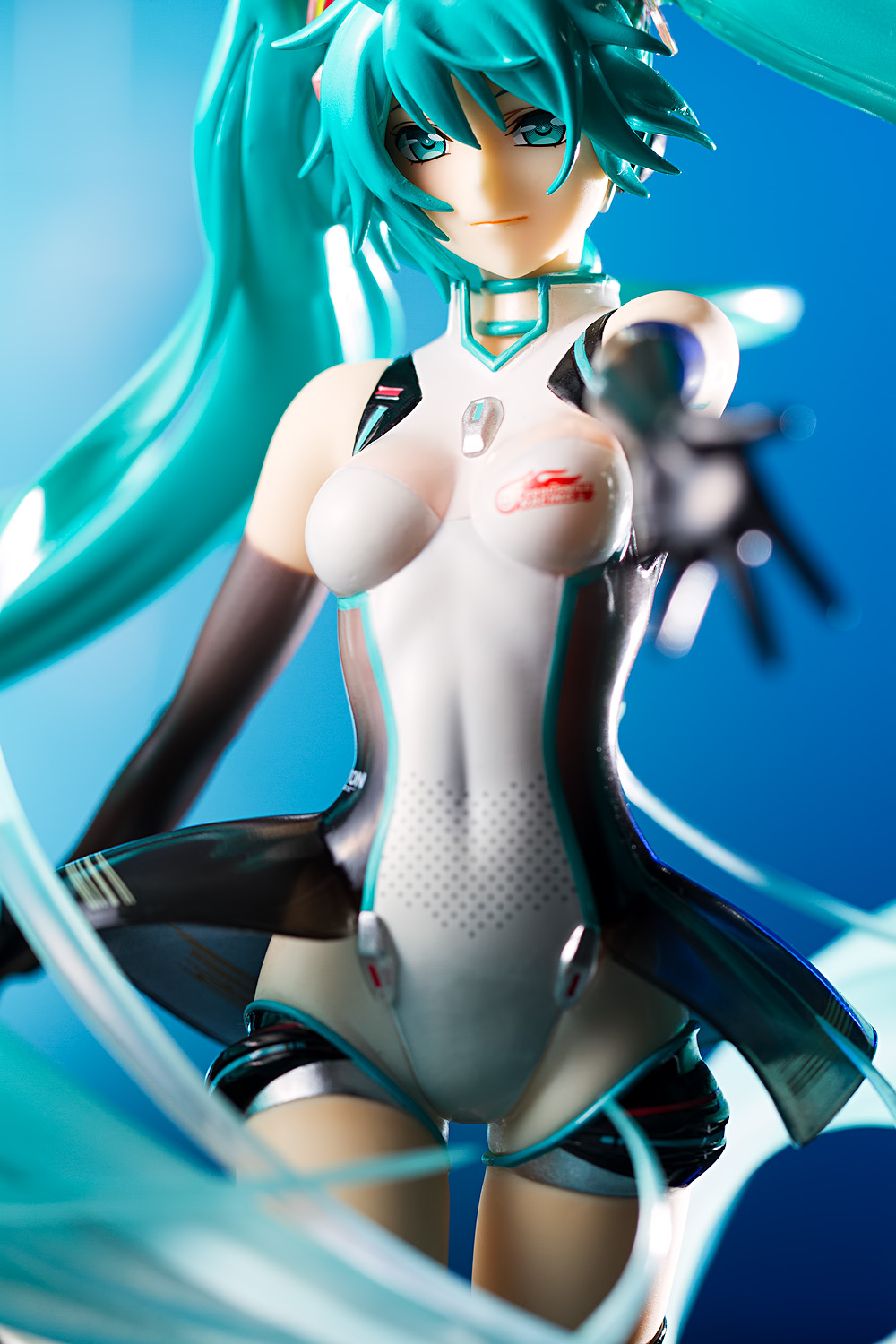
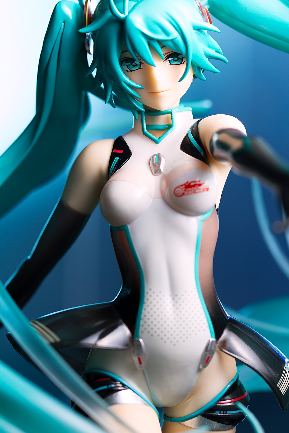
Miku has a relatively mature look here; she certainly appears older than the cheerleader Miku figure. She also has a grown-up body, with long legs, a narrow waist, and prominent hips. But it’s the eyes that I keep coming back to; they are narrowed, giving her a confident, friendly, even seductive look. She has a very pretty face, and my appreciation of this figure is due as much to her expression as to her outfit.
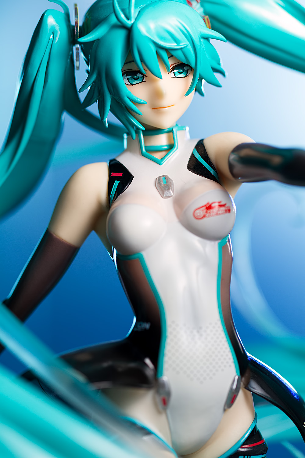
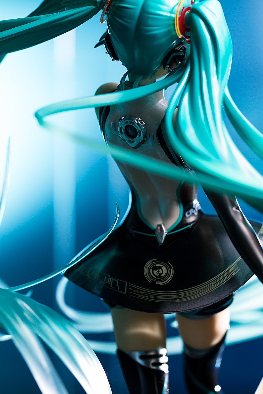
Miku’s green twintails are an iconic aspect of her design, and it seems that no figure sculptor can resist making them swirl around her body. Such is the case here, and the effect adds a tremendous amount of energy to a figure that already possesses a great deal of visual interest. That said, it’s not all good, as a close glance at her hair shows that some of the strands of hair are glued on in a rather conspicuous, almost haphazard manner. It reminds me a lot of another Vocaloid figure, which was also made by a GSC partner company, and I assume this is what is causing the beef amongst figure collectors. I’m not overly bothered by this issue, but it does stand out as a curiously sloppy problem on a figure that otherwise exudes quality.

Even though I might not care much about the whole Vocaloid thing, I like this figure a lot. It’s a very sexy, attractive, and distinctive take on Miku, and that’s more than enough to allay my initial apprehension. Miku figures always leave me feeling conflicted, but I think that I’m going to view Miku’s figures the same way that I do Tamaki Kousaka’s figures, which is to consider the figure individually without worrying too much about the character’s other baggage. I might not like many of her figures – her two upcoming Racing 2012 figures look particularly boring – but this one is a winner.


I don’t understand why this character is so popular as of late, as I’ve been seeing more and more of her everywhere, but it’s a cool figure and the pose of the body and hair is interesting…if not awesome?
Yeah, there’s just an unbelievable amount of Miku figures, Nendroids, etc. I don’t understand it at all. Her design, aside from the pigtails, seems so vanilla.
Agreed.
I do like the colors, but then again, I’ve seen so much of this character it seems a bit stale. It doesn’t wow me as much as some other figures I’ve seen. Might be reaching a point in imagination/creativity for hopefully something to burst.
Yeah, I’m not entirely certain I understand it either, though I have the feeling that her popularity in fan works fuels a lot of her popularity. I’m guessing people see a picture of her that they like and they come to like the character as well without knowing much about her (not that there’s much to know) or where she comes from. Personally, that’s the reason I like characters like Fate Testarossa; I have not actually seen much of her television shows (and to be honest, I’m not a big fan of I’ve seen) but I really like a lot of her fan art.
Besides having an image, Miku has a voice, and as her voice and image are spread around the world through her concerts, her popularity boosting is inevitable. Of course we want more figures of her! I think you should be wondering about Sonico being popular. Who the hell is she?
PS: Now rock with Miku!
http://www.youtube.com/watch?v=Z9mnA-lhk-o
PS2: You got an awsome blog tentaclearmada guy. Always read your reviews.
Super Sonico is the mascot of the Nitro+ software company. She’s been around for a long time and while I like her design, I have to admit I am at a loss to explain why she’s gotten so popular so quickly.
I have to admit I don’t quite understand it either, but I also am not very familiar with the music people have made using her voice pack (to be frank, I would think that the few songs I have heard ought to decrease her popularity rather than bolster it). Then again, I guess a few explanations for her popularity come to mind; anime fans seem to love female singers, she has an agreeable (albeit somewhat generic) appearance, and being that she’s purely an image character, she comes with no personality or history. She compares favorably to a character like Inori Yuzuriha, who is also an attractive female singer anime character but cannot escape her casting as an animated Dollfie Dream in a terrible series.
Well, first you probably need to understand why so many people can go ape wild attending a concert sung by a hologram….
Having said that, most hatsune miku designs have a very adorable look that many people can attach to even without knowing much background.
True indeed. I do not know how her concerts are conducted but some part of me thinks it is really cool that a voice synthesis program can play such a big part in live music, and another part of me thinks it’s really weird that fans are basically screaming and cheering at the speaker system rather than the performer.
hatsune miku is “living” proof that Sharon Apple will happen…
To be fair, there are live performers; the band are all real people. But the audience goes to see the vocaloids (primarily Miku) not the band. I have most of the (big) concerts on bluray, and I don’t even particularly like most vocaloid music. I just think it’s fascinating to see thousands of people go to see their virtual idol. It’s a great sociological showcase.
Indeed! I guess nobody ever went to a Michael Jackson concert to listen to the musicians or the backing vocalists. And as odd as the concept sounds to me, I suppose going to one of her live concerts and cheering her on isn’t tremendously different than going to a sports bar and screaming at the television.
I like her quite a lot, and was sorely tempted to get her, but the glossy sheen on her hair was the killing point, for me. I like the pose, her face, and most of all, her maturity rather than her usual pettan look. I may still pick her up in the future if I see her for a price that is too hard to pass up, but the hair still bugs me. They’ve done it with a few other of her figures that were otherwise excellent, too. (The Tony ver from A while back, for example).
I like what you did with the lighting here. The blue hue to the backdrop/light actually works well for her, too. Which I wouldn’t have thought given her aqua hair. But you made it all work very nicely. A wonderful shoot, as always. And I always enjoy reading your opinions, motivations and thoughts on figures; always blunt, yet totally correct. She really is a cash cow, but sometimes, a cashcow can produce nice things.
I like all those things as well, and I’m pretty disappointed (and a bit perplexed) at the Racing 2012 figure; that sort of youthful appearance isn’t really what I associate with the classic race queen look. But I guess they know what they’re doing and I’m sure they’ll sell a bunch of figures regardless (but I’m going to laugh if it gets discounted a week after release).
Whenever I have a futuristic figure like Racing Miku or Lacia, for some reason I tend to think of blue. I try to picture what I want in my head and somehow, red or green or violet just doesn’t seem right. Sometimes I think orange can work but I don’t really like the way it looks with the green hair; I used an orange-ish background for the cheerleader Miku figure and I wish I hadn’t, because it makes her look sorta like she’s cheerleading on Mars or something. (That said, I don’t think the blue pictures worked that great, either; I struggle to come up with a good, complementary color scheme for Miku when I don’t have that default, futuristic aqua blue to go to. Fortunately, the one other Miku figure that I have yet to photograph won’t require me to find one, because the main reason I bought her is to be a subject for the Machine of Joy.)
I have the figma version of this and I think it’s my favourite iteration of Miku by far. The mature look is great and a nice change for her I think. I agree with most of your comments on the design, it is a sexy outfit for sure. Shame they have gone for the younger look with the 2012 version.
Love your photos!
Thanks! I agree, I think this is also my favorite look for her (I also like her Append design, but I think Max Factory’s figure doesn’t quite present her at her best). Yeah, I’m not digging her more youthful appearance for 2012; plus she looks more like a fairy-themed cheerleader than a race queen to me. (I’m not really digging the face of the GSC version, either; she looks sorta like she OD’d on some really powerful stimulants or something.)
I like this version of racing miku because she actually looks like a woman here instead of a girl. secksy gorgeous.
one of those “call me when you’re grown up” moments.
Indeed! I like her more mature-looking designs better than her younger-looking ones. Well, most of the time … I gotta admit, as much as I rag on Miku, that Real Action Heroes doll of her is pretty cute.
Pingback: The week in figures: April 26, 2013 | Makigumo
I’m just going to come out and say it, This Miku is the only design which I would say I genuinely like! There! I said it! (the 2013 design seems to take many cues from this one tho)
She’s also the only miku in my collection save for a “world is mine” GK which I got mainly due to its rarity than any love for the design (which is rather interesting).
My only complaint for her is the umbrella. I haven’t had any problems in terms of stability for my Miku but it’s practically impossible to keep the damn umbrella up!!
I am completely unfamiliar with her 2013 design, but it will be heartening if they based it more on this version than her 2012 cheerleader-esque version. I remember seeing the 2012 design and thinking it was supposed to be some sort of fairy tale princess adaptation, with her skirt and her headgear resembling a tiara, and I was mystified to find out that that was the design for the racing team mascot.
You know, I never was a big fan of the World Is Mine figure … I remember tons and tons of people went ga-ga for it but it never really moved me much. The picture frame gimmick always struck me as being rather silly, too.
I haven’t had any problem with her umbrella falling out but I’m still hoping her pegs are reinforced or something; I can’t believe how much this figure wobbles if you move it around (not that I ought to be moving it around much, but I’ve currently got it on my desk while I figure out which figures I want to box up to clear out some shelf space for her, and so it gets jarred more than it otherwise would).
http://img.goodsmile.info/cgm/ecommerce/goodsmile/images/large/41677cd9a45e196cf725c8cf8b7cf9c5.jpg
They went back to the “cute” miku look rather than the mature one tho but the overall design has a simplistic elegance which I thought the 2011 version had as well.
“world is mine” miku did nothing for me either but the one I snapped up wasn’t the framed one but the kiking GK where she’s sitting on a chair with her legs crossed.
Prob won’t be buying another Miku for a very long time tho…
Aaaaahhh, it’s one of those stupid little crooked hats … God I hate those. I don’t know why I hate them but I hate them. Rest of the outfit is pretty cool, though I wonder why she has talons on her hands. I can’t help but think that her heels look a bit like little wine bottles, too.
I love this new version of her as opposed to the orange pit crew version of 2010. Also picked her up a few months ago due to another factor……….she’s been co sculpted by Chieri(anything with the Chieri fingerprint I make it a point to pick up). If I got any complaints, its the fragility of her hair and the lack of a camel toe hehehehe. If I have anything else to complement her, its also the hair lol! How Chieri and Nakayaman pulled this off is outstanding! Wished her figma version wasn’t that expensive.
Yeah, I was not a fan at all of the pit crew figure. That figure’s face was … well, not something I liked very much. I did not actually know Chieri sculpted this Miku but that goes a big way towards explaining why I like it so much. Though as you say, a little more cameltoe would’ve been appreciated. I had actually thought to put this on my five favorite figure list last year and in retrospect, I think I should have.
Speaking of which……another Chieri work:
http://www.amiami.com/top/detail/detail?gcode=FIG-MOE-9257&page=top
Knowing you, you’ve probably pre ordered her already right……..the futuristic S and M ensemble simply blows away her previous Megahouse version.
Actually I have not, though that’s entirely due to laziness on my part, as I’m definitely going to order that figure. I don’t know what the context is of that outfit (if there is any; as far as I know it’s just the costume she wore in one of her concerts) but I absolutely approve.
Great job on this review! I really liked what you did with the backdrop. It’s simple but fits the figure very well. I dug the silhouette shot too.
I didn’t care for the other Race Queen style Mikus but this one looks sleek and futuristic.She’s still a little too close to the conventional Miku for me, though. I’m gonna go for the Deep Sea Girl Miku and maybe that Princess Knight one from WonFes last year.
Thanks! On that silhouette shot, I think I ought to have pulled her umbrella out, it is bugging the hell out of me now, looking at it.
I like how the underwater Miku figure’s hair looks a lot like tentacles. If Miku had more of a relationship to tentacles, I’d probably be more fond of her character.
“a cybernetic prostitute ” Well, unfortunately not, give the girl some boobs already XD
Haha, nevertheless it’s a cool figure, I like the futuristic grid girl look and the happy sadist expression of her face, I love slanted eyes on figures.
In your review I finally realized what bothers me on this figure, her fringe is chunky, I don’t like how these thick strands cover her eyes and face like that. If soomeone had asked me I had made them a few mm thinner ^_^ That would actually be my only complaint about her.
The new future Grid Miku looks cute and funny with her crazy hyperactive eyes, as if she had taken too many funny piils. But Miku doesn’t appeal to me enough, I tried it two times, but ended up selling them a few weeks later.
Yeah, it’s pretty bulky, and one of the reasons I didn’t put this figure on my five favorite figure list for last year is because I thought her chin looked too large. I didn’t understand why I thought that until I noticed how much of her forehead is covered up by her hair.
Haha, I gotta admit, I’m kinda thinking of offloading some Miku figures, too. I would definitely like to sell off my older Max Factory Miku; it’s not really doing much for me now.
I preordered this MIku, but cancelled her and I am still on the fence on whether I should pick her up.
I am not a Miku person, but I do own two of her and like her design. I own the 2010 Pit Crew/Race Queen and the 2011 Race Queen figma. Because I own the figma I decided against this one. I am not a fan of owning two figures of the same design whether they are different scales or not.
This figure still tempts me though. I love her eyes and her mature look. She has a great body and the colors work really well with her. That is in stark contrast to 2012, which I hate. I cannot understand why 2012 has the stupid young face and I think she looks like a clown with her multi-colored thigh-high boots.
Nice photoshoot as usual.
I think she’s still in the bargain bin at Amiami, and I think she would be worth the money if you like the design. I’ve got some level of apathy – maybe even disdain – regarding Miku but I really like this figure a lot. In retrospect, I probably ought to have put this fifth on my favorite figure list from last year.
Yeah, I’m really not digging 2012 Miku at all … though I’ll be curious to see if she gets bargain binned soon after release, too.
Pingback: GSC 1/8 Racing Miku 2012 ver. | Reflective Boundary
How do you feel about some of the newer Racing Mikus coming out now, in particular the 2013 Super Sepang Miku and 2014 Good Smile Racing Miku? Both seem to take a very different direction in terms of her visual design, and I think they both look quite good, going from the preview photos.
http://myfigurecollection.net/item/198428 and http://myfigurecollection.net/item/198541
Erm, I really should check the pending comments queue more often. Sorry about that. I kinda like the FREEing version because of the skin exposure but I’m not a big fan of the double bun hairstyle (I wasn’t a big fan of Chun-Li’s character design or of Princess Leia’s hairstyle, either). I don’t dig the 2014 Racing figure as much, not really because of the adapted character design but more because her outfit seems to be based off of a school swimsuit, which I’m also not a huge fan of. I actually like the Max Factory figure, with the two-piece outfit and the odd facial expression, but the price tag is really huge, particularly for a 1/7 scale figure (and especially with the way MF figures tend to hit the bargain bin right after release).