Previously, we looked at how the direction and size of a light source affects the appearance of your photographic subject. Today we’ll look at how the distance between the light source and your subject impacts your photographs and how you can creatively take advantage of this factor. We’ll start off our exploration with the most friendly and accessible method that anyone could ask for: with a mathematical formula!
The Inverse-Square Law
Cribbing from Wikipedia, an inverse-square law is any physical law stating that a specified physical quantity or intensity is inversely proportional to the square of the distance from the source of that physical quantity. Typically any discussion of the inverse-square law is followed by a diagram showing how it works, but since there’s one on the Wikipedia page, I’ll dispense with it. The inverse-square law is not too difficult to understand, but since many people have a phobia of any form of mathematics more complicated than arithmetic, I’ll deliver the good news and say that you don’t really need to memorize the scientific definition.
The main thing you should take away is that the intensity of light diminishes as it travels further away from the light source. You probably already understand this; anyone who has ever used a flashlight or turned on a car’s headlights knows that light loses brightness over distance. However, what the inverse-square law tells us is that light loses brightness very quickly, possibly much faster than you might expect. This can cause some serious complications in photography as well as opening up certain possibilities. To illustrate this point, we’ll look at some specific examples in which the inverse-square law comes into play.
Subject and Background
One of the most common situations in which the distance of light becomes significant is when you have a background in your image and you want to control its brightness relative to the exposure of your figure. We’ll demonstrate how this can be controlled with this set of images featuring long-forgotten Shuraki girl Liu Meifeng. The background is located about 30 centimeters behind the subject and the light source was placed approximately 120 centimeters, 50 centimeters, and 15 centimeters from the figure.
Light distance: 120 centimeters | 50 centimeters | 15 centimeters
At 120 centimeters, both Liu Meifeng and the background are brightly lit. When the light is brought in to 50 centimeters from the figure, the background gets darker, and when it’s brought in to 15 centimeters, it becomes even darker still. This is because the relative distance between the subject and background is much higher than that between the light source and the subject. Looking at it mathematically, at a distance of 120 centimeters, the intensity of the light hitting Meifeng is 1/1202, or 1/14400; the intensity of the light hitting the background (placed 30 centimeters behind the figure, so it is about 150 centimeters from the light source) is 1/1502, or 1/22500. Dividing the figure’s light intensity by the background’s light intensity, we find that the figure gets about 1.5 times more light than the background; looking at the image, that seems reasonable, as the exposures of the figure and the background look similar. Let’s compare that with the amount of light hitting the figure from a distance of 15 centimeters. Following the same procedure, the light hitting Meifeng is 1/152 and the light hitting the background is 1/452; dividing the former value by the latter, we find that Meifeng is getting 9 times more light than the background, which is why the background becomes so much darker.
If the numbers scare you, you can just remember this simple, though somewhat non-intuitive, rule: if you want your background to be darker, move your light closer to your subject.
One other thing to note from this set of images: notice how the shadows on Meifeng’s body get darker as the light is moved closer to her. This effect is particularly noticeable on her hip and on the back side of her left arm. We’ll talk more about this in a bit.
Two Points on a Subject
The inverse-square law can also rear its head without the background being involved. Case in point:
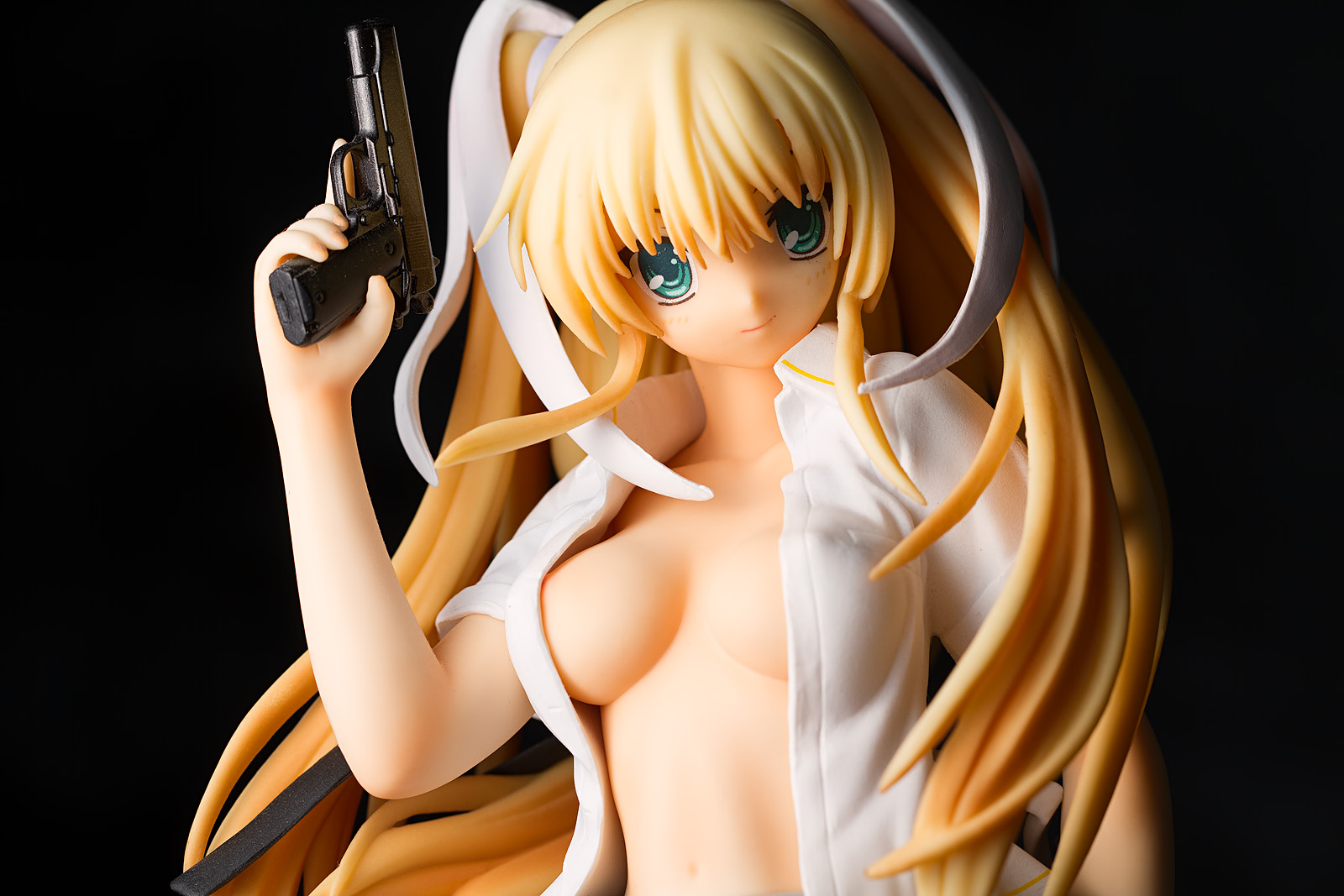
Here, the key light was placed off to camera left (the figure’s right side) and is shining on the side of her head. However, the light source is placed quite close to the figure and because Sena’s right arm is closer to the light, her elbow becomes the brightest element in the image, and it becomes very apparent that her right arm is much brighter than her left. This is not what I normally want; usually, I want the face to be brighter than the rest of the body.
Here’s a more subtle example; the outside of Saya’s right forearm has a hotter light intensity than any other part of her body.
Multiple Figures
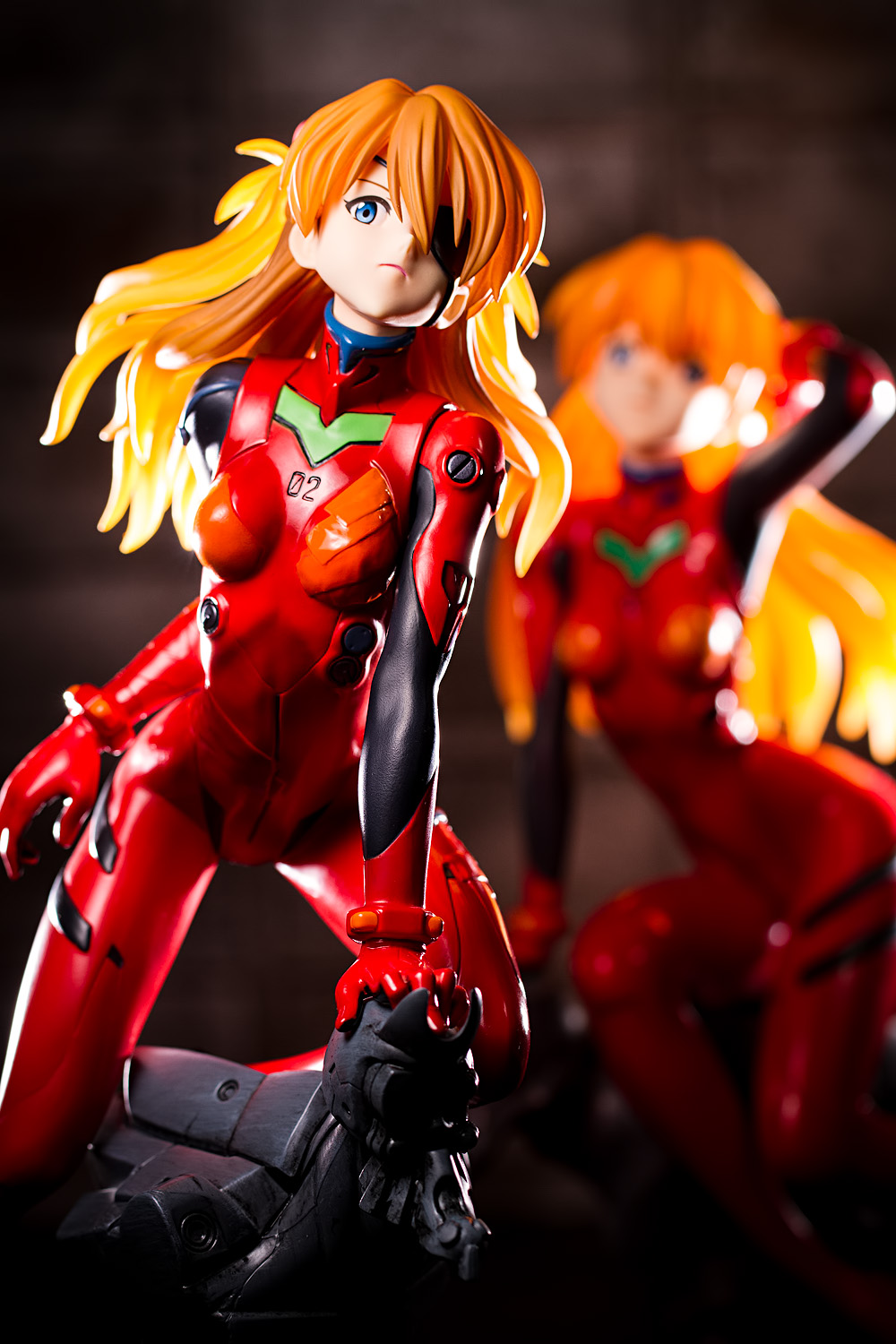
One of the more maddening situations that the inverse-square law influences occurs when you are lighting more than one subject:
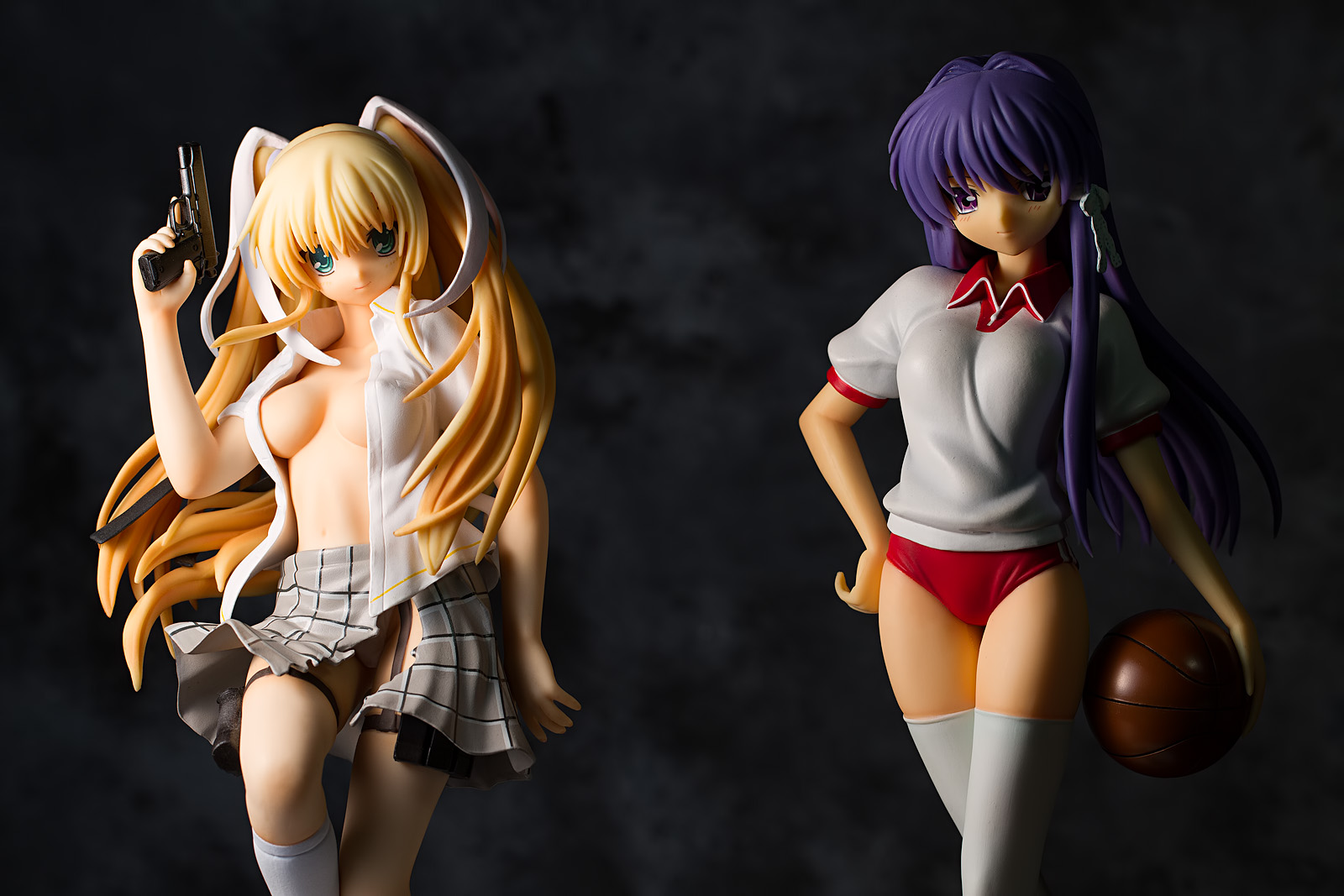
You can probably guess what happened here; the light is off to camera left, relatively close to Saya Tokido, which means it is rather far from Kyou Fujibayashi. As a result, Saya is properly exposed while Kyou is mired in murkiness. Exposing the image for Kyou would obviously cause Saya to become overexposed. What can you do about this?

One easy thing you can try is to move the figures closer together. This brings the light intensity on each figure closer together and is also usually more appealing from a compositional standpoint. However, you may not be able to do this, depending on the construction of the figures you’re shooting. What else can you do? The obvious thing to do is to move the light further away; that will even out the exposure on each figure. However, you might wonder whether that will cause the light to become harder, as moving it away turns it into a relatively smaller light source. Indeed, that is what will happen; if you want to maintain the same level of softness, you’d have to use a bigger softbox (or other diffusive device). Photographic lighting often involves making compromises, and there is no free lunch to be had here.
Or, well, actually, there is; what I usually do is fix up the exposures in post-processing software. For example here’s what that Sena Kashiwazaki photo looks like with Lightroom’s graduated filter applied to her right arm with a 0.3 stop exposure reduction and a -70 Highlights value:
Without brightness reduction | With brightness reduction
Lightroom users will note that the adjustment brush would obtain more localized and accurate results, but the graduated filter does get the job done quickly.
Alternatively, you could add in another light to light up your second subject:
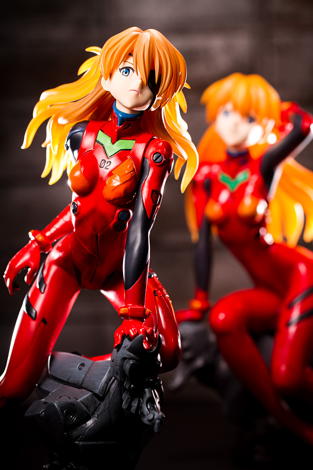
Here we have a version of the header image (which was basically just me noodling around) with an overhead light added into the mix; this light causes the background Asuka to look about as exposed as the foreground Asuka.
Controlling Falloff
Thus far we’ve made it sound like the inverse-square law is something that will plague and bedevil your photographic pursuits. Indeed, the falloff of light that we’ve described can present significant complications, but it also provides for interesting creative possibilities. For example, we’ve talked about how the near side of the figure can become overly bright; by the same token, you can control how dark the far side of the figure appears. For example:
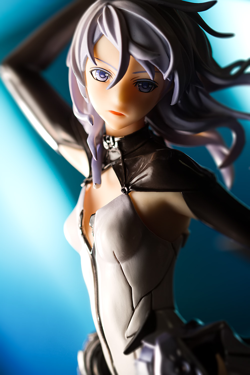
In this image, the light is coming from the left side of the image; placed fairly close to the figure, the shadows on the far side of Lacia’s body are deep and rich, adding dimensionality, drama, and, in my view, appeal. In my experience, not many people seem to take advantage of this phenomenon with their figure photos, and thus this is one thing that can really lift your pictures.
Things You Should Take Away
This topic can be a little counter-intuitive, so I’m going to wrap it up by providing some straightforward answers to some common situations.
I want my figure to be brightly lit but the background to be dark, so that the contrast adds drama and focuses attention on the subject.
- Move your light close to your figure. If you can, move your figure away from the background (note that this will not always be possible, depending on compositional concerns).
I want my figure to be lit at about the same value as the background, which gives it a more natural look.
- Move your figure closer to the background if you can, and move the light further away. Depending on what sort of background you’re using, I find that shooting with a narrow aperture can also emphasize the realism of the shot.
I want to have deep shadows on my figure, instead of flat lighting.
- Move your light source close to the figure; I often like to place it as close as I can get it without it appearing in the photograph. Using a longer focal length will allow you to get it closer (as such a lens obviously provides for a narrower field of view). Using a split light style will also emphasize the shadows, as they will appear on the opposite side of the figure, rather than being cast behind the figure (as they would be if your light source were placed closer to the front of the figure).
I want to light a group shot.
- I really hate lighting more than one figure; the problems we’ve discussed here are a big reason why I seldom take group shots. However, when you do need to include two or more figures in a shot, there are a few things you can do. We’ve mentioned moving the light source further back to even out the light intensity on each figure. If one figure is wearing dark clothing or has darker skin, placing it closer to the light will cause the difference in brightness to be less noticeable. Using a fill source with the figure that is furthest away (but not on the one that is closer) can also even out the brightnesses.
Personally, I usually just light each figure separately; the left-side figure gets a split light to camera left, the right-side figure gets a split light to camera right. It certainly doesn’t look natural, since each figure is being lit from a different direction, but it gets the job done.
This wraps up our discussion of the properties of light; next time, we’ll look at shaping and controlling light with light modifiers.


All that math. I understand the inverse square law just fine, but I still hate seeing numbers. My mind likes to just switch off when people get mathy. I have a friend who is a chemist, and absolutely adores math as the core of everything, and gushes about it at times. I like to kick him.
Some interesting stuff results from it, anyway. Some of it I have experimented with. I usually prefer to keep lights closer to minimise spill, as I dislike light backgrounds, generally speaking. (given I just use plain colours, I’d rather they be vague bokeh). It is nice to see it explained well, once you get past the dreary math.
The highlights on Sena’s arm you pointed out is something I’ve struggled with on a few shots, but I generally find turning figures slightly or moving the lighting usually resolves it. Some figures, though, particularly ones with glossy surfaces, can be a real pain for reflective blowouts. Flags and snoots have resolved some of that, too. But since my lamps are square, it’s a pain to snoot them (I’d actually have to cut and build one, not simply roll some cardboard around it). Still, maybe just moving lights a bit further away will help.
Yeah, I know a lot of people start zoning out once they see numbers and equations, so I tried to keep that stuff to a minimum (which is why there aren’t actually any equations in the post; I figured just seeing the symbols would terrify people). I studied engineering in school so I’m used to this stuff, but then, I know I start zoning out when I see certain subjects (like with pretty much any discussion of philosophy … and also whenever I see anyone getting deep into firearm or Fate/stay night trivia).
I use paper to build my snoots; it’s flexible so it works well for wrapping it around large objects (like a desk lamp) or oddly-shaped lights (like a flash head). I bought a pack of black construction paper a few years back and it’s worked very well. Back when I used desk lamps, they were basically disposable; I’d tape them on and when I was done, I’d rip them off and toss them. Now, I use some snoots made out of ordinary printer paper wrapped in black tape to give it some durability; I put some velcro tape on it so that I can easily attach it to the flash head; I’ve also put velcro on the outside of my main softbox so that unrolled, I can stick it to the side so that it works as a flag.
I’d have gone in to the sciences, if it weren’t for all the math involved. I love science, and the results of much of it, but I can’t help but dislike numbers in general. I put it down to traumatic education, I think. Never had a good teacher for it in any year or at any school. And my loathing for it is too engrained to bother trying to learn now despite the infinite resources of the internet.
Snooting and flags and other modifcations is something I’m really going to have to work on, because controlling light is vital for a good shot. I have little patience for all of the fiddly little details, though, so usually I just slap a figure on my desk, broadly light it then get a few snaps and select the one that I like most to crop/upload. Which is why all my photos are crappy. The figure photo I like most of everything I’ve ever shot was actually with my P&S. Took no effort at all, yet came out very pleasingly. I’ve been unable to replicate the look with my SLR.
http://myfigurecollection.net/picture/130666&ref=user%3AAsako — I know the levels are off, but I still prefer it to anything I’ve done since. Even though I understand photography now. Sad times.
I really wanted to study biology, but the school I went to didn’t have much of a zoology program, which was my main interest; they were mostly microbiology-based, which I wasn’t too enthusiastic about. More pertinently, I had decided by then that going into biology wouldn’t lead to very good job prospects, so I decided to do computer science instead. (Then I found out – a couple days before classes started – that CS enrollment was capped and that I wasn’t going to be able to get in.)
I think that demonstrates how equipment can play a small role in making an attractive picture. I try not to talk too much about gear – though I’ve got a funny story about that, which I will write about when I write that camera post – and I find it somewhat depressing when people can talking about cameras and lenses. There’s a photography club somewhere on Tsuki-board where people pretty much talked all about gear. Last time I checked it, there was this guy who couldn’t stop talking about his medium-format digital camera and how much he wanted a Leica M9 and I was like, “Riiiiiiiight.”
Biology was always interesting. My mother was a vet-nurse and did a lot of lab assistant work which she adored, which probably led to my interest. But with all the math required, I ended up shunning such pursuits.
And yes, the photography club on MFC is… sadly gear oriented. I was made a mod of it (without being informed, just noticed one day I was a mod) though I’ve never done any modly type stuff. I just participate in conversation. Largely trying to open people’s eyes to other options, not blindly going Canikon (which, despite some of my rants, I have no issues with, just the blind consumerism, people never looking at anything else, just going for the brands they see).
I recall someone talking about their MF setup. It was really quite rude, especially considering their photos were generally nothing special. A decent photographer could do the same with a phone or any P&S. MF certainly allows for a lot of cropping to get the framing you want, though. 😀
I think one of the reasons I liked zoology was that there wasn’t a lot of math involved. I know back in biology class, I never liked stuff like Punnet squares and other genetic stuff. And I really never liked chemistry much. I barely passed first-year chemistry, and I only passed because the average class grade was somewhere around 35 or 40%.
I happily admit that whenever people ask me which camera they should buy, I tell them to buy a Canon or Nikon camera. The other camera makers make fine products, but there’s no chance that Canon or Nikon will exit the camera business in the near future, and none of the other companies can make that claim.
I have this rule whenever I look at photo forums; if the person lists what camera they used and if there’s no photographic evidence to prove otherwise, I immediately assume that they are clueless. It’s been borne out far more often than it has not.
Group shots can be tricky indeed. Although I prefer figures in series and would love to try couple/group shots for some of the characters, I have rarely done so in practice so far, because of my limit number of lights and size of the background setup. More subjects more compromises. Great to see that you can explain these ideas with math. I tried to explain the same thing, control the fore/background brightness ratio by light source distance, to one of my friends not long ago and I know how it feels like when your audience don’t quite accept math 🙂
I’ve run into the same issue; I don’t have a large shooting space and most of my backgrounds are only large enough to comfortably accommodate one figure, so those are other reasons I avoid shooting groups. I also don’t like shooting full-body shots most of the time, and since group shots are usually most useful for comparing two or more figures, a full-body shot is almost mandatory, which is another reason why I don’t do them often. And then there’s the depth of field issue …
Yeah, I’ve seen a lot of people express their distaste of math. Even back in school, I knew a lot of people who didn’t care for math … heck, I guess I’m in that category myself, given how many times I had to repeat freshman calculus.
Great posts this might help a lot, I can’t help it, these explanation post give a kind of another aspect to your personality as blog author. I think of you as a open minded person, but now I also think that you are also extremely kind for sharing your knowledge and writing about this stuff in understandable manner.
Im an math idiot, but I can at least understand these numbers here haha
Actually I haven’t thought about an Inverse-Square Law. Well, I saw it with my eyes what happened when I moved the lights around, but nothing was actually planned. That will change now.You could also write about to deal with hard to capture figure faces next.
btw I recently received this Fate from Gift, she’s totally gorgeous, like your shots already implied ^^
Thanks XD super rats’s post on lighting played a huge role in my own interest, and while I doubt these posts will have the same impact, it’d be nice if they got a few people to take a more serious interest in photography and creative lighting.
Fate really is a super-cute figure; they did a great job with her. Making her 1/4 scale was a great idea too, not just because I like big figures, but also because it lets her stand out much more than she would if she were smaller.
A well written and informational set of tutorials on lighting for figure photography. I really like your writing style and your figure reviews. It’s awesome that you’re sharing your knowledge with the rest of us – thanks!
Thanks very much! I’m glad that you liked these posts.