Perhaps one of the most overlooked aspects of figure photography, at least when starting out, is the direction of light. Speaking for myself, when I was beginning, my only concern was achieving soft light, and the extent of my concern for direction was that I vaguely pointed the light at my figure without really paying attention to what I was seeing. That, of course, was a mistake; direction of light plays an enormous role in the character of a figure photograph. Let’s take a look at some of the considerations involved when aiming a light at your figure.
On-Axis Lighting
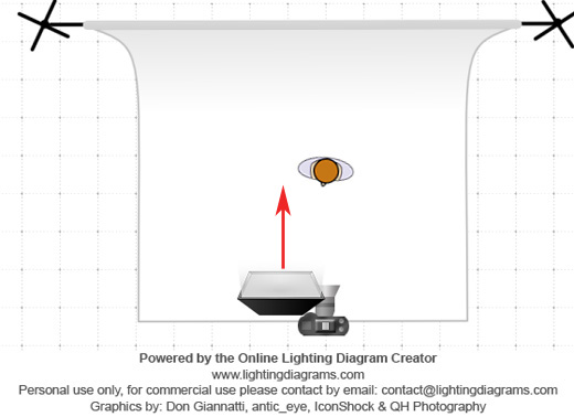
On-axis lighting is a light that emanates from the level and direction of the camera lens. The most familiar and accessible source of on-axis light is, of course, the pop-up flash built into most cameras. Other sources include hotshoe-mounted flashguns, macro flashes and off-camera lights; one possible placement is behind the photographer, using a very large light source (large enough to throw light around the photographer and the camera). The lighting diagram shows how I did it, which is by holding up a flashgun next to the lens barrel.
On-axis light gets a bad rap and deservedly so, most of the time; this type of frontal lighting decimates shadows, leading to a flat, unexciting look devoid of depth and contrast. Generally speaking, you will want to avoid using this type of lighting.
That is not to say that on-axis lighting is always bad; in fact, there are a few lighting styles such as ring flash which are occasionally fashionable. Also, while on-axis lighting often makes for a poor key light, it can make for a very good fill source, particularly when used in a subtle manner. That said, while on-axis lighting is perhaps the easiest light to employ, it often requires a good deal of skill and experience to pull off well.
Angled Lighting
In this setup, the key light is placed at an angle to the subject, typically around 45 degrees or so. The light falls on one side of the face, leaving the other side partially shadowed. The shadows create a sense of depth and dimensionality, giving this type of lighting a more pleasing look than on-axis light.
The vast majority of portrait photography uses this type of lighting direction but to be honest, it’s not my favorite style for lighting figures. Anime figures typically have very flat, featureless faces and even angled light can deliver a similarly flat look. However, this type of lighting is quite flattering and presents a fairly friendly, innocuous appearance, and thus could work quite well when applied to a correspondingly compatible figure, such as a cheerful schoolgirl. I looked around my collection for such a figure but I actually own very few figures of cheerful schoolgirls, which is likely a big reason why I don’t use this style that often.
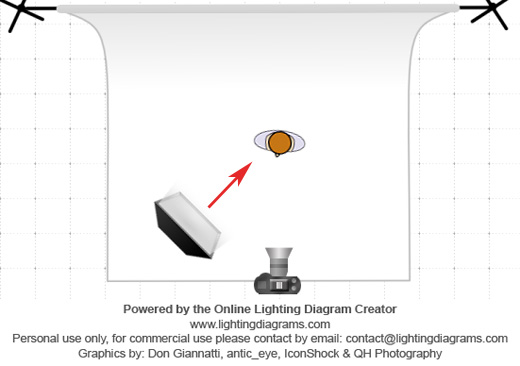
Split Light
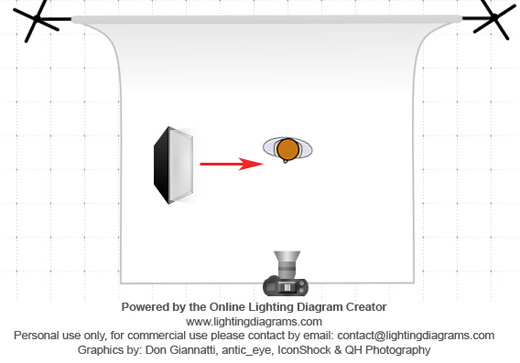
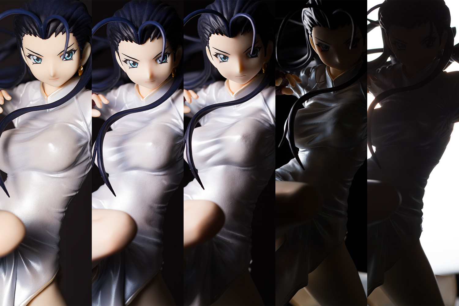
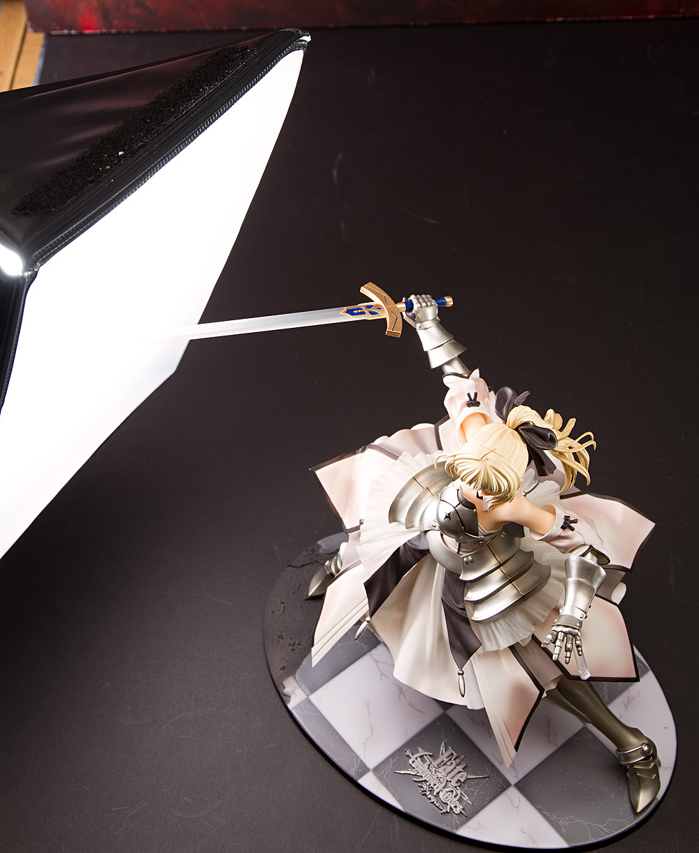
A split light, or side light, style places the light perpendicular to the subject, or very nearly so. With this type of lighting, the near half of the subject’s face will be lit and the far half will be shadowed.
This type of lighting setup is not commonly used in portrait photography, particularly not with female subjects, as it tends to be a dramatic, high contrast type of light that projects a lot of attitude. However, that’s usually what I’m looking for and as such, this is my go-to style of lighting. Indeed, I would guess that better than 95% of my pictures feature a split light style. I have occasionally attempted to experiment with a shallower angle of light but I inevitably find myself gravitating towards the split light look. One reason why this sort of light direction works well with figures is because, as mentioned earlier, anime figure faces are so flat; with a large enough light source, enough light will spill over to the far side of the face to make this type of light appear more natural.
Another advantage to consider is that because this form of light is not aimed at the background, it is easier to control spill. This is particularly useful if you want a dark background, or if you are lighting the background separately.
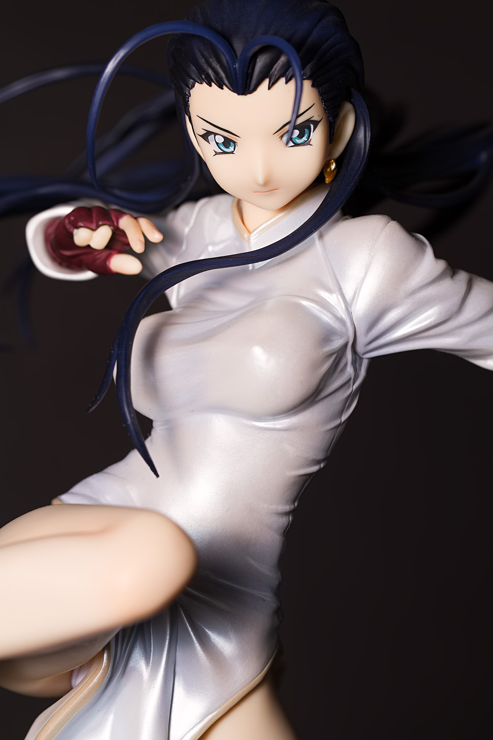
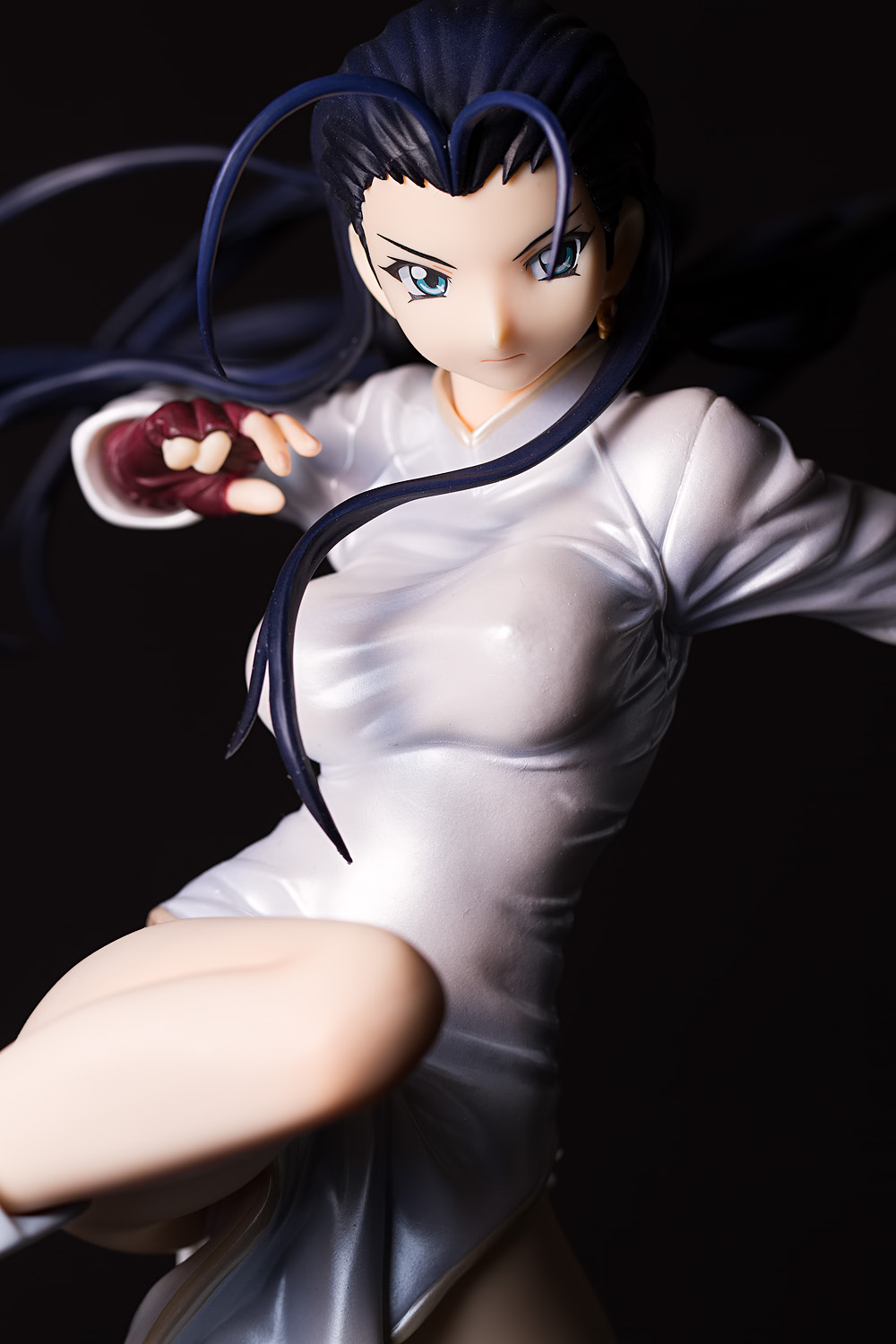
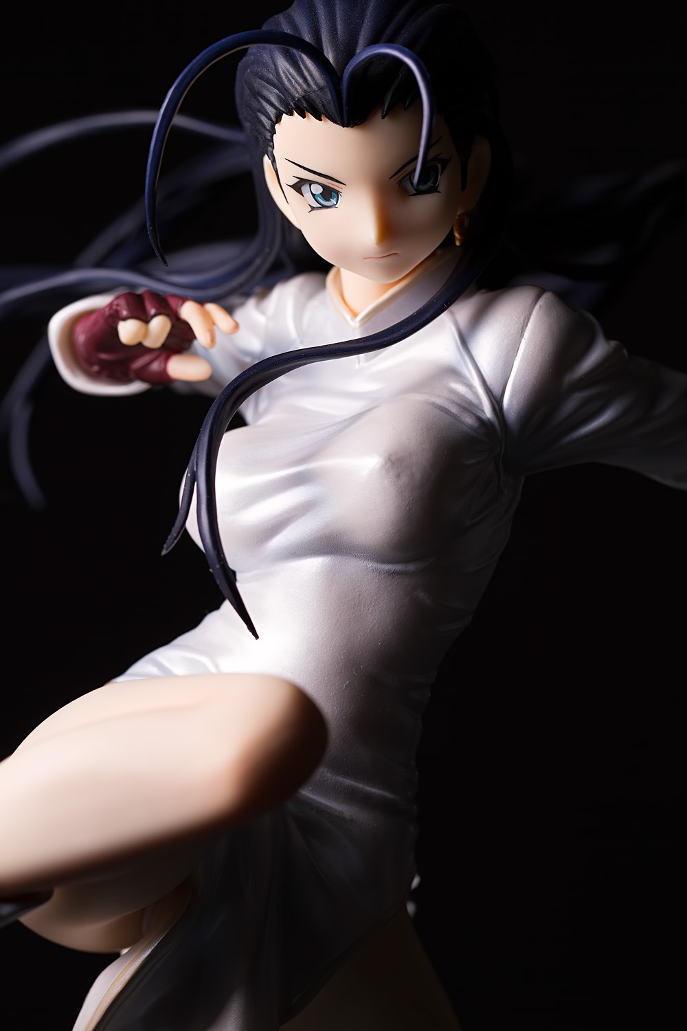
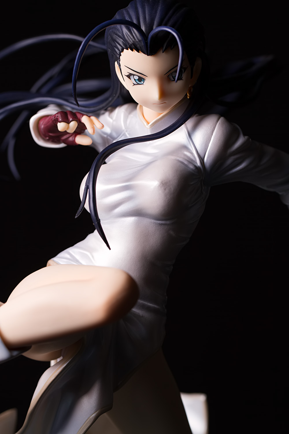
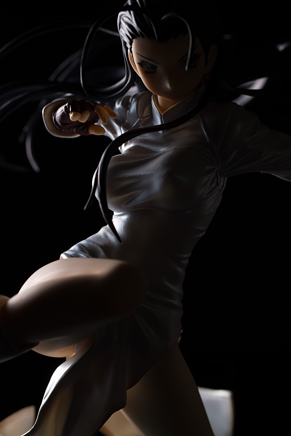
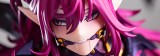
However, this type of dramatic light may not be the best choice for many figures, and you might prefer a lighting style that offers more even coverage and a less intense appearance. In such cases, fill can be used to soften the impact of this lighting style. Here is Myousai with no fill, a fill card placed opposite of the key light, and a fill card placed in the ground in front of the figure, very slightly inclined back at her to toss a little more light at her face:
No fill | Fill placed opposite | Fill placed in front
With a figure like this, I think I would prefer to use no fill; Kakouen Myousai projects menace and hostility, and the deeper shadows emphasizes those qualities. However, that is a stylistic consideration, and the use of fill would absolutely be justified if one prefers that look. There is no right or wrong answer here; there are only subtleties.
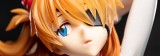
Here is another example:
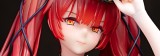
No fill | Fill placed opposite | Fill placed in front
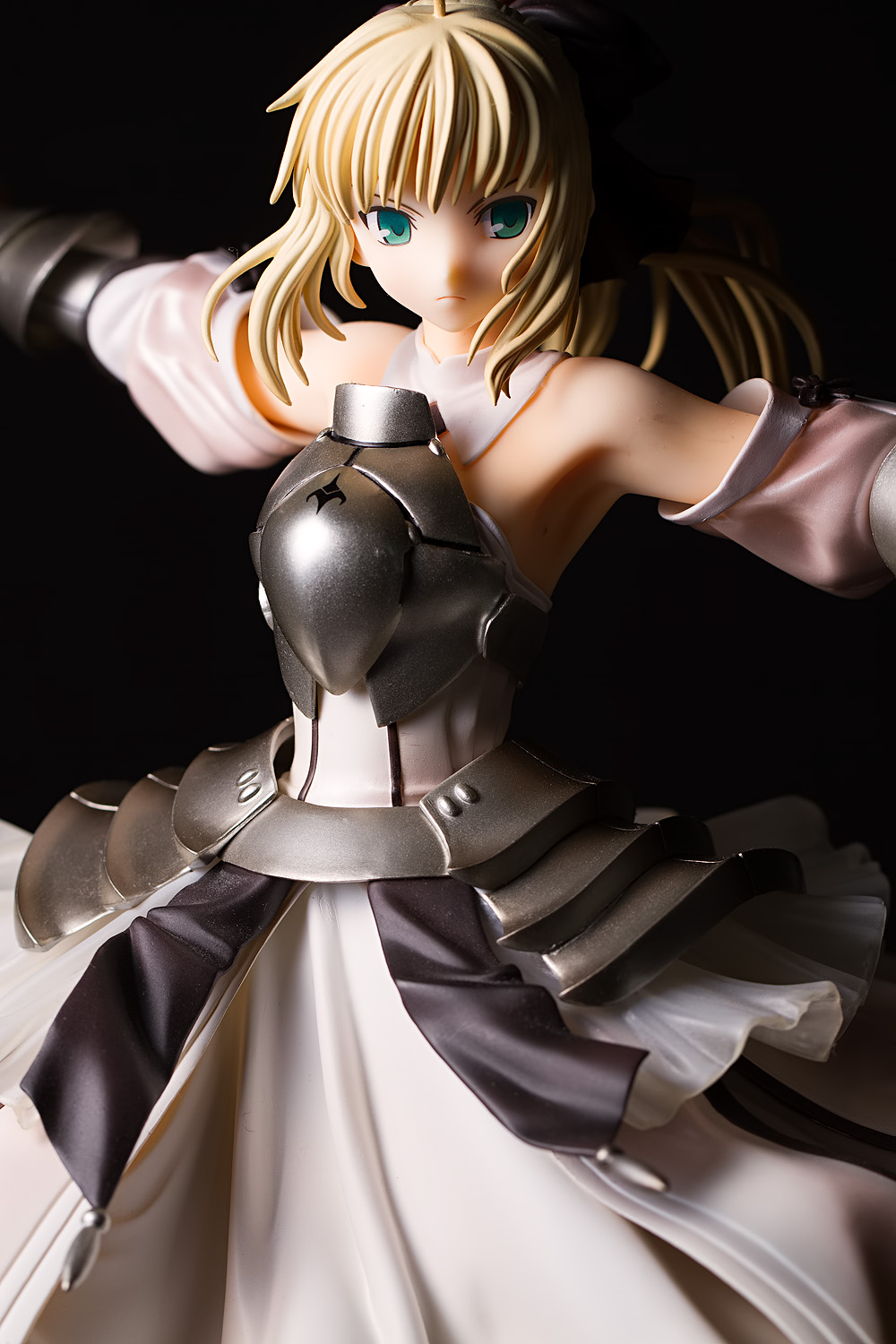
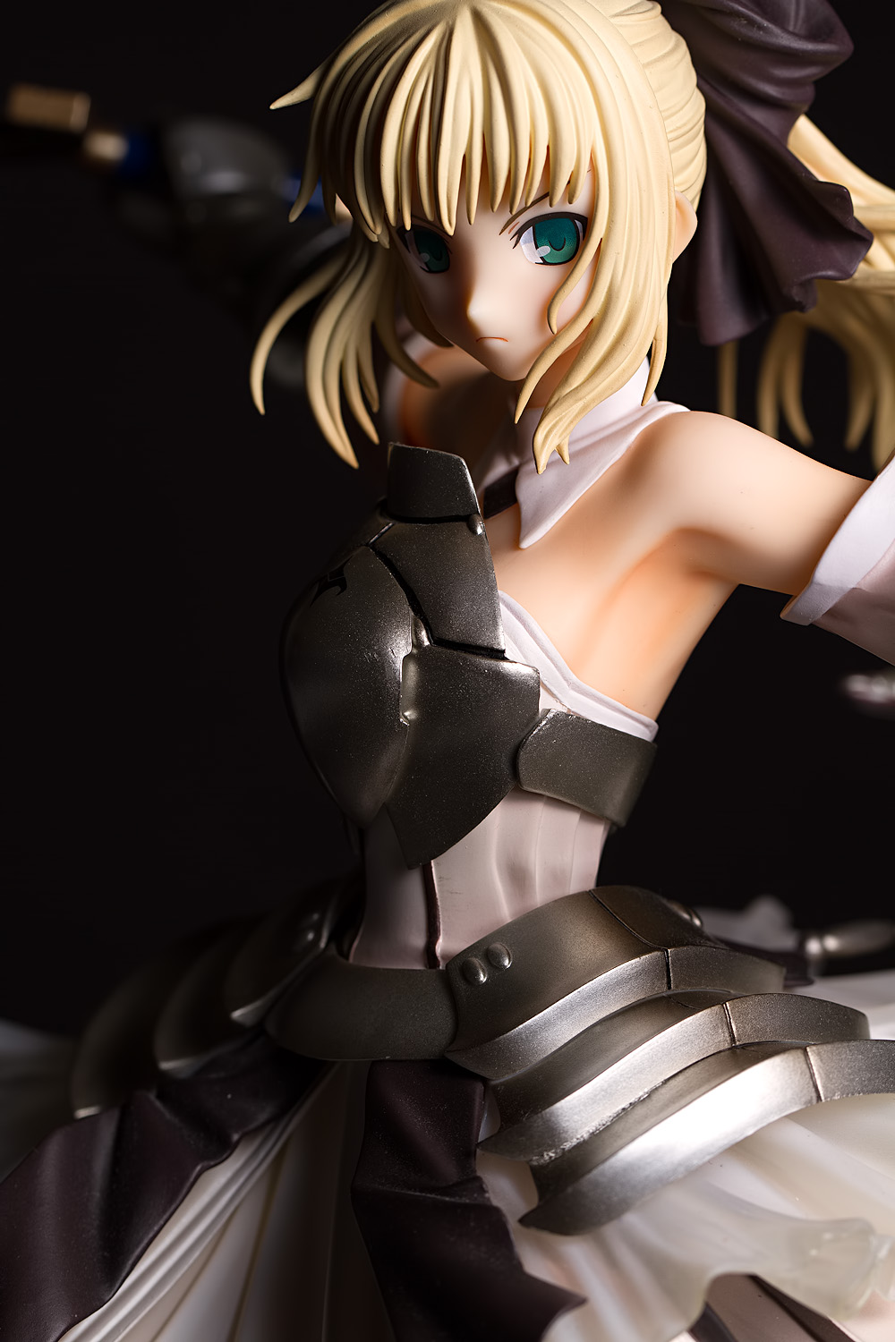
With Saber Lily, I think that the situation is a more ambiguous. Certainly she projects the same type of hostility that Myousai does, being that she is wearing a fearsome scowl and is clutching a big sword, but she also exemplifies elegance and femininity, and if those are the traits you wish to express, then I think that using fill would be the appropriate decision. Placing the fill card on the opposite side greatly lifts the shadows, revealing shape and detail, particularly in her ponytail. Placing the fill in front of the figure strikes an in-between look, bringing up the shadows a little bit but not nearly as much. However, the differences between this look and no fill are obvious – subtle, but obvious.
No fill | Fill placed opposite | Fill placed in front
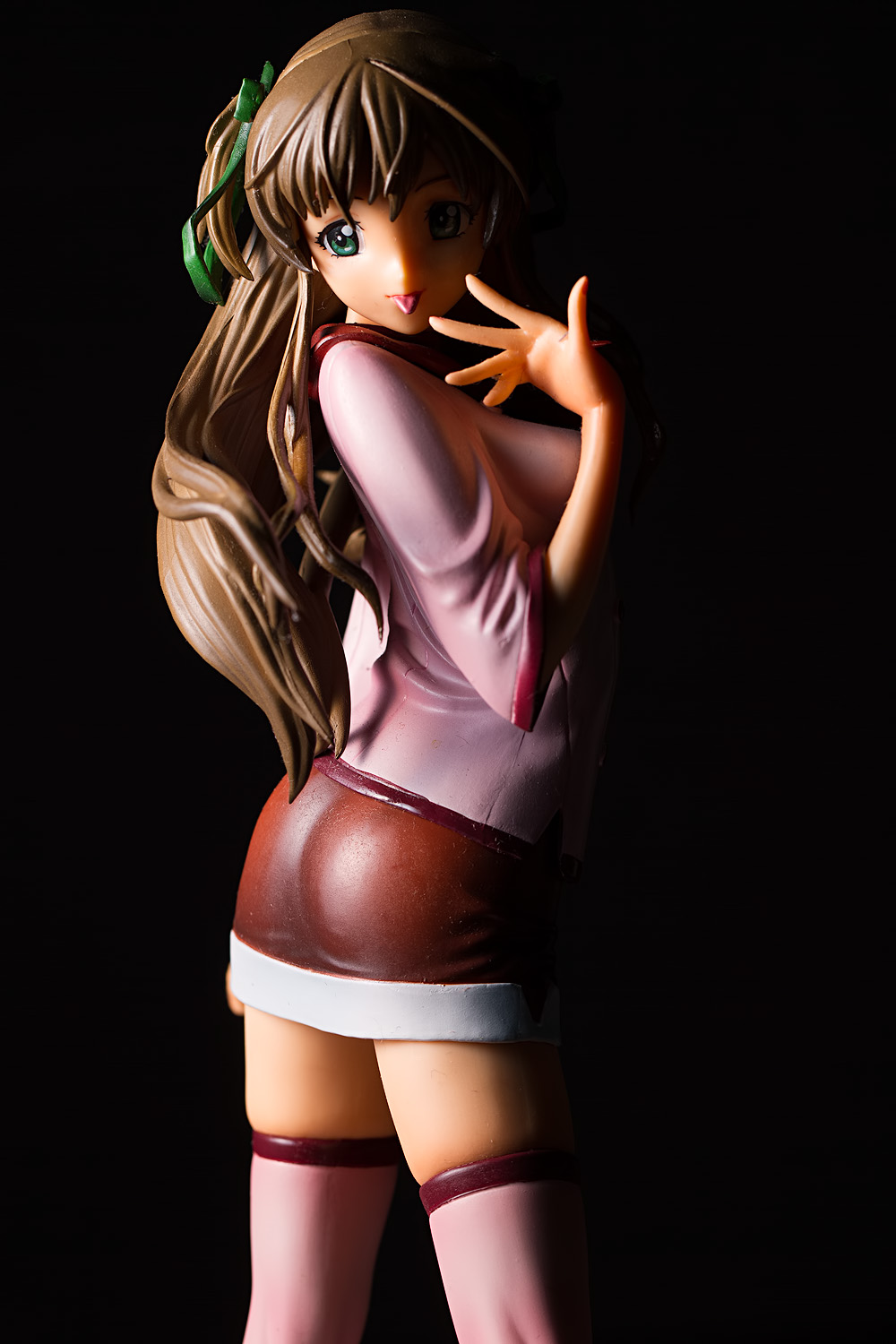
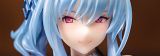
What about with a figure like this? Tsukino is fairly typical-looking schoolgirl, and this type of highly-dramatic light is perhaps not the best choice (the murky background is also doing her no favors). But could it work? It certainly could, depending on what you are going for. Again, you will need to take into account your personal preferences and the qualities of your figure that you are trying to reveal.
Rim Light
We discussed this type of light in the previous section so I will stick to the highlights here. Placing a light behind the figure and to the side creates an outline of light around that particular side of the subject. The example here is a fairly soft rim light, but it’s certainly possible to use a harder light.
Backlight
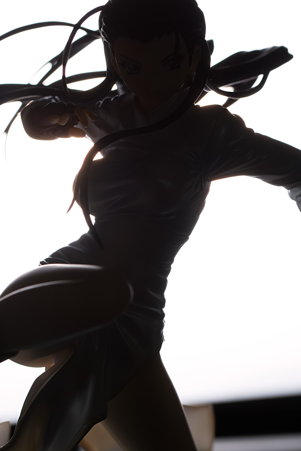
A backlight is, obviously, a light placed behind the subject and aimed straight forward. With human subjects, such a placement can create an aura of light around the subject; figures, however, are often too small to easily conceal anything but the smallest lights. If I wanted such an effect, I’d probably try to create it with two rim lights, placed on each side of the figure.
Another use of a backlight is to generate a silhouette. The particular example shown above is shown only as a fairly ersatz demonstration; the light isn’t big enough to cover the whole figure, for one, and the silhouette isn’t completely dark. If I wanted to do a silhouette shot, I would probably use a sheet of posterboard or foamboard and aim my lights at it. I’d also drop the shadow levels during post-processing to create a true silhouette.
Which Side to Light?
When the figure is facing forward, you have a choice of lighting from the left or the right. Whatever you choose is up to you; I tend to light from camera left (the figure’s right side), partially because of practical concerns (I have more space to put a light on the left side of my shooting area than on the right) and partially, I think, because I’m an English speaker and I naturally read from left to right. I recommend experimenting with a forward-facing figure and seeing which arrangement you prefer.
Sometimes the figure will not give you a choice; hair will be covering one of their eyes, an outstretched limb will be blocking part of their face, or they might be turned in such a way that it’s only practical to light them from one specific side. In such cases, you’ll just have to do the best that you can.
Broad and Short Light
When a figure’s face is turned at an angle to the camera, you have an interesting decision to make. As we just discussed, you generally want light to be striking your figure at an angle and when your figure’s face is turned, you have two choices: you can light the nearer side, which is visibly broader, or the far side, which, being further away, appears to be shorter or narrower. Thus, the respective terms for these types of light are “broad light” and “short light.” The image above shows where the light would be placed in a short light arrangement; in a broad light setup, the light would be placed on the opposite side, striking the other cheek, as it were.
Broad light | Short light
To me, the broad lighting position appears more intimate and personable; the subject appears more human-like. It offers an even-tempered, less-dramatic look. Short lighting, at least the way I typically use it, appears much more aggressive and dramatic; in effect, combining the illuminating qualities of the key light with the impact of a rim light. The light falls further into the image than it does in a broad light style, giving the viewer a sense of detachment from the subject. The visual contrast is more apparent, amplifying the sense of tension.
Note that using a fill light will mitigate a lot of these effects. As always, you should consider what type of emotional content you want your image to convey when deciding whether you want this type of heavily-shadowed look or not.
Short light is said to make the subject’s face look thinner; many portrait photographers use it to make people appear more slender. That’s probably not a major concern when it comes to figure photography, though; most anime fans are accustomed to the very stylized designs found in the medium.
Because the key light in a short lighting setup is aimed back at the subject, it is easier to control spill on the background.
Is short lighting always the way to go, though? Not necessarily; sometimes it can actually look bizarre:
Broad light | Short light
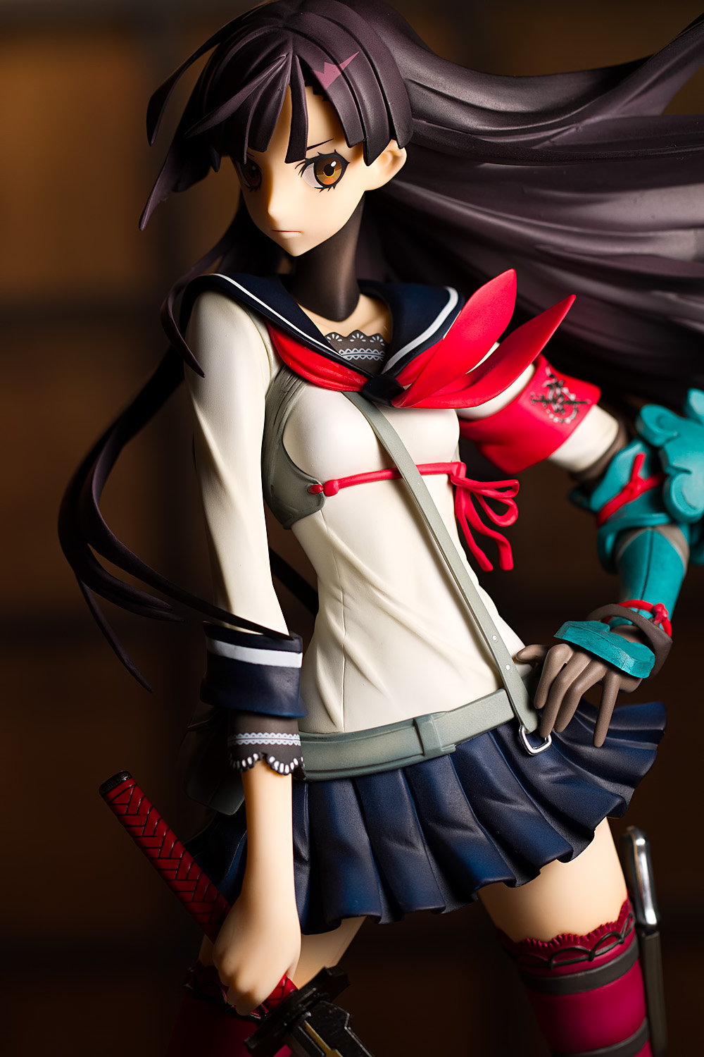
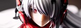
Here we have Katanako; her gaze is strongly directed to her left. The broad light setup leads to a natural, pleasing result, but the short-lit style looks very strange, as if her eyes were misaligned. In this case, Katanako’s eyeline is a critical part of the flow of the image, so it is a good idea to construct the lighting setup to complement it. This is just one of those times where a particular lighting style doesn’t work; if you run into one of these, it’s best to try a different idea rather than fight it.
Vertical Angle of Light
In portrait photography, it’s common to elevate the light so that it is higher than your subject. This appears natural; most light in everyday life shines from above. However, I virtually always keep my key light level with the figure (typically as close to eye-level as I can get it). The reason for this is that most figures have protruding and overhanging bangs that will cast shadows on the figure’s eyes, and this usually looks very bad. You really want to pay attention to the eyes; if you can light the eyes and face in an attractive manner, that will compensate for a whole host of photographic mistakes made elsewhere.
Next time, we’ll look at the one aspect of light that people tend to fixate on: the softness (and hardness) of light.


Another excellent post. This is getting in to the stuff I really need to work on.
And wow, the difference between soft and broad on Katanako is astounding. A very stark contrast. Most of the other stuff is just, yeah, stylistic choice for what mood you want, but Katanako really makes it clear that some figures aren’t suited to certain types of light. Something to definitely keep in mind.
It’s a little odd that, being that figures can’t be directed, I’ve found some figures are much more difficult to photograph than others, and some are really photogenic. I use Buddy and Sora Kasugano a lot just because they seem to look good no matter what I do with them; I could use hard light, soft light, a split light, crazy nuclear-hot rim lights … they seem to look good no matter what. Then there are some figures like Lacia and that one swimsuit Nanoha by Alter which I really had a hard time lighting. And then there are the figures like Tomo Asama where the pose dictates what you can do and that can be annoying if you can’t get the look you want.
Great post, the example pictures explained the differences very well.
Myousai is a great model ^^ Split light is something I want to try next
I often find myself so occupied with the positions of the lights and flashes that I forget to turn the figure for capturing other angles XD
Myousai is one of my favorite figures; I’m glad Alter made her, since I don’t think she’d have gotten a PVC figure if they hadn’t.
Haha, yeah, I’ve had that problem as well. It has happened more than once that I loaded the pictures onto my computer, started looking through them, and then realized that half of the shots I took are all from the exact same angle.
I am completely surprised at how effective a fill card can be. I thought I had to have many lights eventually, but I think I could get a lot of mileage out of one main and one or two rim lights, maximum.
I can see playing with the size and angle of the fill card. Possibly even color of the card for special, specific shots. I didn’t realize using the light….no, better to say that I didn’t know manipulating the light was as easy as it is to create such contrasts in essentially the same shot.
Even a beginner understands that light is important, it is interesting and fun to see just how important and how that importance can be utilized.
I never throw out cardboard packaging for this reason. I got an electronic kettle that had a bunch of white cardboard pieces separating some of the components. That’s like four free fill cards right there! My room is just littered with white, rectangular things.
One thing I haven’t yet tried is using a small fill source to fill in just the face of the figure, while still leaving the deep shadows on the rest of the body. I should get around to playing with that.
I used to play around with color more often. Here’s an example:
I quite liked the effect, though it’s not a very good picture (that’s my keyboard behind her). It helps that the figure is very monochrome, which allows the color tint to stand out a bit more.
I also used to use red construction paper as snoots, which would leave odd red highlights on the figure. That was a big mistake.
Yeessss you’re really cranking these out! I’m learning a lot from these lighting posts and it helps that you can articulate each point so well.
I’m a huge fan of backlighting and using it to create silhouettes, but you need the right figure for it. It can’t have a crazy profile, but it does need one or two distinct elements to be of interest.
You got me thinking about verticality, and that’s something I want to explore. I used to experiment with it but I got lazy, and nowadays it’s easier to throw a light strip onto a flash and call it a day. I think the effect of overhead and under lighting is analogous to your points about broad and short lighting. An overhead light can look intimate (romantic or interrogation room) while under lighting is impersonal and creates a little more tension. I notice it a lot in sci-fi movies and TV shows that involve militaristic settings, where they tend to shoot the light up through grates on the floor.
Anyway, I’m really enjoying these posts and can’t wait for the next one!
I planned on doing these one per day, so as to get these out as quickly as possible. I now see that that was hopelessly optimistic. I’m still hoping to get these all wrapped up by early next week, though.
Yeah, I think a dynamic pose makes silhouette shots more interesting. An easily-recognizable figure also works, particularly if you can connive some way to do it in a way that is fresh and distinctive (I’ll be honest, I don’t always pay a lot of attention to silhouette shots because they can be mundane, and they sometimes venture into cliche territory. Though to be fair, they are nowhere near as bad as crazy Dutch angles, selective coloring, and cats.)
I’ve occasionally experimented with lighting underneath the figure (one of my most notable failures was an attempt at doing that). It can make for an interesting look, though I’d recommend trying to keep the light behind your figure rather than in front. I didn’t mention it here, but lighting a subject from below and in front is sometimes termed “Halloween lighting,” because it leads to the kind of ghastly look you see in some horror movies. However, it can be really dramatic, as you say; indeed, I’ve wanted to shoot something like the kind of sci-fi, light-through-grates thing that you describe (the subject I had in mind is this Starcraft hydralisk toy I’ve got, so it would be alright if the shadows aren’t very pretty).