For most of us, the process of taking pictures is digital from start to finish. The picture is captured by a digital camera, uploaded to a computer, optionally imported into Lightroom, Photoshop, or some other processing application, and then is typically viewed on a monitor or a device LCD, probably in a browser window. However, there’s something really neat about seeing a printed version of a photograph. Even though I scarcely used a camera during my childhood, I was always thrilled to see pictures after my dad brought them back from the one-hour photo processor (unless the pictures were of me – I hated having my picture taken). Now, it takes a bit longer than an hour to get prints delivered – unless you go to a local Costco or other print shop – but it’s no less delighting.
Free Adorama photo book
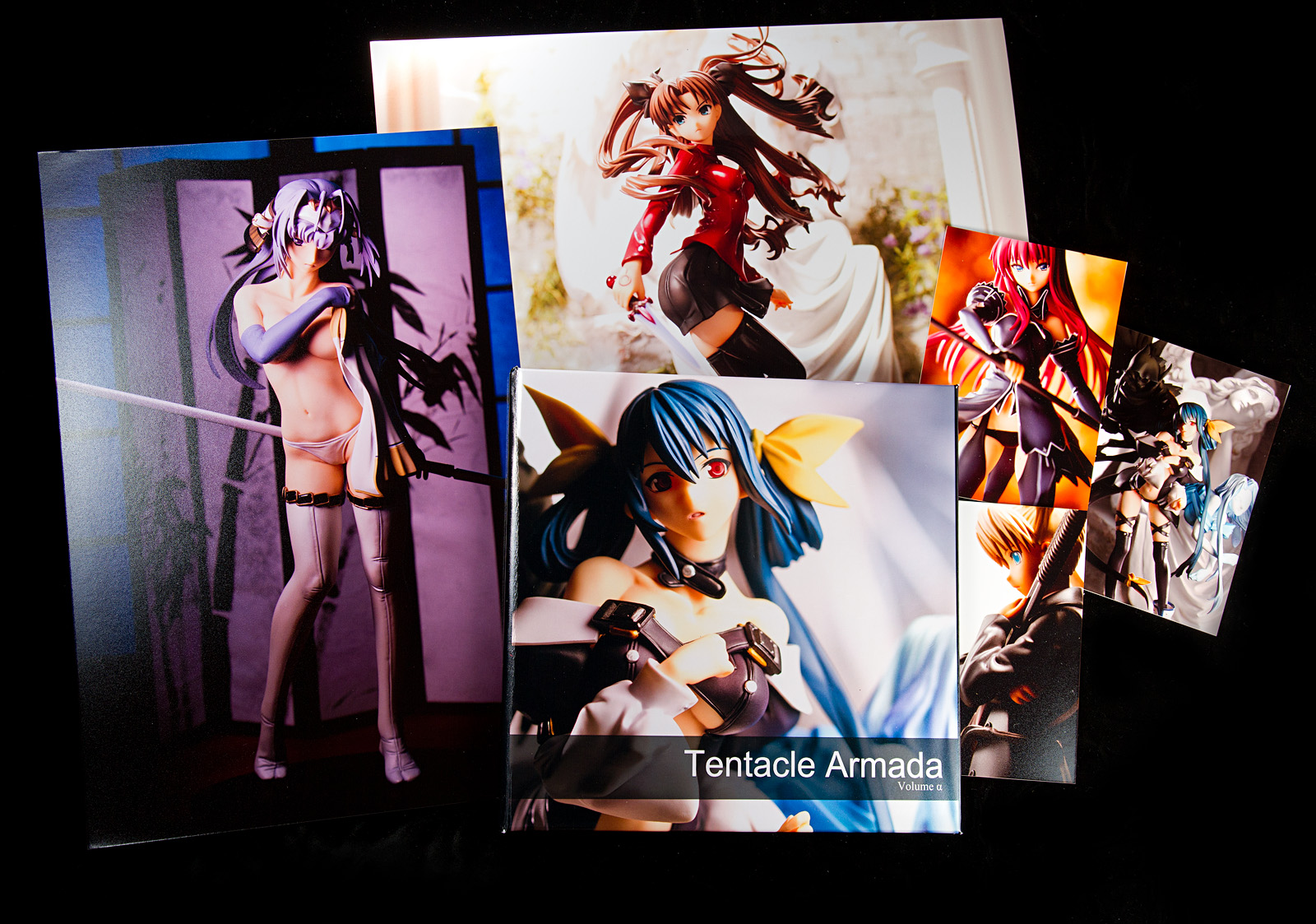
Back during the summer, I bought some camera equipment from Adorama. If you spend over $200, they give you a free 8×8″ 14-page photobook through AdoramaPix, which was a happy surprise for me since I didn’t know about that before placing my order. I had thought that a photobook would be a cool thing to make but I wasn’t sure whether it was worth the time, effort, and expense. However, I remembered when super rats made his photo doujinshi a few years back and how cool it looked. I had wanted to buy a copy but I was broke-ass and unemployed at the time. I also remember that meronpan was very pleased with the way his AdoramaPix prints turned out. When I was apprised of the free photobook offer, I figured this would be a good opportunity to see how my pictures look in print and to assess AdoramaPix’s quality and level of service.
Putting together the book was actually rather difficult. Not because of AdoramaPix’s layout tool, though; on the contrary, their tool is very easy to use and quite well-designed. However, I have no experience with print layout, and even deciding how big I wanted to make my pictures required some thought. I like big pictures so I figured I’d use one picture per page, and since I know nothing about layout, I decided to go with a very simple format, with a black background and small photo captions.
The other issue was deciding which pictures to include. I needed fourteen pictures, and as I wanted to include only one photo per figure, I had a tough time picking fourteen pictures I love enough to have printed.
One other problem, albeit a minor one, was that a couple of the shots I wanted to use were taken with my old Rebel XS camera. It’s a 10 megapixel camera and back then, I was very sloppy with framing since I always intended to crop the image. However, the pictures seem to hold up very well, even after requiring some heavy cropping. I’m really glad I don’t use a tripod anymore, since it’s a lot easier to compose a shot handheld than on a tripod, particularly the broken pan-and-tilt Best Buy-brand tripod I used to use. I’m also glad I use an 18 megapixel camera now; not that I put a lot of stock in megapixel counts, given that 99% of the shots I share are displayed at relatively low resolution on the internet, but if I need to crop, having that big a picture gives me a lot of latitude.
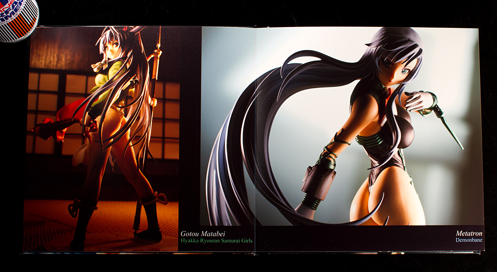
The quality of the photobook is superb. Not that I have any experience with making or viewing photobooks, but the pictures look fantastic. A particularly nice feature is that Adoramapix binds the book so that they open flat, making it easy to view photos that are spread across both pages. I’m definitely very pleased with this book. I probably should’ve brushed the dust off of the pages before taking pictures, though.
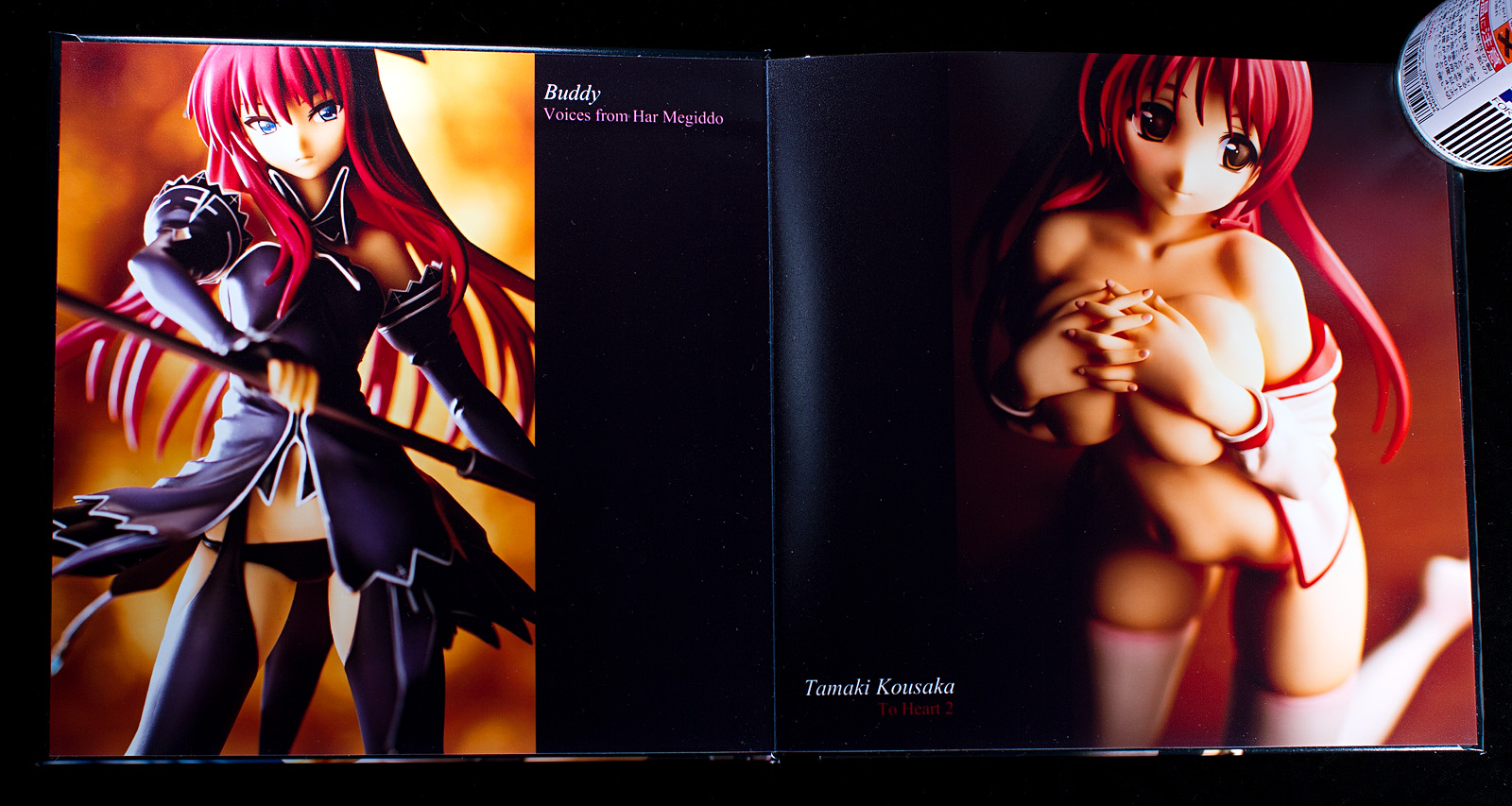
Since this was just a trial book to experiment with layout, I labeled this book “Volume Alpha.” I’m sort of thinking of making a longer, more elaborate book for myself, probably in 3:2 size rather than square format, but I don’t have all the pictures I want to include yet. If I do make another book, there are a few things I’d do differently. An obvious one is that I wouldn’t place pictures on the inside covers, since they are glued to the covers and are creased near the top and bottom. I should have also paid more attention to page bleed, since some of the text is positioned very close to the edges. And last, I’ll forgo color corrections because my monitor is calibrated and I’m a control freak. I recently got some 8×12″ prints made without color corrections and they look fantastic.
Post-processing
I’m a big proponent of post-processing. For me, taking pictures means getting them as ready as I can for processing. I bought Lightroom during the summer when Adobe was doing one of their periodic $100 off sales and I’m slowly learning its capabilities. I also picked up Photoshop and I use both applications, Lightroom for setting exposure and exporting the RAW files to TIFF, and Photoshop for color tweaks, sharpening, and layering and masking if necessary. To make the photobook, I reprocessed all my photos at full resolution. In some cases, they look quite a bit different than they did the first time I processed them.
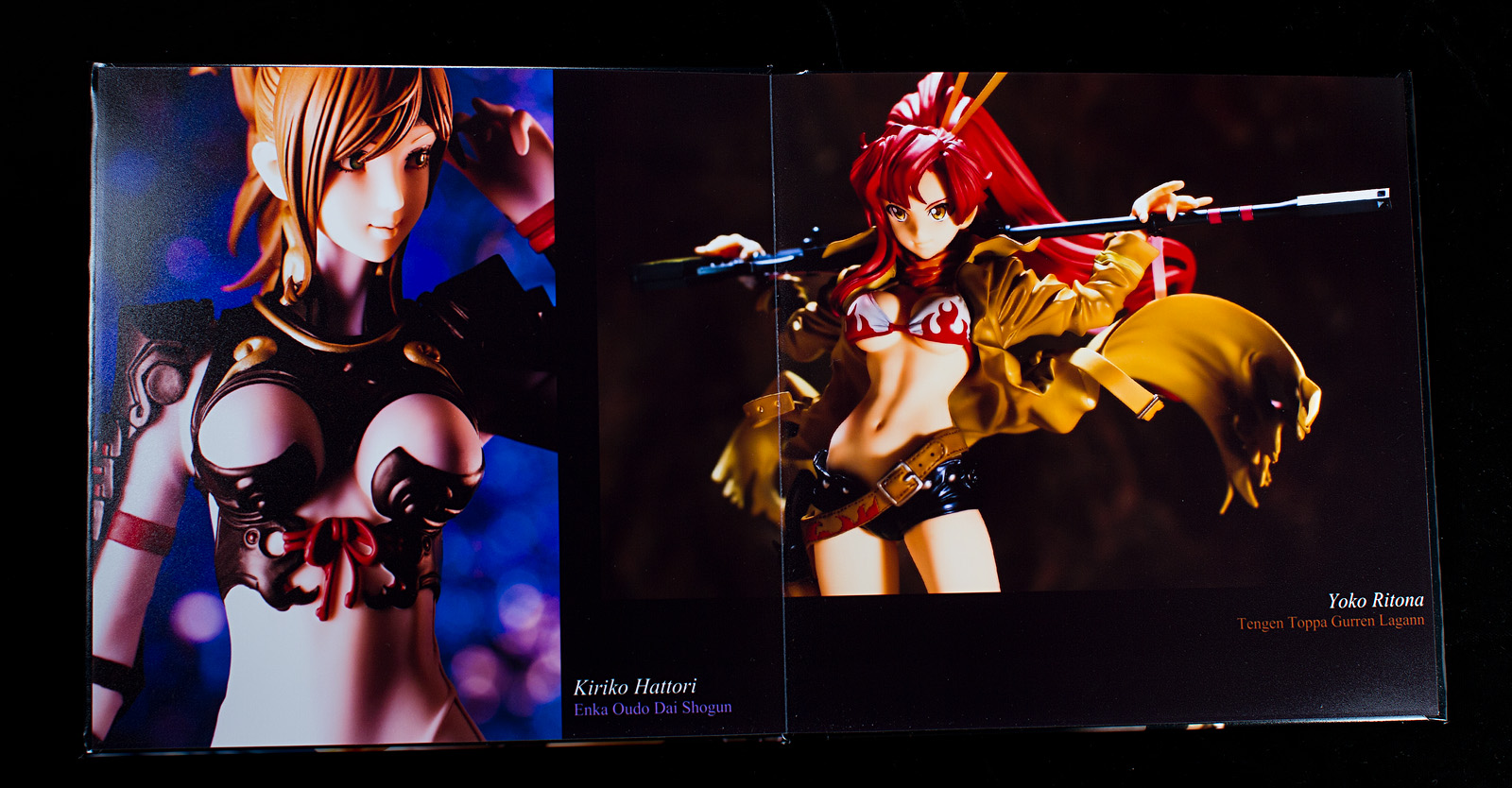
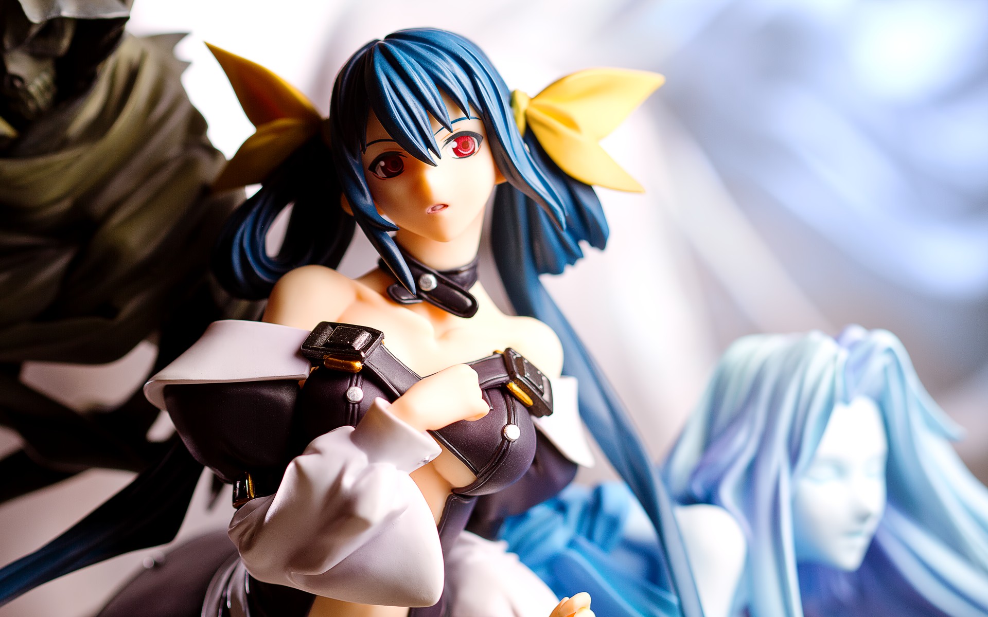
Yoko Ritona
November 2009
This shot of Yoko is one of the older shots I took. I really like this shot but it’s very dim and muddy, and it needs a lot of help. Compounding its problems is the fact that I shot it in JPEG mode. Back then, I didn’t have much hard disk space so I never shot in RAW. Conventional wisdom says that if you want to post-process a picture, you should always shoot RAW, which isn’t quite correct; you can still make quite a few tweaks to a JPEG photo. One thing I did to this picture that I don’t usually do is I duplicated the background layer and ran one of Topaz Labs‘s style filters on it, in this case the Bold Detail preset in Topaz Detail. I dropped the opacity down to about 65% so that the effect wouldn’t be quite so apparent, and I’m pretty happy with how it turned out.
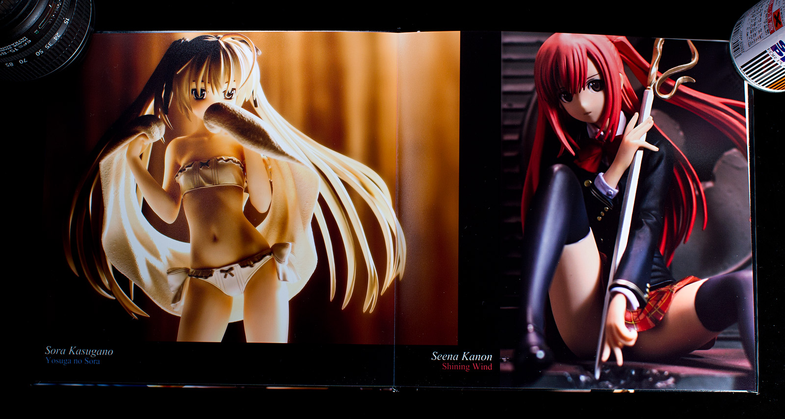
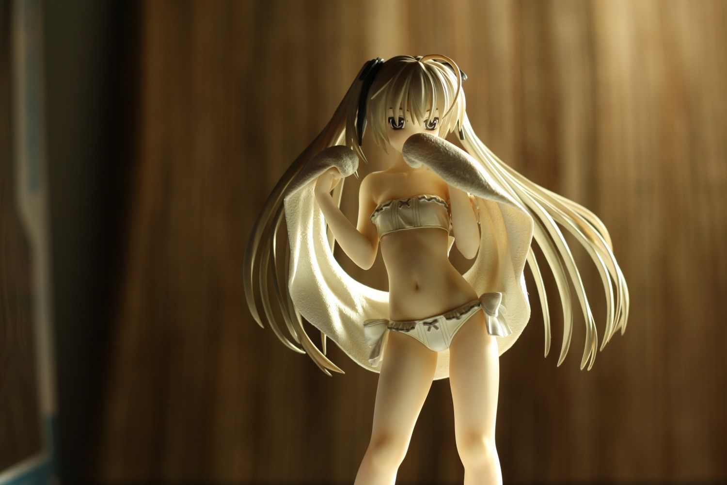
Sora Kasugano
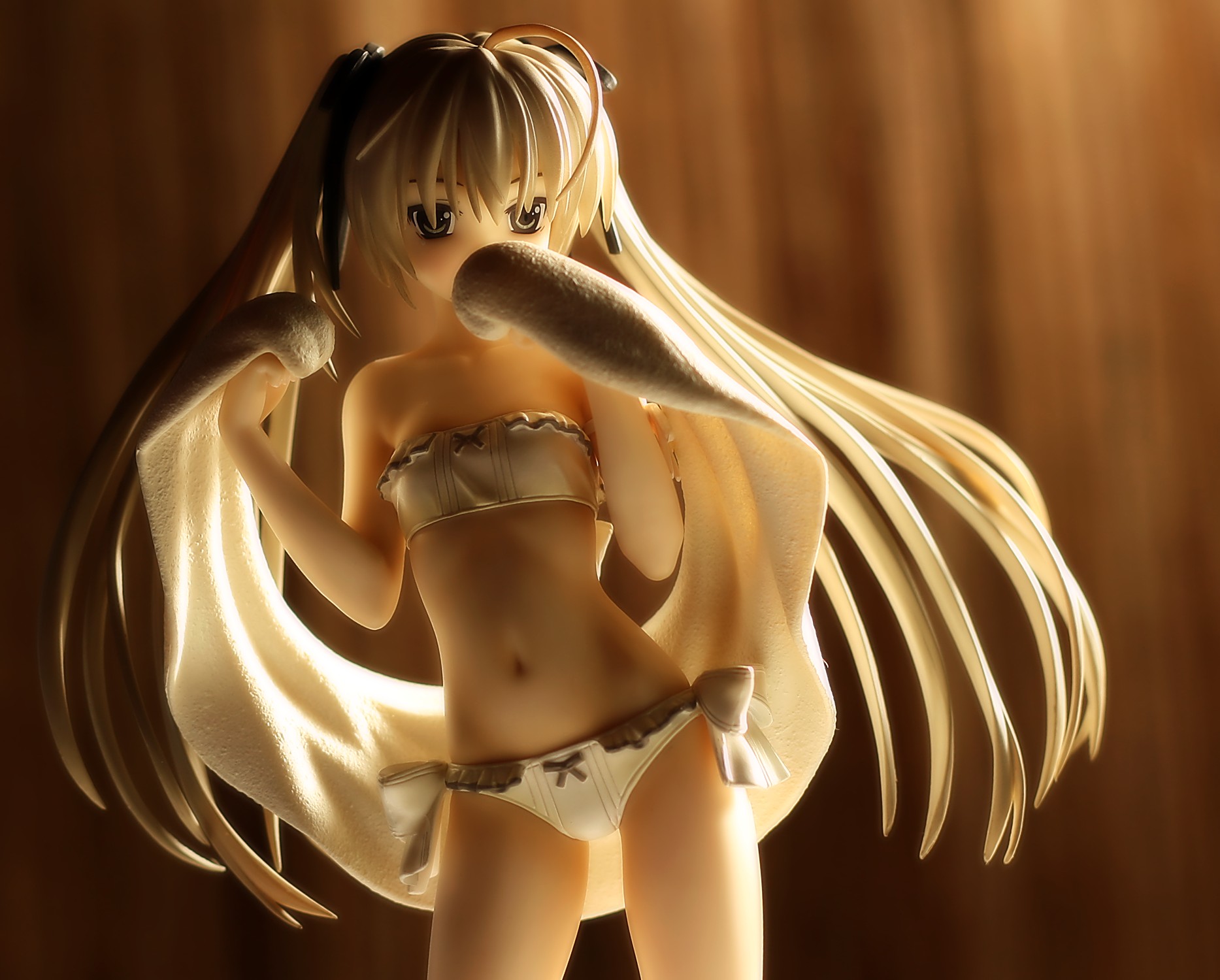
February 2010
Similarly, this is an older photo that was shot in JPEG mode. I still like the way it looks, and I mainly wanted to bump up the contrast a bit for printing. I did a bit more to it, including masking part of the image to get a more defined brightness gradient going from left to right, but in the end, I don’t think it looks too different than the older image.
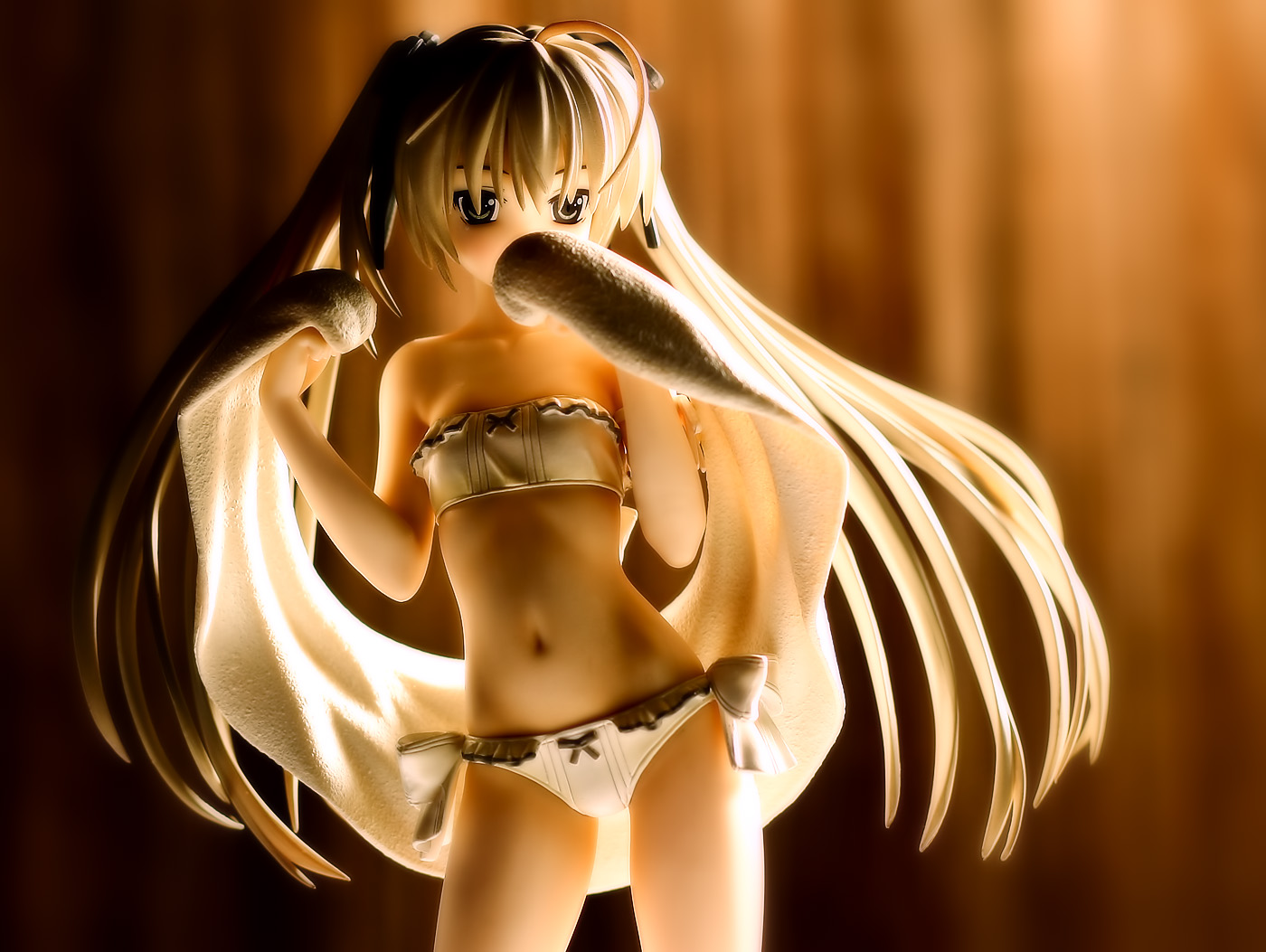
Incidentally, here’s what the original image looks like:
One reason I’m glad I use flashes rather than desk lamps is that I don’t have to deal with the green tint you get with fluorescent bulbs.
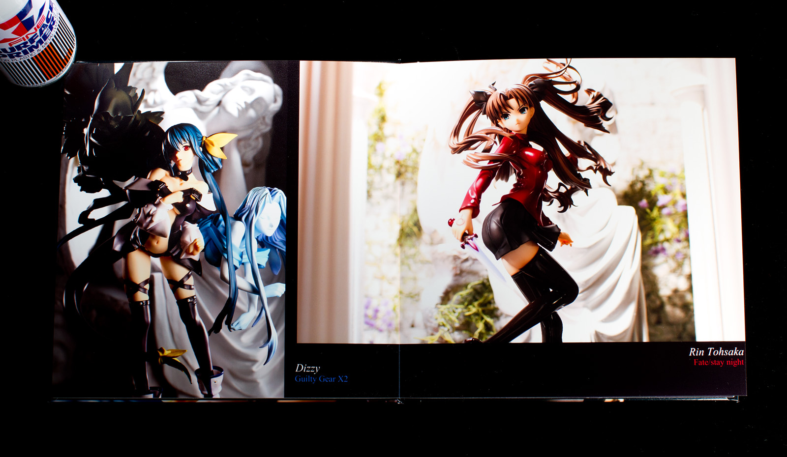
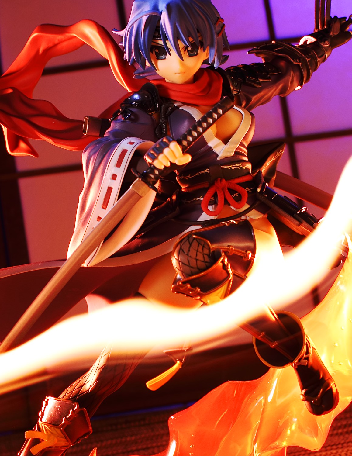
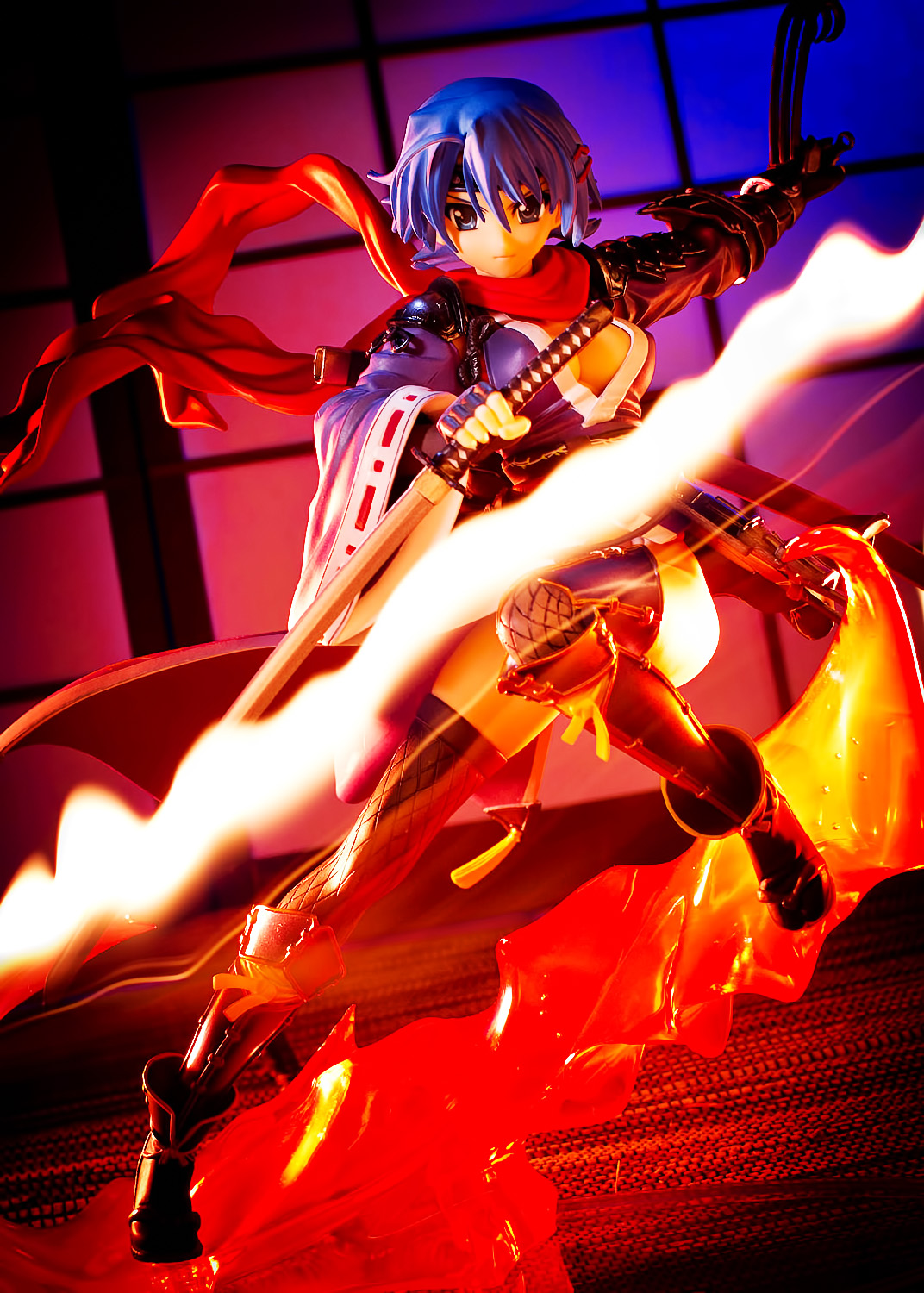
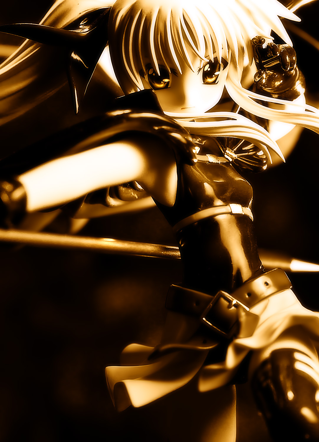
Dizzy
April 2011
This is a very recent shot, having been taken back in April. I wasn’t using Lightroom at the time, though. Needing a shot for the cover of the book, I felt that this one would be a good candidate after a little more work.
I think the skin tone in this newer version is much better. The image is also brighter, although whether that’s better is more of a personal opinion rather than an objective observation. I boosted up the blue values in part of the background just to get it looking a bit more interesting, and I really like how the left side of the picture is a bit warmer, with a ruddy background and darker tones, while the right side is brighter and cooler. I also feathered a selection around Undine’s face to bring up more detail and contrast there.
Tamaki Kousaka
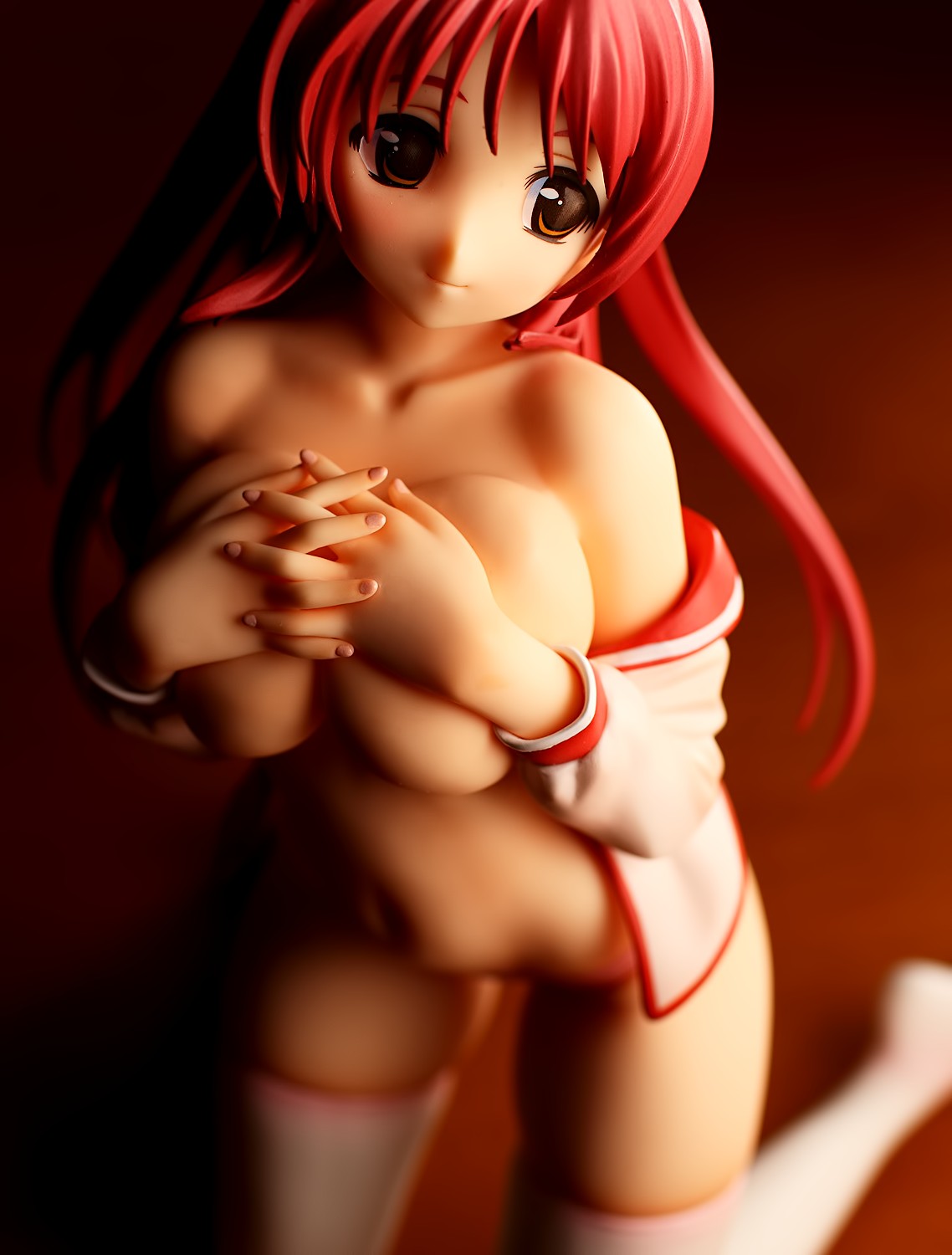
November 2010
I’ve always been bothered by the way Tamaki’s right eye looks like a dark hole in her face. This was one of the pictures I was sure I was going to include in the book, but I knew I wanted to fix that problem with her eye.
Lightroom has limited masking capability via its Adjustment Brush tool. After opening this image in Lightroom, I painted over her right eye and brought up the exposure value.
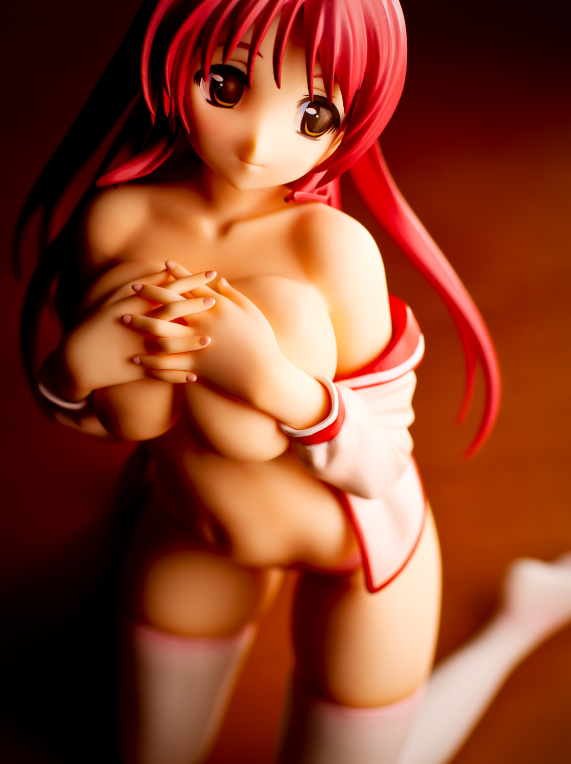
Like with most of the other images presented here, I increased the brightness as well. I think the one change to her eye improves this picture a great deal.
Junko Hattori
May 2011
I didn’t include this image in the book, mainly because I was equivocal as to how much I liked it. On a whim, I ran a different version of this image through Lightroom and got this image, which I like quite a bit better:
I jacked the hell out of the color saturation to get a more interesting look and dropped a big vignette on the lower right and upper left corners to emphasize the diagonal nature of the image. I also cleaned up her eyes a bit so they stand out more. That’s sort of a common theme here: the eyes are really important, and a little effort is worth spending to get the eyes looking good.
Experiments with Monochrome
I don’t shoot much in black and white. This is mainly because I do not think figures make great subjects for black and white photos, but since I suspect that my opinion is completely wrong, I’ve played around a bit with some of the black and white settings in Lightroom. One of the cool things you can do is convert an image to black and white and then apply split tone coloration. I took a few photos and tried out a few techniques, though in these cases, the two colors used for the tones were fairly close in value, so I’m not really sure if you’d still call it a split tone or not.
Rei Ayanami
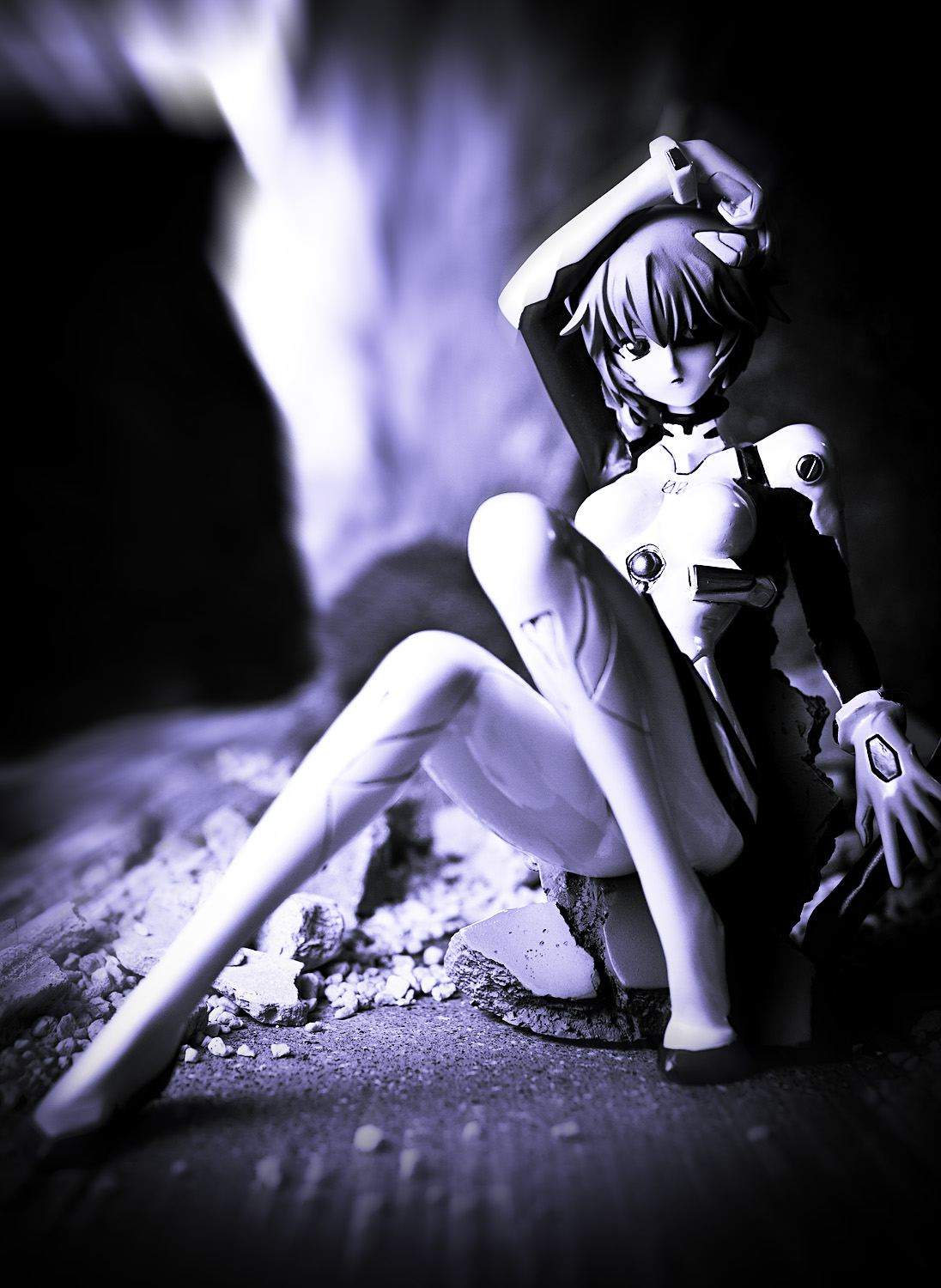
Rei Ayanami is an obvious candidate for black and white pictures. I gave this image a bluish tone, and then gave it a blurred look somewhat similar to a Lensbaby lens. I’m not too thrilled with how dark her eye looks; I probably should have brightened it a bit. Incidentally, Rei is also an obvious candidate for selective coloring, but there is no way I’m going to do something like that.
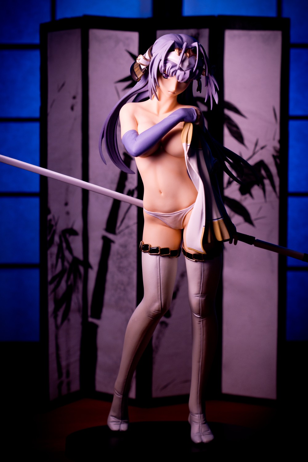
Senhime
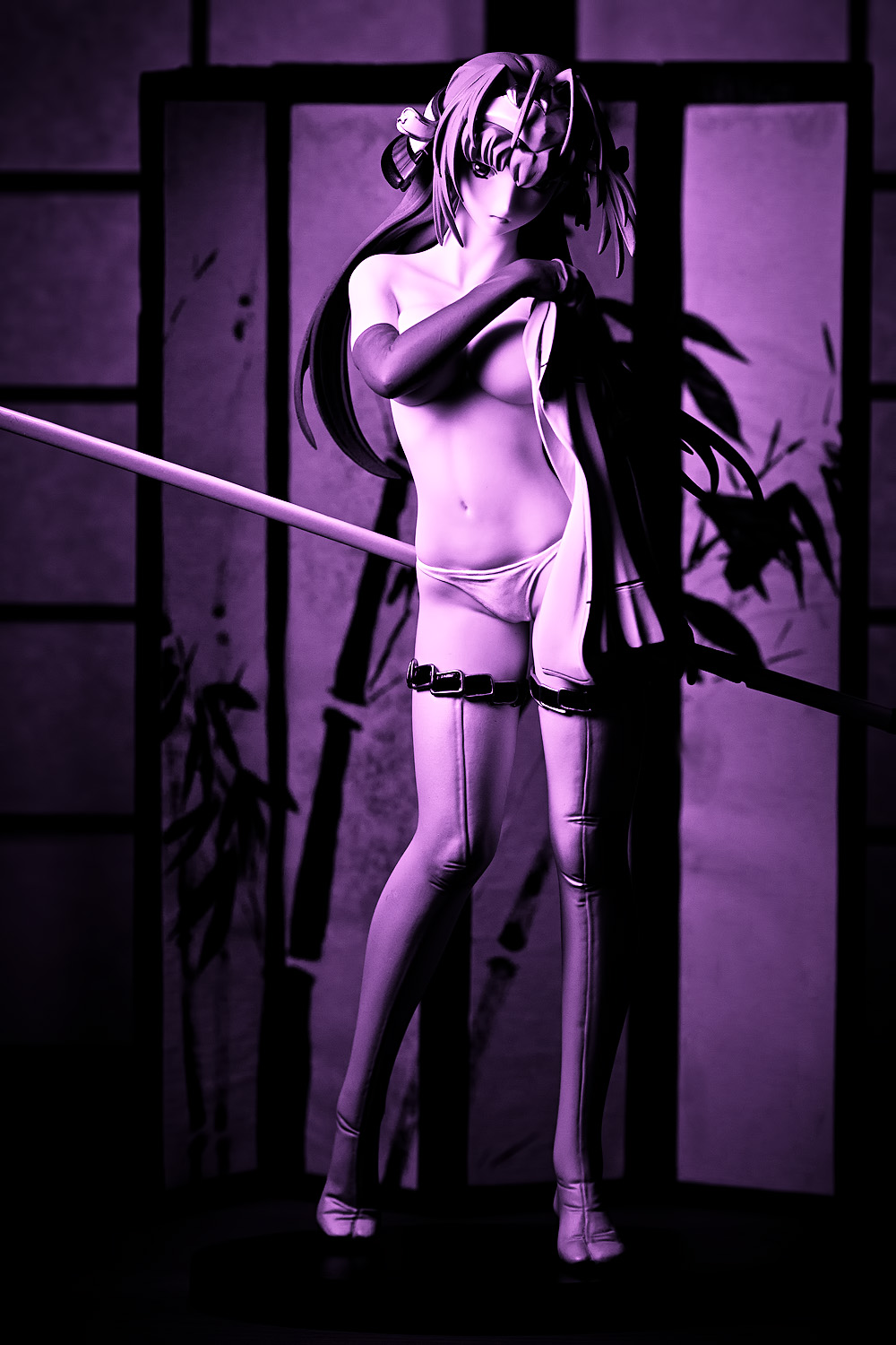
This is something of a throwaway picture, in that I haven’t yet reviewed this particular figure. As with Rei, the purple tone was dictated by the color of her hair. I like the tones of the shadows on her body but in this case, I think I prefer a color treatment. This isn’t exactly the same photo but demonstrates what it looks like in color:
Fate Testarossa
I didn’t use this image in my review of this figure, so I was curious to see what it looked like as a split-toned image. I really like the way her eyes look in this rendition, and there’s a three-dimensional look to her skirt and hand that I think is very attractive. In this case, I think the black and white conversion works very well, and while I’m certainly going to be sticking with color for most of my stuff, I’m going to be looking for opportunities to make images like this one.


I tried out the Adorama photo book during a promotion and was quite pleased as well. I made the same mistake of putting an image on the inside covers. I’d love to make a really large 12×9 book, but that is super pricey. Might try the Kodak service as they have a sweet 12×14 size that is cheaper than Adorama.
I’m using Aperture 3 and trying to learn it better. I tried the trial of Lightroom 3 and it’s a real cool program as well. Does it have brushes? I didn’t check for them at the time. I use brushes in Aperture 3 all the time. Will put one of those new wacom tablets on my Xmas list so I can use brushes with a bit more finesse.
Does Adorama give you the option to sell your books? I know Blurb does. I’d certainly be interested if you put something together.
Yeah, they are hugely expensive; I figure a big book would be something I’d just keep for myself, since nobody’s gonna be spending a hundred bucks on someone else’s photobook.
Ah, cool; I’ve heard good things about Aperture but I use Windows so that’s obviously not available to me. Lightroom doesn’t really have brushes; it does have something called an Adjustment Brush which gives some measure of localized editing capability, but it’s more limited than I would like. It lets you “paint” in areas where you want to adjust exposure, saturation, contrast, etc., and it has some feathering options and a neat auto-mask option which does a pretty good job of detecting borders and edges, making it easier to mask off the areas you don’t want to edit. I wish it let you adjust things like color temperature and curves, though; it doesn’t let you do that.
Ah, cool, I have never used a tablet before but there’s a photographer named David DuChemin who speaks very highly of his Wacom tablet. Truthfully, I’m not quite certain how he uses it, but he says he uses it all the time, so it must be quite useful.
Yeah, Adorama lets you sell your books. I’m not quite sure how it works, but I assume customers can just order the book through Adorama or AdoramaPix.
A great article and insight in your work, the photobook also looks fantastic. Dust particles sure are annoying to deal with sometimes, I guess that’s a painful reminder when you get the shots on print.
I actually prefer your Tamaki shot prior to post-processing but the others are excellent improvements even if the original shots look good already.
This would certainly make a neat Christmas gift, though skipping Giga Pulse for family members may be a wise decision.
I spent a little time darkening the Tamaki picture a bit and bringing down the highlights. Let’s see how it looks:
I think I brought them down too much. The picture seems to have a very different look than the other two pictures. Or maybe it’s just my imagination; I’ve probably spent too much time working on this image during the last few months.
Haha, yeah, I think I’m going to leave the more explicit figures out of any future book I make. AdoramaPix doesn’t have problems with artistic nudity, and I’ve read at least one person on a message board who said he basically printed full-out sexual pictures without a hassle, but I figure I’d want to keep my book tasteful. I guess that probably means leaving out nipple shots, since for some reason, a lot of people are just terrified by nipples (that aren’t on men, anyway).
Just wanted to say that I also thought the Tamaki shot looked better before processing. The original had a softer look. Of course, it’s subjective.
Anyway, I think all of the shots look great and the book sounds like a fun idea.
That looks really nice in book form, you should make a bigger photobook and sell some copies, I would buy one for sure. Just the images which go over two pages would look better when placed on one side I think.
From time to time I send some pictures to have real copys and once made an album with some of them, but in a more analog way, by glueing photos into a nice looking album, the pictures increase their viewing pleasure potential when placed on a black matte textured page.
Next time I will use the easier method, by ordering a photobook online, where you can also design the cover and put text inside, which is an advantage.
I’m thinking about doing something like that, but I’d want to make sure I’ve got pictures of all my favorite figures in there, and I’d probably also need to make it so that people can afford it. AdoramaPix isn’t quite a super-premium service but I’d consider them high-end for the kind of complete amateur work that I do, so maybe there’s a cheaper service out there that might be more appropriate for this idea.
Ah, that’s a neat idea; I like the idea of a photo scrapbook. Actually, I have something of a fetish for low-tech aesthetics. Since I had purchased a Polaroid SX-70 camera, I had this idea for making a wall collage of Polaroid pictures, one picture per figure. That idea got dropped once I figured out how much it’d cost to buy all that film, though. I like your idea, though; I still kinda have this plan for getting a film camera and making B&W prints from the negatives, maybe I might try something like what you did.
Oh post-processing, what a maddening affair! Too many times have I processed and posted a set of photos, only to wake up next morning completely unhappy with them. Part if it is the fact that I have scarcely any patience, and part of it is that a work of art is never complete (not that I would call what I make “art”). There seems to be always room for improvement, and just as people constantly change, so do their definitions of perfection. I’ve tried going back to redo some of the sets I shot in the past, but I always stopped myself knowing that it’d probably be an endless cycle of frustration.
Still, it’s always good to read about the thoughts that went into your photography. The addition of vignetting on Junko is really cool, and I’m definitely going to try out the TopazLab filters myself. Learning the creative process behind it all is the best thing about your photography posts!
By the way, I don’t mean to come off as a total brown-noser, but I’d totally buy an copy of your photo book should you make more. You’ve always been somewhat of an inspiration to me, and I’d love to have a collection of your shots to flip through when I’m bored.
Bah, you should see what constitutes photographic art these days. Google for the most expensive photograph sold – it’s sort of bewildering. If a picture of a straight river is art, a picture of a figure in a river is certainly art.
I think the most frustrating thing for me is that I don’t have a great handle on post-processing. Despite having used Photoshop for about 14 or 15 years now, I didn’t learn what layer masks are until last year. I didn’t start using them until this year. My post-processing workflow is in huge flux, and while I’m happy to be learning many new things that I know will improve my pictures, it’s sort of depressing to know that I’ve got a ton of older pictures that look kinda crappy.
Thanks for the kind words XD I’m looking into options; I think it’d be really neat to be able to sell a book. Not that I’d expect to sell many, but it’d be cool to be able to say that there at least a few people around the world that have a bound book of my work.
I’d always thought that Cindy Sherman, Untitled #96 was the most expensive photograph ever sold as art. Maybe because people see Rhein II’s digital manipulation as no longer being a photograph. Either way, both those items were crazy over priced. I think we’re all geniuses here, we should start selling our photos for at least a million or two dollars.
I like this plan. Shoot, I’ll even settle for like, one hundred grand. I’m not greedy, I don’t need a lot of money, even eighty grand would be acceptable. For one photo.
I remember a couple years ago doing a little book of photos for family. They’re always asking about them and I always show them on some digital device. I’m not sure how I feel about printing out any of the figure stuff I took. I think 99% of it would be garbage as it’s all white background review crap. But never the less it’s an intriguing thought.
I’m not sure if selling such a thing would work out in terms of producing a great profit but I could see people buying a copy or three. You definitely have some of the more interesting figure photos on the Internet. Another idea might be a joint effort, if say super rats and yourself got together and perhaps some others, perhaps you could sell a few more, though again profit wouldn’t likely be the main grab I don’t think.
Yeah, I was kinda thinking to myself of getting a tablet just so I could share media when I meet friends in person … but having seen this book, there’s something really neat about seeing pictures in print. Of course, I don’t even have a smartphone, so I don’t even know what it’s like having a media player constantly in my pocket.
Incidentally, I think white-background pictures can look pretty cool, too. When I saw meronpan’s post, his Black Rock Shooter picture (on white) caught my eye. Admittedly, part of that is the attractive contrast between the white background and the mostly black and white colors of the figure, but I think it worked out very well.
I suppose I could find one or two images where the contrasting nature of the background and figures colours work well. But w/e, maybe when I’m an artist like Andreas Gursky I can manage to fit them into a book.
I’m pretty happy with my BlackBerry PlayBook, and if I were richer and had enormous pockets the iPad2 is pretty damn sweet. I have all kinds of complaints about both of them, but having such a digital device available I find completely invaluable now. Before working for my current employer, I’d never had a smartphone either and never felt the need to acquire one. Since they gave me one free of charge and I’ve used it for 2 years, I couldn’t see myself not having one any more. Perhaps it’s best not to get one then, they’re addictive and expensive, and you’ve already got some expensive hobbies.
Funny story (funny now, not quite so funny at the time): so last Wednesday, my car died after I had driven to get lunch. I figured the problem was electrical because it wouldn’t start (it turned out to be corrosion on the battery terminals, which was annoying as hell because I had just cleaned them a few weeks ago). So I call up a friend and ask him to come over and try to jump my car. When he arrives, I ask him if he knows the order the cables should be placed; he doesn’t, but he takes out his iPhone and searches to confirm it. Later on, I’m sitting in his car and getting the information for the tow truck company and the garage my car is going to be towed to, and I don’t have paper on me, so he takes the information and enters it into his phone. If I needed directions to the garage, he could’ve given those to me too. That whole time, I was thinking to myself that it really sucks having a broken car, and that I need to get myself a damn smartphone already. Fortunately the tow truck guy scraped off the battery posts with a knife and saved me (and him) a lot of hassle that afternoon.
Poooo. I thought this was going to be an announcement that you were going to put out a book. Until recently, I used an 8MP camera (bumped up to a whole 12MP last month). For a letter sized book, even 8MP is fine.
Just to echo some of your post, when doing my figure book, I reprocessed most of the images (luckily I kept most of the from camera jpgs of the keepers). I think you almost have to process images differently for print vs. web, though for a good number the difference is too little to notice or care on casual examination. But some of those shots where you’re pushing the colors a bit, you really do have to reprocess for print.
I’m going to echo Nightmare’s comment about liking the first Tamaki process (on screen) than the second. I think the highlights get too hot and my eye gets pulled to the highlight. I think lightening up her face improved it, but I wouldn’t have lightened up her body highlights as much. I wind up staring at her shoulder. Though since these were adjusted for print, the highlight might not be as intense on paper.
Every now and then I think of buying a bunch of those cheap flashes on eBay and trying out the way you do it, mainly for spotlighting control which can be annoying with a desk lamp, but I start thinking about the batteries! How many do you go through a month? Also, how many flash units do you normally use? I’ve probably asked this before, but my memory sucks.
I’d love to put out a book in a similar manner to what you did, but first I’ve got a few figures in the review queue that I want to take shots of. I think that when I decide which pictures should be included, half of the criteria is going to be how much I like the picture and the other half will be how much I like the figure. I’ve got a few figures that I need to take shots of, including my longtime second-favorite figure and my new #1 most favorite figure.
Yeah, I wasn’t completely certain what the prints were going to look like, but I had ordered one (a 20×30″ print) previously so I adjusted for a couple of things. I think the 20×30 print is a bit dark (though I’m not sure if that’s not my fault), so I brightened up a lot of the photos I submitted for printing. I also sharpened them differently, though I’m not sure if it made a difference; I’ve often heard that you should sharpen for your intended output, but I must admit that the distinction is lost on me. The printed images do seem sharp enough for me, though.
Yeah, I think I agree with you and Nightmare; I tend to like a very high-contrast look where the highlights are nearly blown out, but I think I took it too far there. Some pictures look pretty good with the hot highlights but I don’t think this is one of them. (Incidentally, I’m not much of an expose-to-the-right sort of the guy even though every professional photo blog I read seems to endorse that).
I bought a couple 8-packs of Eneloops off Amazon and I just recharge them every couple of weeks. I bought an eight-cell Maha charger which can recharge a battery in a couple of hours, so I usually don’t have power problems (I do remember running out of juice when I was photographing Lily, though; I was popping full-power blasts off of a black velvet background to try to get some interesting patterns). I’ve got, uhh, seven flashes: a 580EX II, two LumoPro LP160s, a Yongnuo YN-565EX, YN-560, and YN-460 II, and an old Canon 540EZ. I’ve also got two more flashes, a Canon 270EX and some cheap Holga unit, that I don’t use anymore. It’s tremendous overkill but it’s nice having options. You can get a YN-560 off Amazon for something like $65; I wouldn’t completely endorse the unit since I had one fail on me (I’ve heard the repair is relatively simple for anyone with soldering skill, though) but at that price for a fairly full-featured flash, it’s still a pretty good deal.
Very cool feature from Adorama, I might send some business their way. I’d totally buy some of your prints!
I like how your post-processing is subtle but really livens up the picture. The Sora photo has an angelic glow to it that gets emphasized after post-processing. In absolute terms it doesn’t look like a huge change, but it does a lot to enhance the feel of the photo.
They’ve got great service, they also run sales fairly frequently; just a few weeks ago they had a 50% off sale, which was great since I got a big backdrop printed out.
Yeah, that’s one of the things I like the most about that picture. It was a complete accident, too; it’s a two-light shot with one light bulb on the backdrop and one on Sora hitting the left side of her face. That light reflected off her towel and gives her that glowing look. I hadn’t planned it that way at all but I love the way it turned out.
It is great to see more on how you play with your pictures.
As for the printing and the photobooks. I work at a printing center and make quiet a few photobooks and prints, but I haven’t tried printing out any of our photos. I probably wouldn’t even try until I get into staging like you do. I will stick with my coloured paper backgrounds till I get more comfortable will scenes and staging shoots for my figures.
Thanks! Good luck with your pictures; I see your blog partner has shot on green, which gives him a step up on me, because I’ve tried shooting on green before and I have never gotten it to work. If you look through this website, I think the only pictures you’ll ever see with a green background are the ones I took outdoors.
uhm this is pretty intererestign indeed, but i wanted to ask you somethign else… sicne you already have a Tamaki, i wanted to aks if oyud like to buy my old tamaki GFestival Figure? im sellign her due to lack of Space… the figure is pretty well-made except for a very visible seam at her left arm, but it is, i think, the only fully-castoffable Figure of Tamaki at all (correct me if im wrong), though she has nothing “down there”. she came with a kind of silicon-rubber swimsuit, but it had aproduction error and broke; but the figure itself is in top-condition, and can be dressed ian anythign anyways (looks beter withotu the swimsuit anyways. the ruber it was made of attracted dust and dirt and was very hard to clean of it.)
well, if your itnerested just mail me
danielkochen@yahoo.de
Thank you for the offer, but I will pass; I’m not a big fan of figures smaller than 1/8 scale, other than action figures and the very occasional exception. Hope you find someone who can give her a new home!
okay , thanks anyways^^
Damn! I want a copy where can I buy one?!
Gee, I guess I’m going to have to look around for publishing services to compare prices, since there seems to be some actual interest in a book. Though I got the feeling that when people see how much these things cost, a lot of that interest is going to evaporate.
A photobook is a good way of preserving your archives. I just realized that “figure photography” is indeed a difficult subject to venture, especially if you don’t have the time or buck. Having them in a hard copy can last a long time, even without electricity I guess.
Yeah, figure photography is not a field you’re going to see many (or any) professional photographers going into, unlike food or macro photography, but it still draws from the same basic principles and requires much of the same equipment (though not nearly as much equipment as many people would think). I try to keep my photos regularly backed up, but it’s pretty nice to have hardcopies of my images to show people or just in case something incredibly disastrous occurs.
WOW, really amazed on the compilation of your images! Great stuff you got there bro! 😀 I haven’t read the post entirely because i just looked at your awesome shots, just wanna ask, how much did it cost you to print those out?
Thanks! It didn’t cost too much; Adorama was running a 50% off sale not long ago, and the photobook was free. They have pricing on their site, but I think the 8×12″ prints were only like $1.50 or so each.